Benjamin Moore Midnight (2129-10) is a rich, striking shade that effortlessly bridges the gap between drama and sophistication. This deep, inky hue exudes timeless elegance and adds a sense of depth to any space, making it a versatile choice for both modern and traditional interiors. Midnight is part of Benjamin Moore's Classic Color Collection, a curated palette celebrated for its enduring appeal and impeccable versatility.
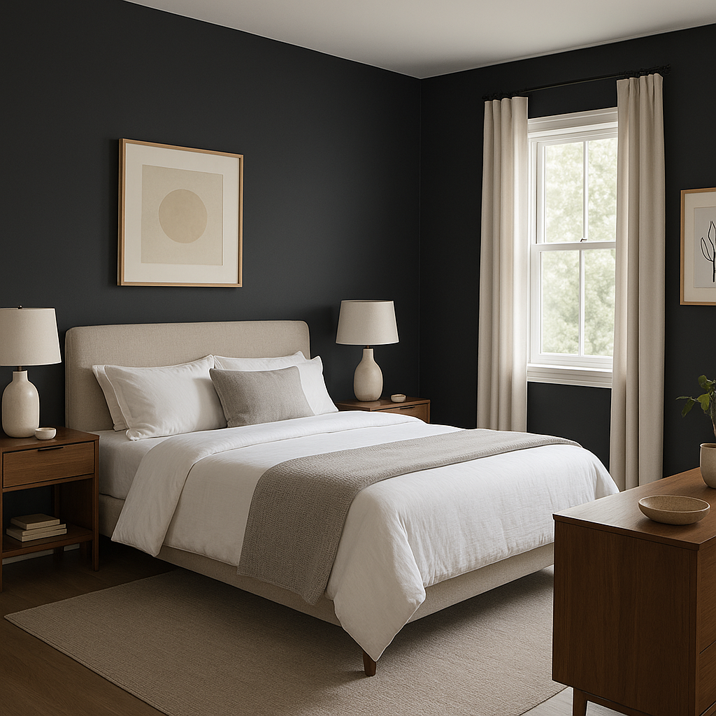
Midnight is a true dark charcoal with subtle blue undertones, giving it a cool and refined edge. These undertones make it particularly appealing for spaces that need a touch of modernity without the starkness of pure black. The blue undertones help create a sense of calm and serenity, making Midnight an excellent choice for bedrooms, living areas, or even home offices.
The sophisticated balance of its undertones allows it to shift slightly depending on the lighting. In bright, natural light, Midnight appears more subdued and smoky, while in dim or artificial lighting, its depth and richness truly shine, creating a moody and atmospheric vibe.
Benjamin Moore Midnight pairs beautifully with a range of complementary and contrasting hues, allowing for endless design possibilities. Here are some recommended coordinating colors:
Midnight is a perfect choice for an accent wall in living rooms, dining spaces, or bedrooms. Its bold presence draws the eye and creates a focal point, making it ideal for spaces where you want a touch of drama without overwhelming the room. Pair it with lighter, neutral walls to achieve a balanced and inviting ambiance.
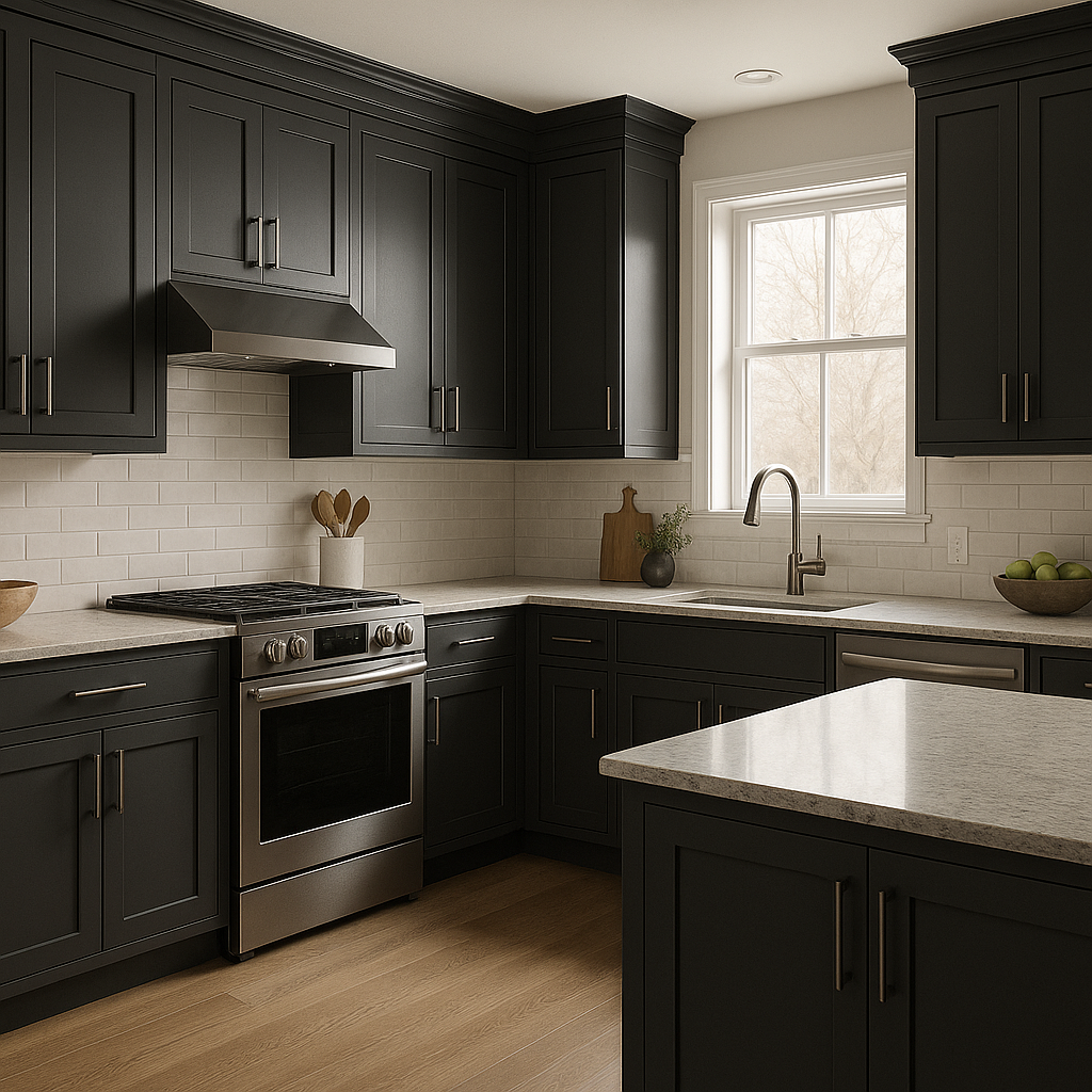
Dark, moody cabinetry painted in Midnight can elevate kitchens, bathrooms, or built-in storage units, adding a contemporary and luxurious feel. Pair it with brushed brass or matte black hardware for a polished and stylish look.
For a truly unique design, consider using Midnight on a ceiling. It can create a cocooning effect in rooms like libraries, home theaters, or powder rooms, adding depth and sophistication to the space.
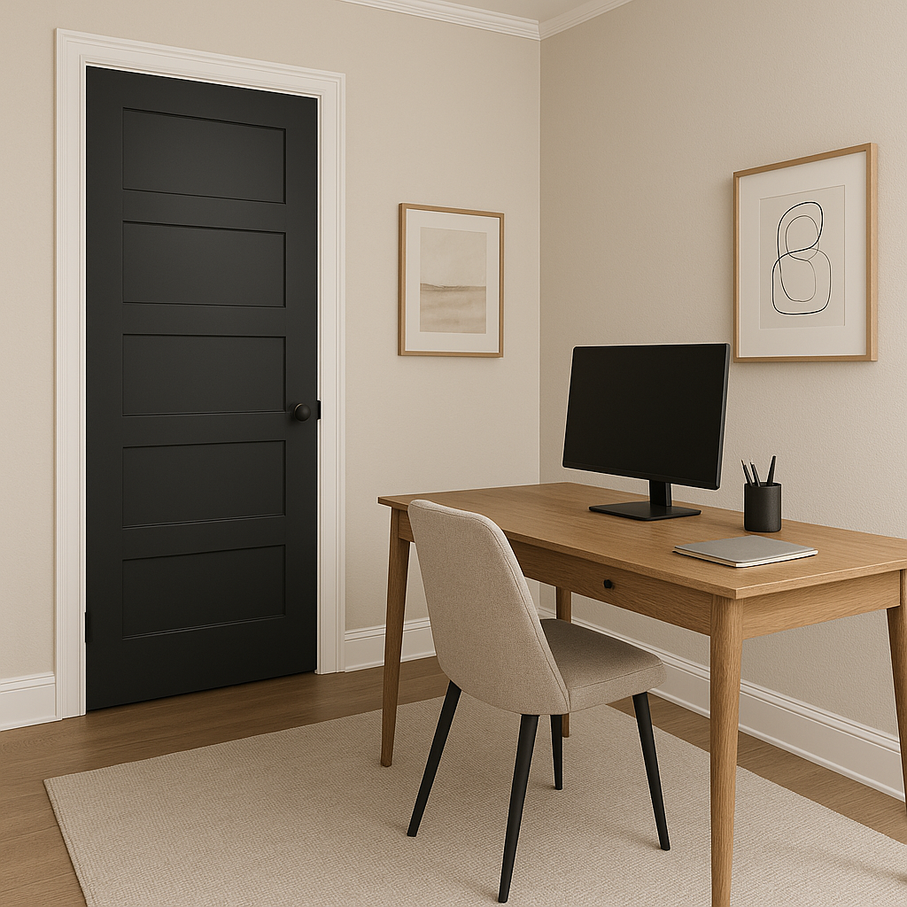
Midnight is equally stunning for exterior use. Consider it for front doors, shutters, or trim to make a bold statement. Its deep hue contrasts beautifully with lighter siding colors or natural stone finishes, offering curb appeal that feels refined and timeless.
When using Benjamin Moore Midnight, proper lighting is key. Its deep, saturated color can shift dramatically depending on light sources. Incorporate layers of lighting, such as sconces, chandeliers, or table lamps, to bring out its richness and provide a balanced glow.
For smaller spaces, use Midnight sparingly to avoid creating a sense of enclosure. Pair it with light, airy colors and reflective surfaces to maintain balance and openness. In larger rooms, its depth can be fully embraced, making the space feel grounded and cohesive.
Benjamin Moore Midnight (2129-10) is a color that commands attention while delivering understated elegance. Whether used as a bold accent or a grounding base, its versatility and timeless appeal make it a favorite among designers and homeowners alike.
View Colors Only by Brand (No Imagery):
Sherwin-Williams
|
Benjamin-Moore
|
Behr
|
Valspar
Live on the Eastern Slope of Colorado and looking for a local painting professional, check out all our painting services and reach out for a free estimate.
Copyright © 2026 : Wild Fox Painting Inc. : 12435 Mead Way, Littleton, CO 80125


