Benjamin Moore Normandy (2129-40) is a captivating medium-toned blue that exudes timeless sophistication and calm. Perfectly balanced, this shade combines a hint of gray undertones with a soft yet rich blue base, making it a versatile choice for a wide range of interior styles. Whether you're striving for a serene coastal vibe, a refined traditional aesthetic, or a modern transitional look, Normandy is a color that adapts seamlessly to various environments.
Normandy carries subtle gray undertones, giving it a muted and sophisticated appearance. These undertones help temper the blue, preventing it from feeling overly bright or saturated. This calming hue leans slightly cool, which makes it an excellent choice for spaces where you want to create a peaceful and grounded atmosphere. The gray undertones also make Normandy a highly adaptable shade, working beautifully with both warm and cool palettes.
When designing with Benjamin Moore Normandy, pairing it with complementary or contrasting hues can elevate your overall aesthetic. Here are some excellent coordinating colors:
Soft Neutrals: Pair Normandy with creamy whites like Benjamin Moore White Dove (OC-17) or Benjamin Moore Simply White (OC-117) for a fresh and airy look. These soft neutrals highlight Normandy’s depth without overpowering the space.
Warm Accents: Add warmth and contrast with golden hues such as Benjamin Moore Golden Straw (2152-50) or earthy tones like Benjamin Moore Lenox Tan (HC-44). These colors bring dimension and balance to Normandy’s cooler essence.
Deep Contrasts: For a more dramatic combination, consider pairing Normandy with rich, dark shades like Benjamin Moore Black Ink (2127-20) or Benjamin Moore Iron Mountain (2134-30). These deeper hues amplify Normandy’s elegance and create a bold, sophisticated look.
Complementary Blues: To maintain a cohesive palette, incorporate lighter blues such as Benjamin Moore Palladian Blue (HC-144) or darker blues like Benjamin Moore Hale Navy (HC-154) for a layered monochromatic design.
Normandy’s versatile nature makes it suitable for various interior applications, from bold accent walls to full-room coverage. It thrives in spaces where calmness, sophistication, and timeless appeal are key.
Normandy creates a tranquil and inviting atmosphere in communal spaces. Pair it with neutral furniture and natural textures like linen or rattan to enhance its relaxing vibe.
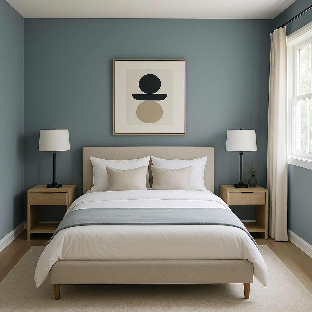
The soft, cool undertones of Normandy make it an ideal choice for bedrooms, promoting restfulness and serenity. Complement it with cozy bedding in soft grays, whites, or muted blues for a cohesive look.
Normandy works beautifully in bathrooms, offering a spa-like ambiance. Combine it with crisp white tiles, polished chrome fixtures, and natural wood accents for a fresh yet luxurious feel.
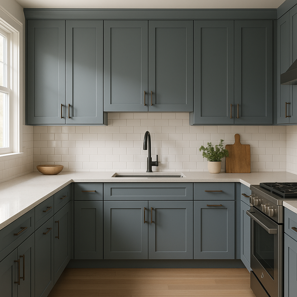
For a modern yet timeless kitchen or dining area, use Normandy on cabinetry or walls. Pair it with white countertops, brass hardware, or warm woods to achieve a balanced and stylish design.
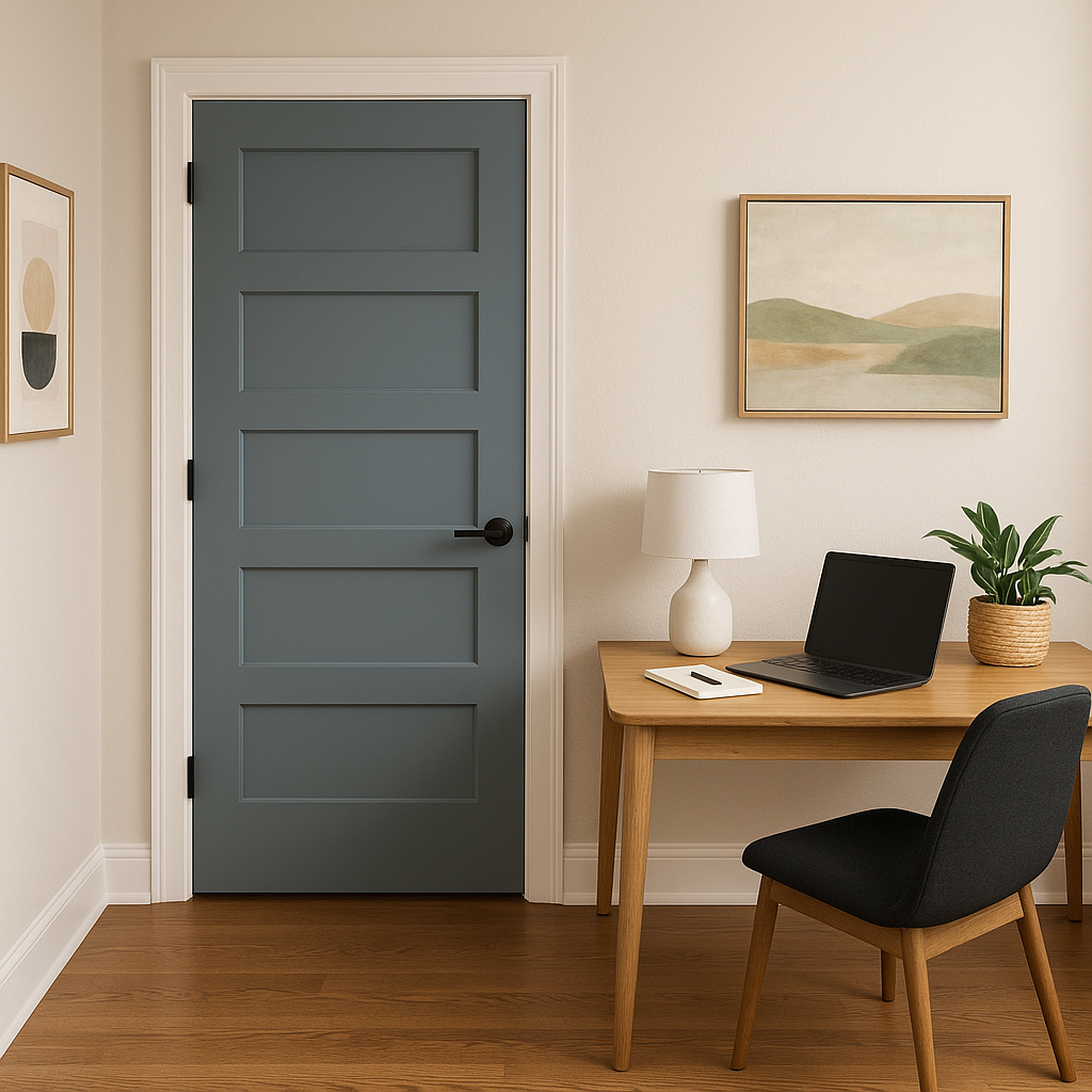
If you’re seeking a bold statement, use Normandy as an accent color on a feature wall. Its rich tone adds depth and character without overwhelming the space.
Benjamin Moore Normandy (2129-40) is a color that resonates with versatility and refinement. Its ability to adapt to a variety of design styles, its calming gray undertones, and its compatibility with a broad range of coordinating colors make it a standout choice for interior spaces. Whether you’re refreshing a single room or designing an entire home, Normandy brings a subtle sophistication that transforms any environment into a stylish sanctuary.
View Colors Only by Brand (No Imagery):
Sherwin-Williams
|
Benjamin-Moore
|
Behr
|
Valspar
Live on the Eastern Slope of Colorado and looking for a local painting professional, check out all our painting services and reach out for a free estimate.
Copyright © 2026 : Wild Fox Painting Inc. : 12435 Mead Way, Littleton, CO 80125


