Benjamin Moore Harp (213) is a sophisticated and serene shade of green that perfectly balances muted depth with a subtle vibrancy. This color evokes a sense of harmony and connection to nature, making it an excellent choice for interiors that aim to feel calm, inviting, and timeless. Its versatility and understated elegance make Harp a standout choice for both modern and traditional design schemes.
Harp is a soft, mid-tone green with cool undertones. It leans slightly gray, giving it a grounded and muted quality that prevents it from feeling overly bright or overpowering. At the same time, its cool green base brings a refreshing vibrancy to the space. This duality—between the earthy gray and the natural green—creates a balanced, soothing hue that adapts beautifully to a variety of lighting conditions.
In natural light, Harp's green tones are more pronounced, delivering an airy and organic vibe. Under artificial or dim lighting, the gray undertones emerge, giving the hue a soft, moody sophistication. This color is ideal for spaces where a subtle yet impactful color is desired.
Benjamin Moore Harp pairs effortlessly with a range of complementary shades, making it a versatile choice for any color palette. Here are some suggestions for coordinating colors:
Harp’s versatility allows it to shine in a variety of spaces and applications. Its calming presence makes it a natural fit for bedrooms, living rooms, and bathrooms, but its modern edge can also elevate kitchens, home offices, and even exterior spaces.
Harp works beautifully in living rooms, where it fosters a sense of comfort and tranquility. Pair it with soft furnishings in light neutrals, natural wood tones, and woven textures for a cozy, organic aesthetic. Add metallic accents like brushed gold or matte black to contrast its cool undertones.
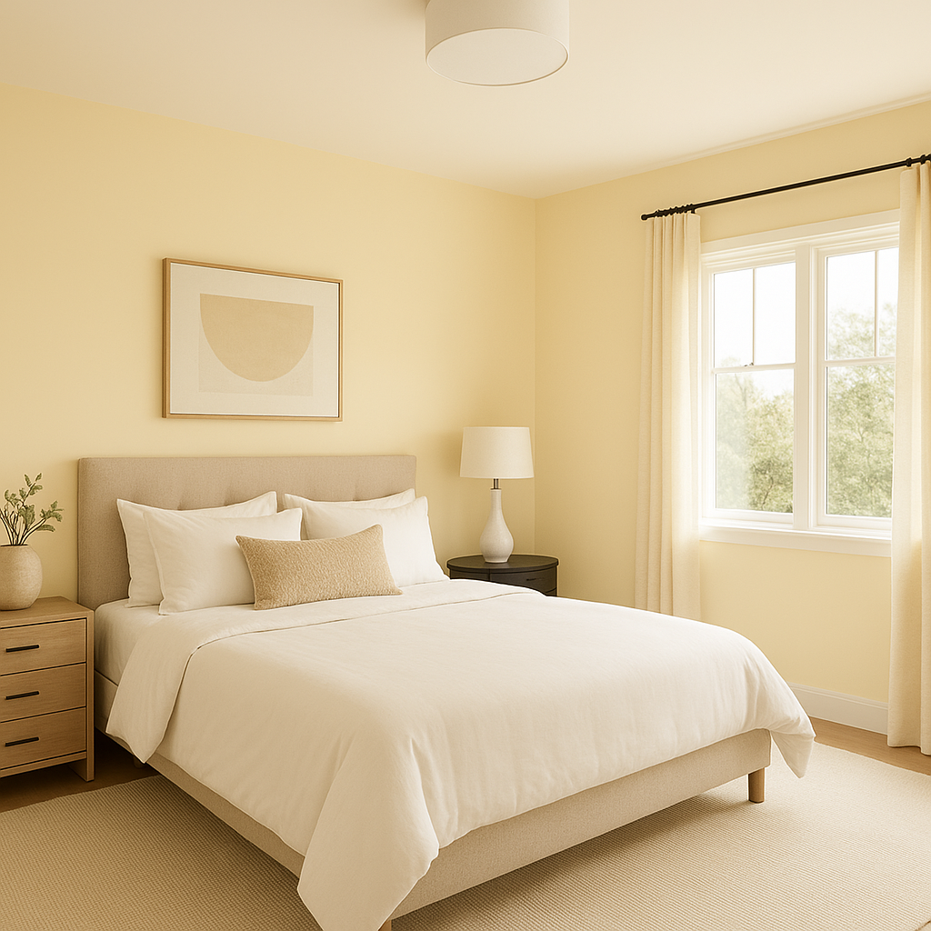
In bedrooms, Harp creates a restful retreat. Use it on walls, complemented by crisp white bedding and warm wood furniture, for a serene and balanced sanctuary.
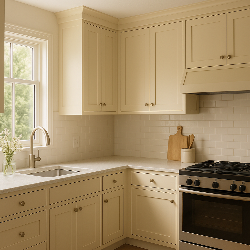
Harp can bring a fresh, modern feel to kitchens when used for cabinetry or an accent wall. Pair it with marble or quartz countertops and brass fixtures for a chic and timeless look.
For bathrooms, Harp’s cool, muted tones evoke a spa-like atmosphere. Pair it with glossy white subway tiles, natural stone, or muted metallics to amplify its soothing effect.
Harp is an excellent choice for exterior siding or shutters. Its organic tones blend seamlessly with natural surroundings, while its gray undertones add a touch of refinement. Pair it with a crisp white trim for a classic and elegant exterior.
Benjamin Moore Harp (213) is more than just a color—it’s a statement of timeless elegance and versatility. Whether you're creating a serene bedroom retreat, an inviting living space, or a polished kitchen, Harp’s muted green-gray tone provides the perfect backdrop for a variety of aesthetics. Its ability to adapt to different lighting conditions and coordinate with a broad spectrum of colors makes it an invaluable tool for interior designers and homeowners alike.
View Colors Only by Brand (No Imagery):
Sherwin-Williams
|
Benjamin-Moore
|
Behr
|
Valspar
Live on the Eastern Slope of Colorado and looking for a local painting professional, check out all our painting services and reach out for a free estimate.
Copyright © 2026 : Wild Fox Painting Inc. : 12435 Mead Way, Littleton, CO 80125


