Benjamin Moore Nimbus 2131-50 is a beautifully versatile paint color that strikes the perfect balance between warm and cool undertones. This soft, medium-depth gray is a go-to choice for creating a serene and sophisticated atmosphere, making it a favorite among interior designers and homeowners alike. Whether you’re updating a single room or transforming an entire home, Nimbus delivers understated elegance with its timeless appeal.
One of the standout features of Benjamin Moore Nimbus is its nuanced undertones. This gray leans slightly warm, with subtle hints of beige that prevent it from feeling too cold or sterile. At the same time, it maintains enough of a cool gray base to feel modern and grounded. These balanced undertones make Nimbus an adaptable option that works beautifully in a variety of lighting conditions.
Its chameleon-like ability to shift subtly depending on the environment makes it an exceptional choice for both contemporary and traditional interiors.
Benjamin Moore Nimbus pairs effortlessly with a range of complementary colors, allowing you to build cohesive palettes tailored to your design goals. Here are a few recommended options:
Whites and Off-Whites
Pair Nimbus with crisp whites like Benjamin Moore Chantilly Lace (OC-65) or soft off-whites like White Dove (OC-17) to achieve a clean, classic look. These combinations work well for trim, ceilings, or cabinetry, adding brightness and contrast to Nimbus's soft gray.
Deep Charcoals and Blacks
For a bold, modern edge, consider teaming Nimbus with darker shades such as Benjamin Moore Wrought Iron (2124-10) or Kendall Charcoal (HC-166). These dramatic pairings create depth and sophistication, perfect for accent walls or furniture.
Blues and Greens
Nimbus also complements soothing blues and greens, such as Palladian Blue (HC-144) or Soft Fern (2144-40). These combinations evoke a natural, serene aesthetic that’s ideal for bedrooms, bathrooms, or any space where relaxation is the goal.
Warm Neutrals
To enhance Nimbus's slight warmth, consider pairing it with beige or taupe tones like Edgecomb Gray (HC-173) or Revere Pewter (HC-172). This creates a cozy, inviting vibe that’s perfect for living rooms and entryways.
Thanks to its versatility and balanced undertones, Nimbus is a fantastic choice for a wide range of applications. Here are some ideas on where and how to use this stunning shade:
Living Rooms
Create a relaxed yet sophisticated living space by using Nimbus on the walls. Pair it with soft neutral furniture and metallic accents for a polished look.
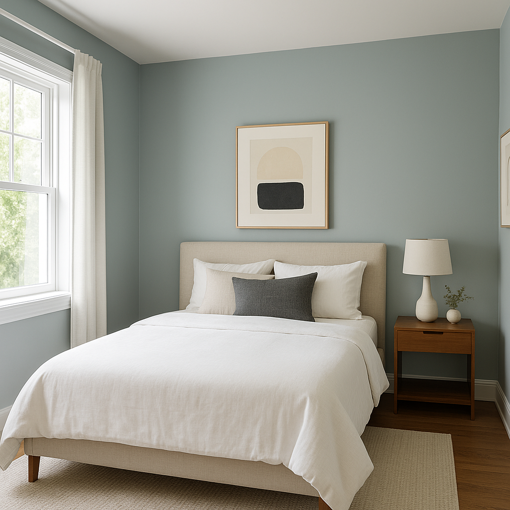
Bedrooms
Nimbus shines in bedrooms, where its calming undertones promote rest and relaxation. Pair it with plush textiles in complementary shades for a cozy retreat.
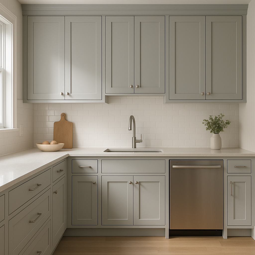
Kitchens and Dining Areas
In kitchens, Nimbus works particularly well on walls or cabinetry. Combine it with white subway tile, warm wood finishes, and stainless steel appliances for a timeless, upscale aesthetic.
Bathrooms
For a spa-like bathroom, use Nimbus alongside crisp whites and soft blues. Its subtle warmth ensures the space feels inviting without becoming overly stark.
Hallways and Entryways
As a medium-tone neutral, Nimbus is an excellent choice for high-traffic areas.
View Colors Only by Brand (No Imagery):
Sherwin-Williams
|
Benjamin-Moore
|
Behr
|
Valspar
Live on the Eastern Slope of Colorado and looking for a local painting professional, check out all our painting services and reach out for a free estimate.
Copyright © 2026 : Wild Fox Painting Inc. : 12435 Mead Way, Littleton, CO 80125


