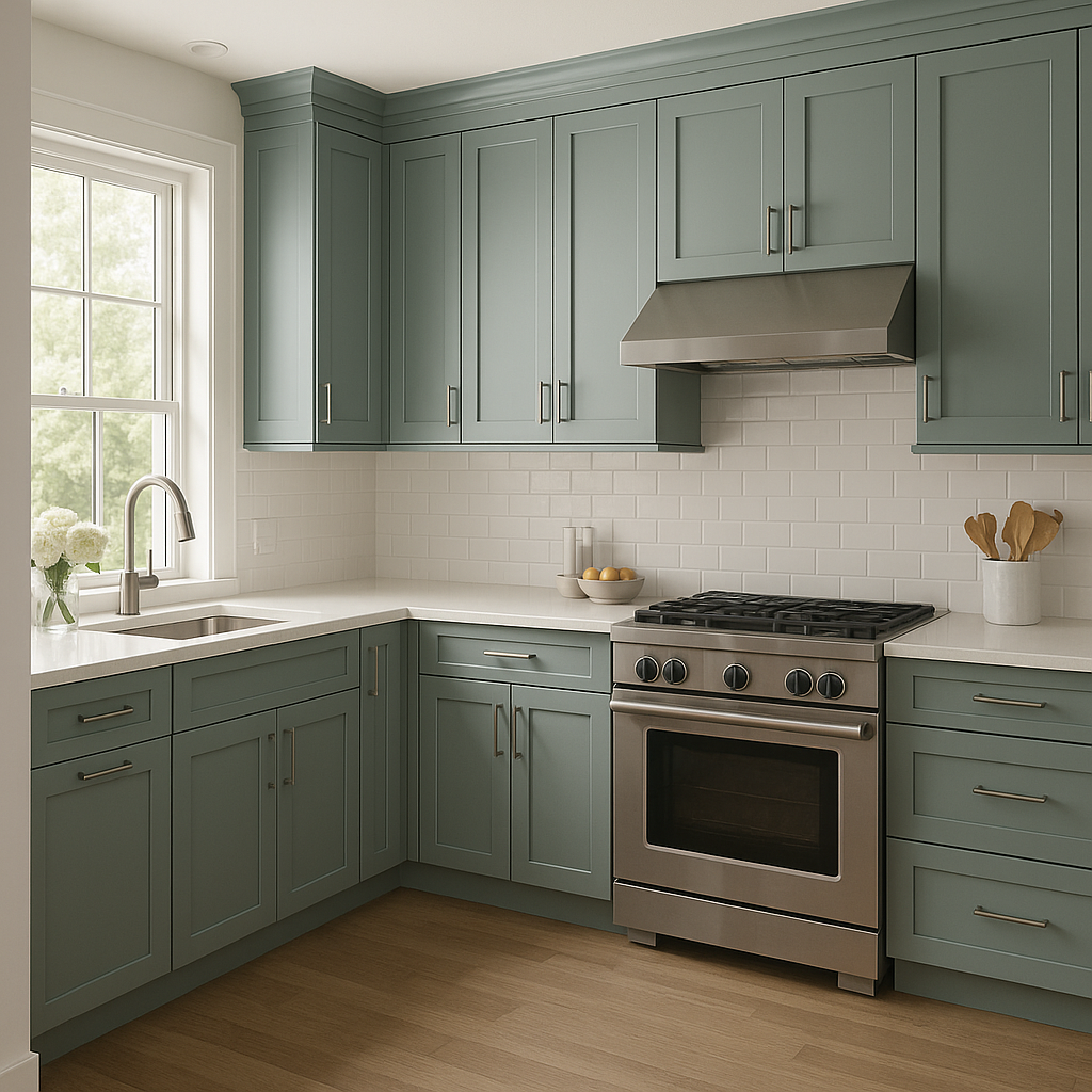
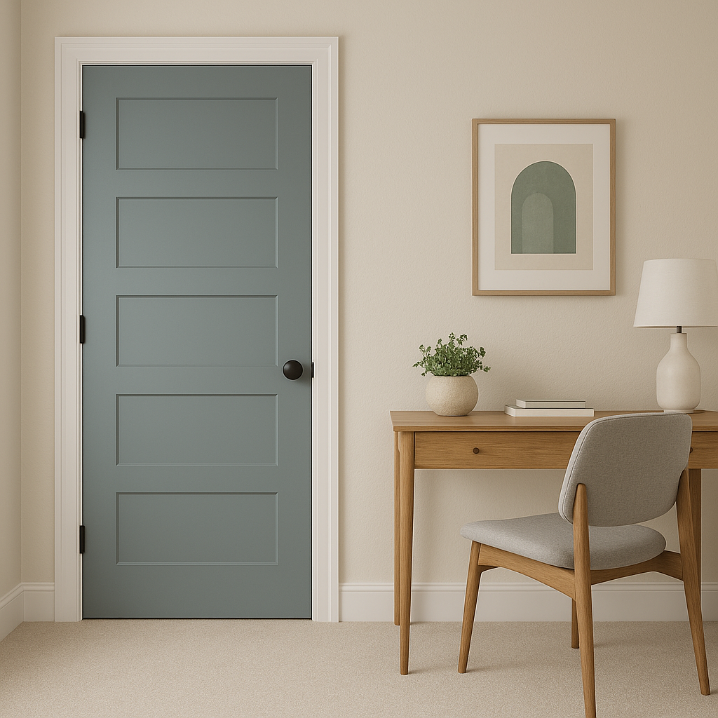
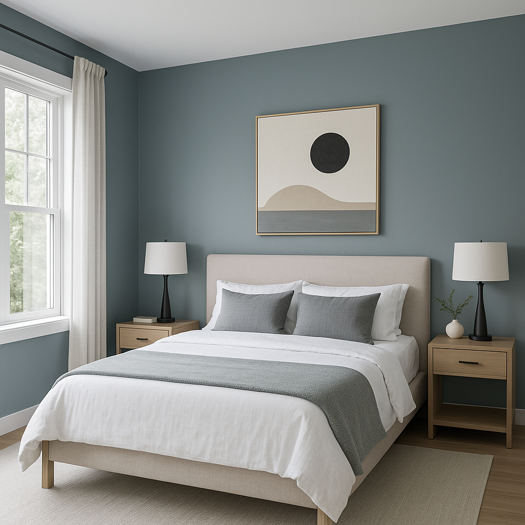
Benjamin Moore Province 2135-40 is a sophisticated, medium-tone gray-green that exudes a sense of calm, understated elegance. Its earthy and organic appeal makes it a versatile choice for various design styles, from modern and minimalist to traditional and rustic. This shade is part of Benjamin Moore’s classic palette, celebrated for its timeless quality and ability to harmonize with a wide range of environments.
One of the defining characteristics of Province 2135-40 is its subtle undertones. This color has a complex mix of green, gray, and a hint of blue, giving it a smoky and subdued appearance. The green undertone is dominant, lending depth and a natural feel, while the gray softens the hue, making it feel grounded and versatile. The ever-so-slight blue undertone emerges under certain lighting conditions, adding a cool, crisp edge. This blend of undertones allows Province to adapt beautifully to different lighting situations, making it an excellent choice for both well-lit and dimly lit spaces.
To create a cohesive and balanced color palette, pair Province 2135-40 with complementary and contrasting hues that enhance its natural beauty. Below are some suggestions for coordinating colors:
The versatility of Province 2135-40 makes it suitable for a variety of spaces and design applications:
As with any paint color, lighting plays a crucial role in how Province 2135-40 appears in your space. In natural daylight, the green undertones become more prominent, giving it a fresh and airy look. Under artificial or low lighting, the gray tones take center stage, resulting in a cozier, more subdued effect. Be sure to test the color in your space and observe it at different times of the day to ensure it meets your expectations.
View Colors Only by Brand (No Imagery):
Sherwin-Williams
|
Benjamin-Moore
|
Behr
|
Valspar
Live on the Eastern Slope of Colorado and looking for a local painting professional, check out all our painting services and reach out for a free estimate.
Copyright © 2026 : Wild Fox Painting Inc. : 12435 Mead Way, Littleton, CO 80125


