Benjamin Moore Harbor (2136-60) is a timeless and versatile paint color that evokes the calming essence of coastal living. This soft gray-green hue strikes a perfect balance between warmth and coolness, making it an ideal choice for creating tranquil and elegant spaces. Whether you're designing a serene bedroom retreat or a sophisticated living room, Harbor brings a sense of harmony and understated charm to any interior.
Harbor is a gray-green color with subtle blue undertones that give it a refreshing and soothing quality. The green base provides an organic, nature-inspired feel, while the blue undertones add a hint of cool sophistication. These undertones allow Harbor to shift in appearance depending on the lighting and surrounding decor, making it a dynamic and layered choice for your walls. In natural light, Harbor leans more toward its green side, while in artificial or dim lighting, its gray-blue undertones may become more pronounced.
Benjamin Moore Harbor pairs beautifully with a range of coordinating colors, allowing you to create cohesive and thoughtfully designed spaces. Consider these complementary shades to enhance its serene appeal:
Neutral Pairings: For a classic and balanced look, pair Harbor with warm neutrals like White Dove (OC-17) or cool whites like Chantilly Lace (OC-65). These crisp whites contrast beautifully with Harbor’s muted tones, creating a clean and sophisticated palette.
Deep Accents: Bring depth and drama to your space by incorporating rich, moody tones like Kendall Charcoal (HC-166) or Hale Navy (HC-154). These darker hues create a striking contrast with Harbor’s softness, perfect for accent walls, cabinetry, or furniture.
Earthy Complements: Enhance Harbor’s natural green undertones with earthy shades like Richmond Green (HC-118) or Fernwood Green (2145-40). These colors amplify the organic feel of Harbor, making them ideal for spaces inspired by nature.
Soft Pastels: For a light and airy aesthetic, pair Harbor with gentle pastels like Soft Pink (2006-70) or Seafoam (2123-60). These playful tones add a touch of whimsy and charm to Harbor’s understated elegance.
Benjamin Moore Harbor is an incredibly adaptable color that works beautifully in various interior applications. Whether you’re designing a contemporary, coastal, or traditional space, Harbor can serve as a versatile backdrop or a statement hue.
Transform your living room into a serene haven by using Harbor as the main wall color. Pair it with plush furniture in neutral tones and natural wood finishes for a cozy yet refined vibe. Add pops of color with cushions or artwork to personalize the space.
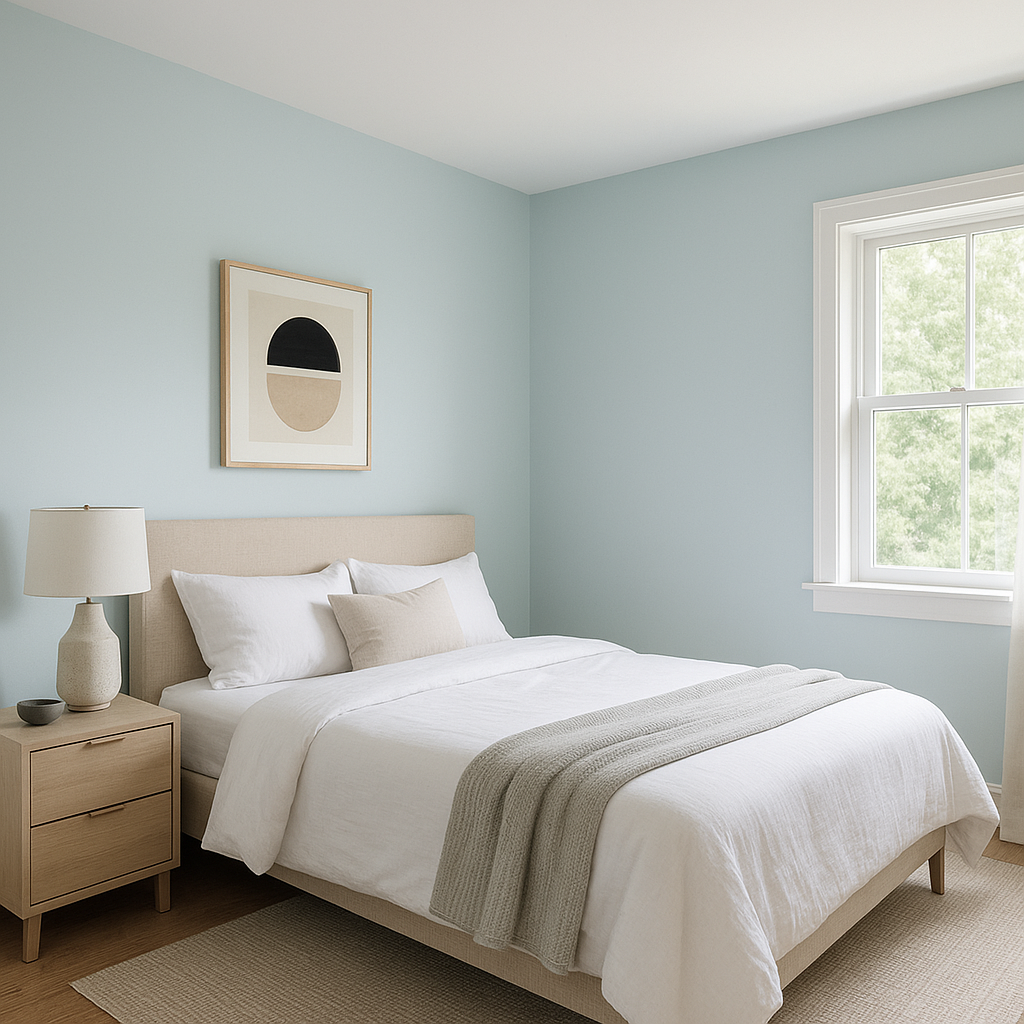
Harbor is a fantastic choice for bedrooms, where its calming undertones promote relaxation and restfulness. Combine it with crisp white bedding and soft textiles for a dreamy retreat that feels fresh and rejuvenating.
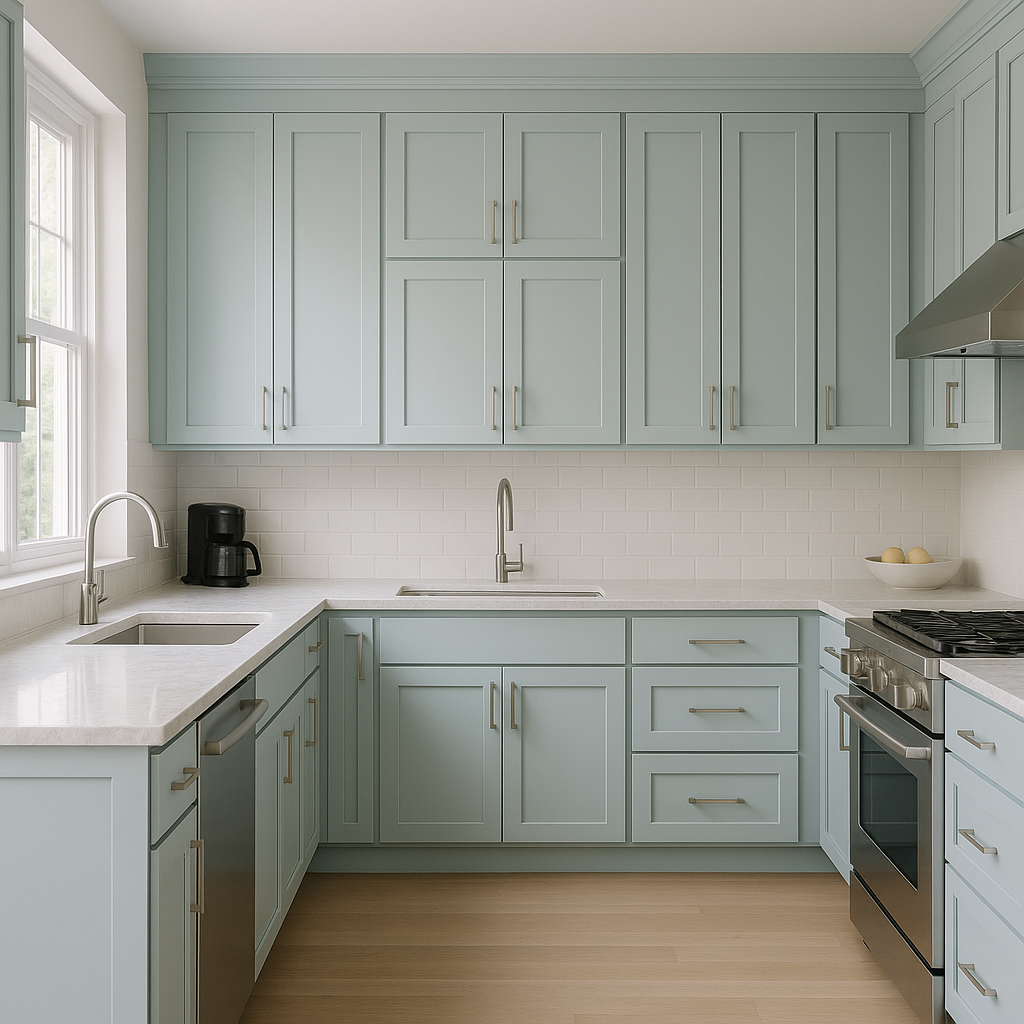
For a modern yet inviting kitchen, use Harbor on cabinetry or as an accent wall. It works beautifully with brushed nickel hardware, marble countertops, and subway tiles, creating a clean and sophisticated look.
Bring spa-like tranquility to your bathroom with Harbor’s soothing tones. Pair it with white or gray tiles and soft lighting for a space that feels serene and luxurious.
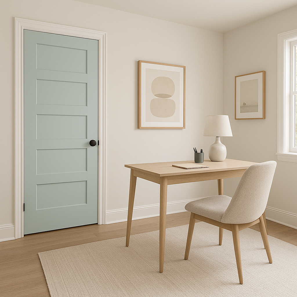
Harbor’s muted elegance is ideal for home offices, offering both focus and relaxation. Pair it with sleek furniture and metallic accents for a polished workspace that inspires productivity.
As with any paint color, lighting plays a significant role in how Benjamin Moore Harbor will appear in your space. In rooms with ample natural light, Harbor’s green undertones will shine, creating a fresh and airy feel. In spaces with limited natural light, its gray-blue undertones may take center stage, lending a more subdued and sophisticated vibe.
Consider testing Harbor with paint swatches or samples in your space to see how it interacts with your lighting and decor before committing fully.
Benjamin Moore Harbor (2136-60) is a versatile, elegant, and calming color that suits a wide range of interior styles. Its unique blend of gray, green, and blue undertones makes it a dynamic choice for creating spaces that feel effortlessly timeless and harmonious. Whether used as a main wall color or as a subtle accent, Harbor is sure to elevate the look and feel of your home.
View Colors Only by Brand (No Imagery):
Sherwin-Williams
|
Benjamin-Moore
|
Behr
|
Valspar
Live on the Eastern Slope of Colorado and looking for a local painting professional, check out all our painting services and reach out for a free estimate.
Copyright © 2026 : Wild Fox Painting Inc. : 12435 Mead Way, Littleton, CO 80125


