Benjamin Moore Fatigue (2140-10) is a deep, earthy green that exudes sophistication and strength. With its rich, muted tone, this color brings a sense of calm and grounding to any space, making it a versatile choice for interiors seeking a balance between boldness and subtlety. Whether used as an accent or a primary wall color, Fatigue offers a timeless aesthetic that works beautifully across various design styles—from industrial to rustic to modern.
Fatigue is rooted in earthy green tones, but its complexity lies in its subtle undertones. It carries hints of warm olive and cool forest green, which give it a dynamic edge. These undertones make it adaptable in different lighting conditions: in bright natural light, it may lean more vibrant and fresh, while in dimmer settings, it deepens into a moodier and more dramatic shade. This duality makes Fatigue especially appealing for spaces that want to evoke both serenity and strength.
To maximize the beauty of Benjamin Moore Fatigue, consider pairing it with complementary colors that enhance its depth while creating a cohesive palette. Here are some suggestions:
Fatigue’s bold yet calming presence makes it a versatile choice across various spaces and design applications. Here are some ideas for incorporating this color into your home or workspace:
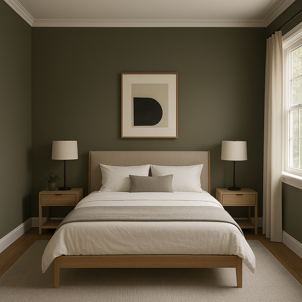
Fatigue is an excellent choice for an accent wall in living rooms, bedrooms, or home offices. Its rich tone adds depth and character without overwhelming the space.
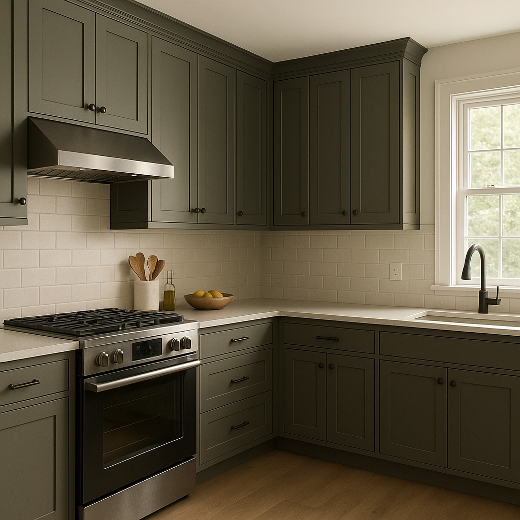
For kitchens or bathrooms, Fatigue can be used on cabinetry to create a refined yet grounded look. Pair it with white marble countertops or neutral tiles for a stunning contrast.
Create an intimate and inviting dining room atmosphere by painting the walls in Fatigue. Pair it with warm wood furniture and soft lighting to enhance the space’s cozy appeal.
Set the tone for your home by using Fatigue in entryways or mudrooms. Its bold hue creates a sophisticated first impression while remaining practical for high-traffic areas.
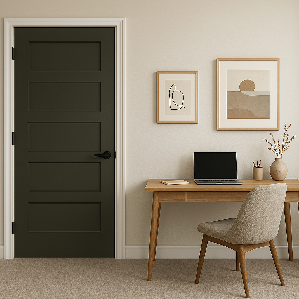
If painting walls feels too bold, consider using Fatigue on furniture pieces like a dresser, bookcase, or side table. It can also be incorporated into textiles, such as curtains, throw pillows, or rugs, for a subtle nod to this captivating hue.
As with any deep color, lighting plays a significant role in how Fatigue appears in your space. In rooms with ample natural light, its earthy undertones will shine through, creating a more vibrant and lively appearance. In spaces with low or artificial lighting, it transforms into a darker, moodier shade that feels cozy and dramatic. To ensure the perfect look, test Fatigue in your space under various lighting conditions before committing.
Benjamin Moore Fatigue (2140-10) is a powerful color that bridges the gap between boldness and tranquility. Its earthy undertones, adaptability, and ability to pair seamlessly with a range of coordinating shades make it a go-to choice for anyone seeking to create a grounded yet stylish interior. Whether you're looking to make a statement or create a serene retreat, Fatigue delivers timeless appeal with its rich, sophisticated charm.
View Colors Only by Brand (No Imagery):
Sherwin-Williams
|
Benjamin-Moore
|
Behr
|
Valspar
Live on the Eastern Slope of Colorado and looking for a local painting professional, check out all our painting services and reach out for a free estimate.
Copyright © 2026 : Wild Fox Painting Inc. : 12435 Mead Way, Littleton, CO 80125


