Benjamin Moore Moonshine (2140-60) is a refined, soft gray paint color that has become a favorite among interior designers for its understated elegance and adaptability. Known for its ability to create a calming and harmonious atmosphere, Moonshine is a color that beautifully balances modern sophistication with timeless charm. Whether you’re refreshing a living room, designing a chic bedroom, or updating a kitchen, Moonshine is versatile enough to complement a wide range of aesthetics.
One of the defining characteristics of Moonshine is its subtle undertones. While it may appear as a simple gray at first glance, it has delicate green and blue undertones that give it depth and personality. These cool undertones help Moonshine exude a tranquil and airy vibe, making it an excellent choice for spaces that need a touch of serenity. It’s worth noting that the undertones can shift slightly depending on lighting conditions. In natural light, Moonshine leans toward a soft gray with a hint of green, while under artificial lighting, the blue undertones may become more prominent.
Moonshine’s versatility makes it easy to pair with a variety of coordinating colors. Here are some suggestions to create cohesive and stunning color palettes for your space:
These coordinating colors allow you to tailor Moonshine to different design styles, whether you’re aiming for contemporary, traditional, or coastal aesthetics.
Moonshine is a fantastic choice for rooms where you want to invite natural light and create a sense of spaciousness. Here are some potential uses:
Moonshine serves as a perfect backdrop for living rooms, especially when paired with light-colored furniture and natural wood accents. Its understated elegance makes it ideal for maintaining a clean and uncluttered look without feeling cold or sterile.
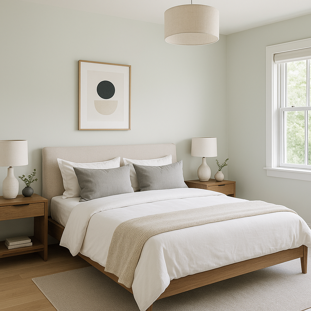
The tranquil undertones of Moonshine make it a great choice for bedrooms. Pair it with soft linens in whites, creams, or muted blues for a restful retreat that promotes relaxation.
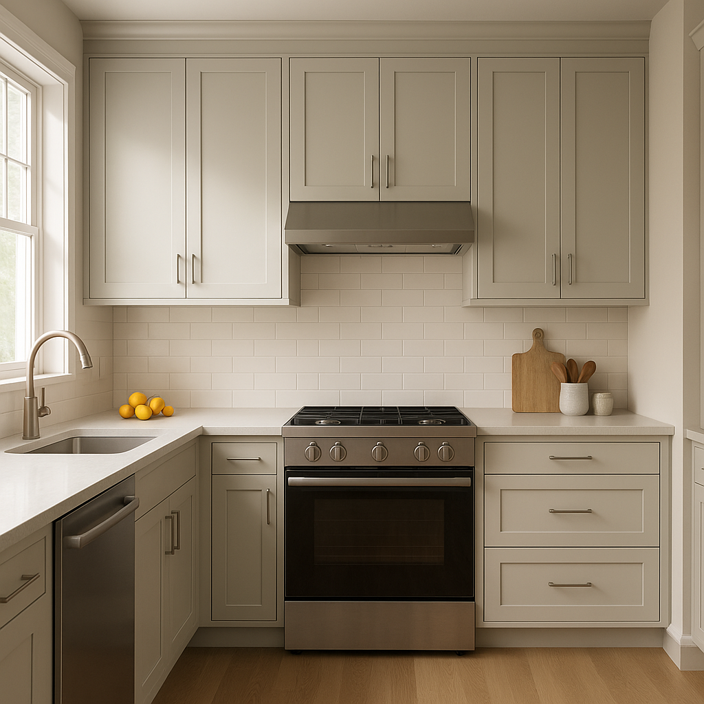
For kitchens, Moonshine can be used on walls and cabinetry alike. It works beautifully with stainless steel appliances and white subway tile backsplashes, creating a fresh and modern culinary space.
Moonshine’s cool, calming tones make it an excellent choice for bathrooms. Pair it with polished chrome fixtures and white accents for a spa-like atmosphere.
Hallways painted in Moonshine feel bright and inviting, especially when paired with coordinating trim colors like White Dove. Its light gray tone helps reflect natural light, making narrow spaces feel more open.
Lighting greatly influences how Moonshine appears in a space. In rooms with ample natural daylight, Moonshine feels light and airy, with its green undertones becoming more pronounced. In spaces with warm artificial lighting, its blue undertones may take center stage, offering a cooler ambiance. To ensure Moonshine works harmoniously in your space, test it in different lighting conditions before committing.
Moonshine’s versatility, subtle undertones, and ability to coordinate effortlessly with other colors make it an exceptional choice for any home. Its timeless appeal ensures that it won’t go out of style, and its soothing presence provides a perfect backdrop for both minimalist and layered designs.
Whether you’re looking to brighten a space, create a serene retreat, or add just the right touch of modern neutrality, Benjamin Moore Moonshine (2140-60) is a color that delivers elegance and adaptability in equal measure.
View Colors Only by Brand (No Imagery):
Sherwin-Williams
|
Benjamin-Moore
|
Behr
|
Valspar
Live on the Eastern Slope of Colorado and looking for a local painting professional, check out all our painting services and reach out for a free estimate.
Copyright © 2026 : Wild Fox Painting Inc. : 12435 Mead Way, Littleton, CO 80125


