Benjamin Moore Horizon (2141-50) is a soft, understated gray that effortlessly transforms any space with its calming and sophisticated presence. Known for its versatility, this shade is a favorite among interior designers and homeowners alike, thanks to its ability to adapt to various design styles and color palettes. Whether you're aiming for a minimalist modern aesthetic or a timeless traditional look, Horizon is a subtle yet impactful choice.
Horizon (2141-50) is a light gray with cool undertones that lean toward blue. Its faint blue hint brings a touch of freshness and tranquility, making it an excellent choice for spaces where relaxation and serenity are key. However, the undertones are soft enough that Horizon remains neutral, avoiding the overly icy or sterile feel that cooler grays can sometimes evoke.
This color also has a whisper of green in certain lighting conditions, adding depth and complexity. This makes it particularly dynamic, as it shifts slightly depending on the time of day and the quality of light in the room. Whether bathed in natural sunlight or illuminated by artificial lighting, Horizon maintains its understated elegance.
Benjamin Moore Horizon is incredibly versatile when it comes to coordinating colors. Its neutral base and cool undertones make it a great companion to both warm and cool hues. Here are a few recommended pairings:
Benjamin Moore Horizon is a versatile paint color that works beautifully in a variety of spaces. Its light, neutral quality makes it an excellent choice for creating a calm and welcoming environment. Here are some ideas for incorporating Horizon into your home:
Horizon is perfect for living rooms where you want to strike a balance between sophistication and comfort. Pair it with plush furniture, soft area rugs, and metallic accents to create an elegant yet inviting space. Its neutral tone allows you to play with texture and color in décor pieces without overwhelming the room.
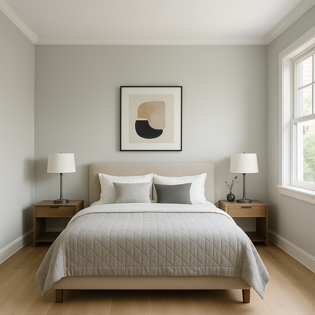
In bedrooms, Horizon sets the stage for tranquility and relaxation. Its cool undertones promote a restful atmosphere, making it ideal for a peaceful retreat. Layer it with cozy bedding in soft whites, pale blues, or warm taupes to complete the look.
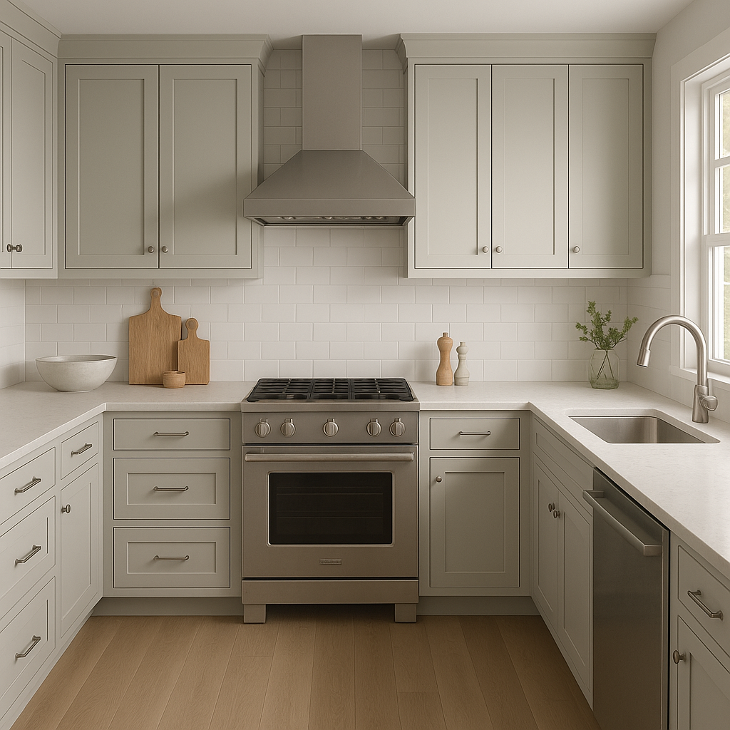
For kitchens, Horizon offers a clean and contemporary aesthetic. Use it on walls or cabinetry paired with white countertops and stainless steel appliances for a crisp, modern feel. Add natural wood finishes or warm metallic fixtures to soften the overall look.
Horizon shines in bathrooms thanks to its fresh and airy vibe. It pairs beautifully with white subway tile, polished chrome fixtures, and marble accents for a spa-like atmosphere. Its subtle undertones work well with both natural and artificial lighting, ensuring a serene feel throughout the day.
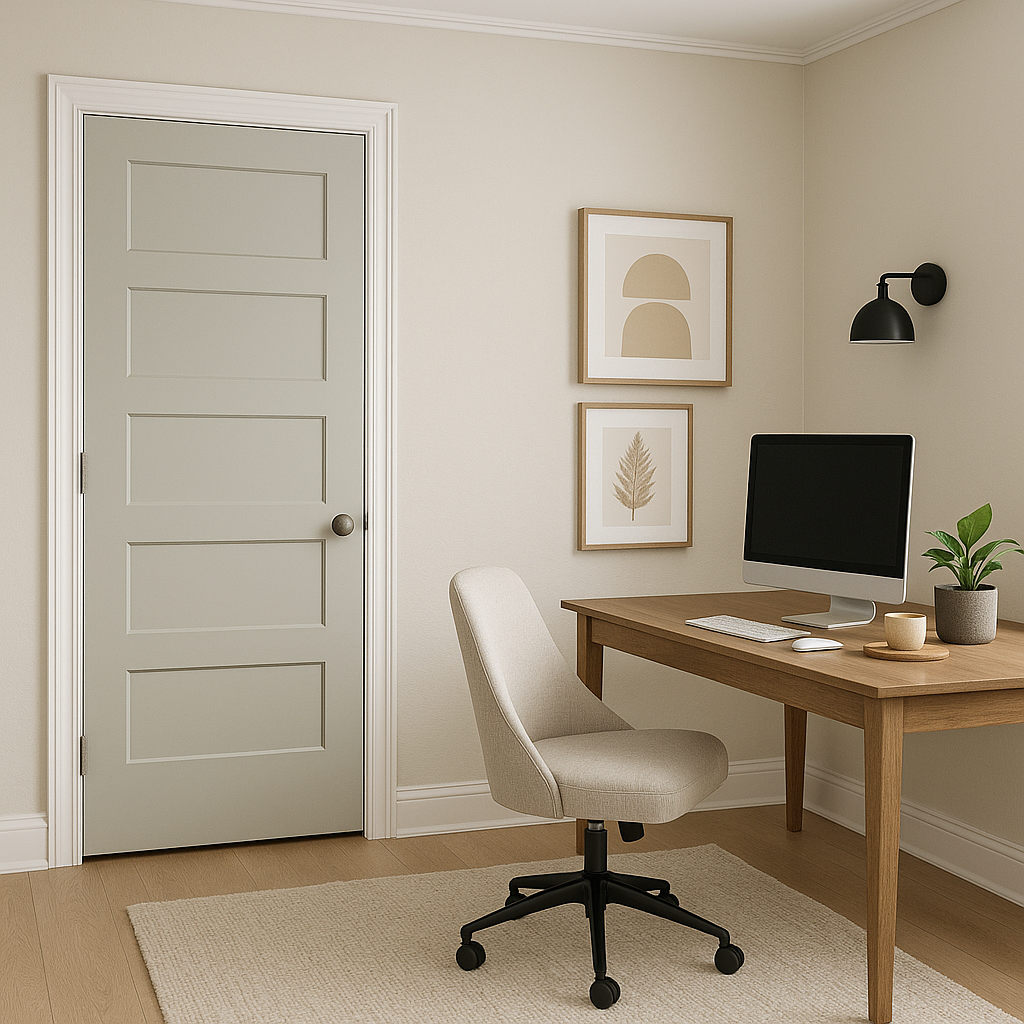
As a light neutral, Horizon is ideal for hallways and entryways. It creates an open and welcoming ambiance while remaining unobtrusive, allowing you to add bold artwork or statement furniture pieces without clashing.
Horizon (2141-50) is the epitome of understated elegance. Its soft gray tone, cool undertones, and ability to harmonize with a wide range of colors make it a go-to choice for both large-scale interiors and smaller accent spaces. Whether you're redesigning your entire home or looking for a subtle refresh, Horizon offers a timeless, versatile solution that will elevate any room with ease.
View Colors Only by Brand (No Imagery):
Sherwin-Williams
|
Benjamin-Moore
|
Behr
|
Valspar
Live on the Eastern Slope of Colorado and looking for a local painting professional, check out all our painting services and reach out for a free estimate.
Copyright © 2026 : Wild Fox Painting Inc. : 12435 Mead Way, Littleton, CO 80125


