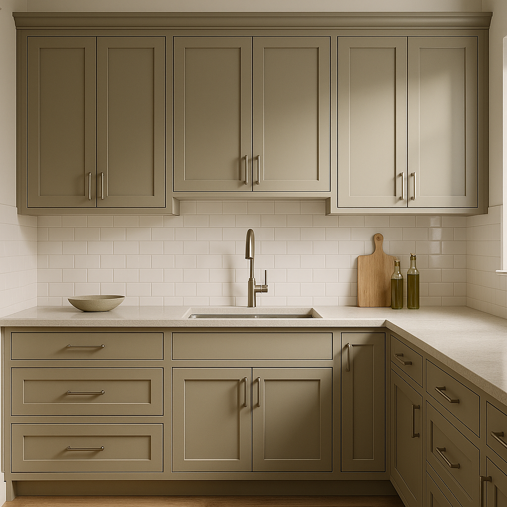
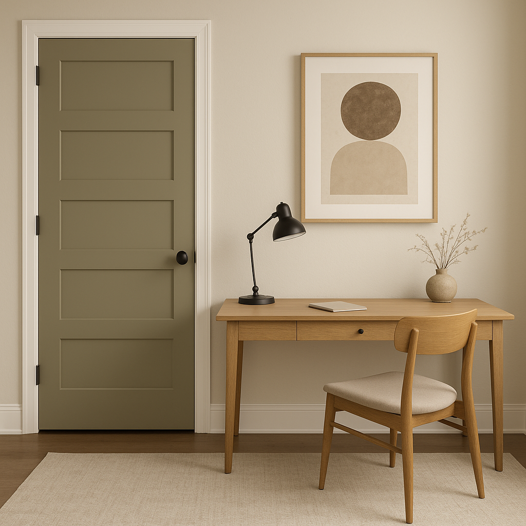
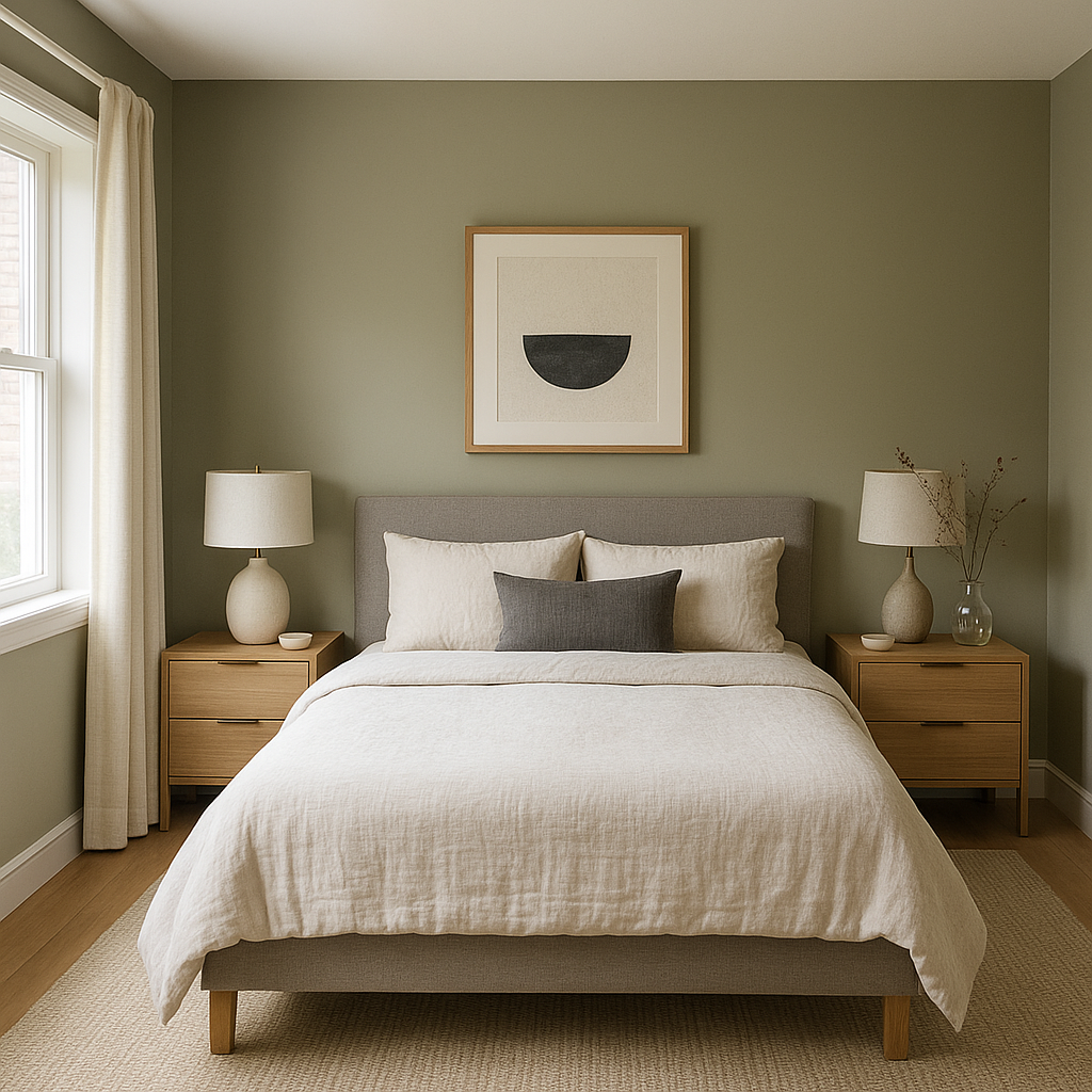
Benjamin Moore Dry (2142-40) is a refined, mid-tone neutral that effortlessly bridges the gap between warm and cool, making it a versatile choice for a variety of interior styles. With its understated elegance and balanced composition, this color evokes a sense of calm and sophistication, making it ideal for spaces where you want to cultivate serenity or subtle drama without overpowering the design.
Dry is a taupe-gray hybrid with soft, earthy undertones that lean slightly warm. It carries hints of beige and a touch of greige, giving it the ability to adapt beautifully in different lighting conditions. In spaces with ample natural light, the warmth of this neutral shines through, while in darker rooms, it leans toward a richer, muted gray. The subtle complexity of its undertones ensures it pairs effortlessly with other colors, whether you're looking to create contrast or harmonize with surrounding hues.
Benjamin Moore Dry (2142-40) is incredibly versatile and can be paired with a wide range of colors to suit different aesthetics. Here are some coordinating colors for various design approaches:
These combinations ensure that Benjamin Moore Dry can be a foundational backdrop or an integral part of a more dynamic palette.
Benjamin Moore Dry (2142-40) is a masterful neutral that works beautifully across a variety of spaces and design styles. Its adaptability makes it perfect for:
The appearance of Benjamin Moore Dry (2142-40) can shift depending on the lighting in your space. In bright, well-lit areas, its warmer beige undertones will be more prominent, while in spaces with dim or artificial lighting, its grayish qualities will take center stage. Testing this color in your home at different times of day is recommended to ensure it complements your overall design intent.
Benjamin Moore Dry is more than just a neutral—it’s a color with depth and sophistication that can anchor your design while allowing other elements to shine. Whether you're aiming for a modern, minimalist aesthetic or a cozy, traditional vibe, Dry adapts seamlessly, making it a trusted choice for interior designers and homeowners alike. Its versatility, timeless appeal, and ability to harmonize with a wide range of colors make it a standout neutral that elevates any space.
View Colors Only by Brand (No Imagery):
Sherwin-Williams
|
Benjamin-Moore
|
Behr
|
Valspar
Live on the Eastern Slope of Colorado and looking for a local painting professional, check out all our painting services and reach out for a free estimate.
Copyright © 2026 : Wild Fox Painting Inc. : 12435 Mead Way, Littleton, CO 80125


