Benjamin Moore Pale (2146-40) is a serene, versatile shade that effortlessly combines sophistication with a touch of nature-inspired tranquility. This subdued green is perfect for creating a calming atmosphere while adding understated color to your space. Its muted tone makes it particularly appealing for both modern and traditional interiors, offering flexibility and timeless charm.
Pale (2146-40) has soft gray undertones that lend it an earthy elegance, making it a more sophisticated alternative to brighter greens. These undertones ensure that the color maintains a balanced, neutral quality, which allows it to pair beautifully with a wide range of palettes. The subtle gray also tempers the green, preventing it from feeling overly vibrant, making it ideal for spaces where relaxation and serenity are key.
This shade has a slightly cool quality, which means it works exceptionally well in rooms with ample natural light. However, it can also adapt gracefully to artificial lighting, appearing more neutral and grounding in dimmer spaces.
Benjamin Moore Pale (2146-40) pairs beautifully with other colors, thanks to its subdued nature. Some excellent coordinating colors include:
For a nature-inspired palette, pair Pale with warm wood tones, soft beige, or sandy hues. If you’re aiming for something more modern, accentuate it with crisp whites, matte blacks, or metallic finishes like brass or brushed nickel.
Thanks to its versatility, Pale (2146-40) can be used in a variety of settings, from cozy residential spaces to chic commercial interiors. Here are some design ideas to make the most of this elegant color:
Create a peaceful gathering space by using Pale on the walls. Pair it with plush furniture in neutral tones like taupe or gray, accented with natural textures such as linen curtains or woven rugs. Add metallic touches like brass lamps or decorative pieces to elevate the look.
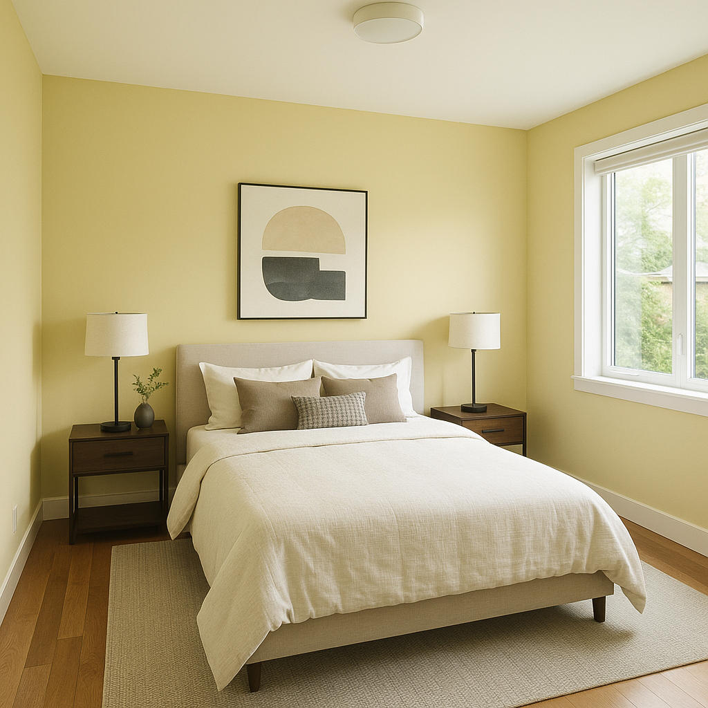
Pale is an excellent choice for bedrooms, where its soothing effect can help foster relaxation. Combine it with soft whites for bedding and curtains, and introduce deeper greens or charcoal grays for accent pieces like throw pillows or furniture.
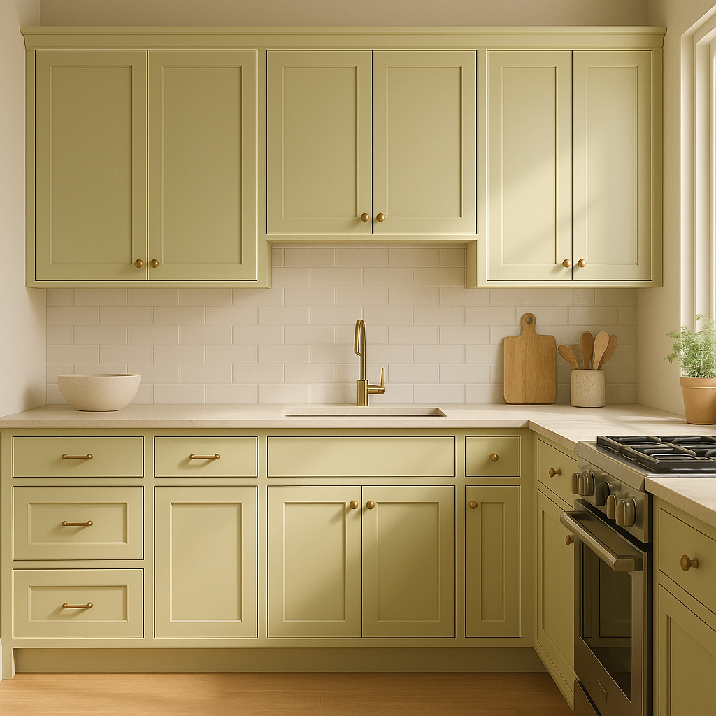
In kitchens, Pale can work beautifully on cabinetry or as a wall color. Pair it with white quartz countertops and brushed metallic hardware for a clean, modern aesthetic. Alternatively, combine it with warm wood tones for a rustic, inviting vibe.
For bathrooms, Pale evokes a spa-like atmosphere. Use it on walls and pair it with crisp white tiles and silver or chrome fixtures. Add greenery or natural wood accents to complete the serene look.
Pale’s calming presence makes it ideal for home offices. Use it as a wall color to foster focus and productivity. Pair it with dark wood furniture and muted accents for a professional yet welcoming space.
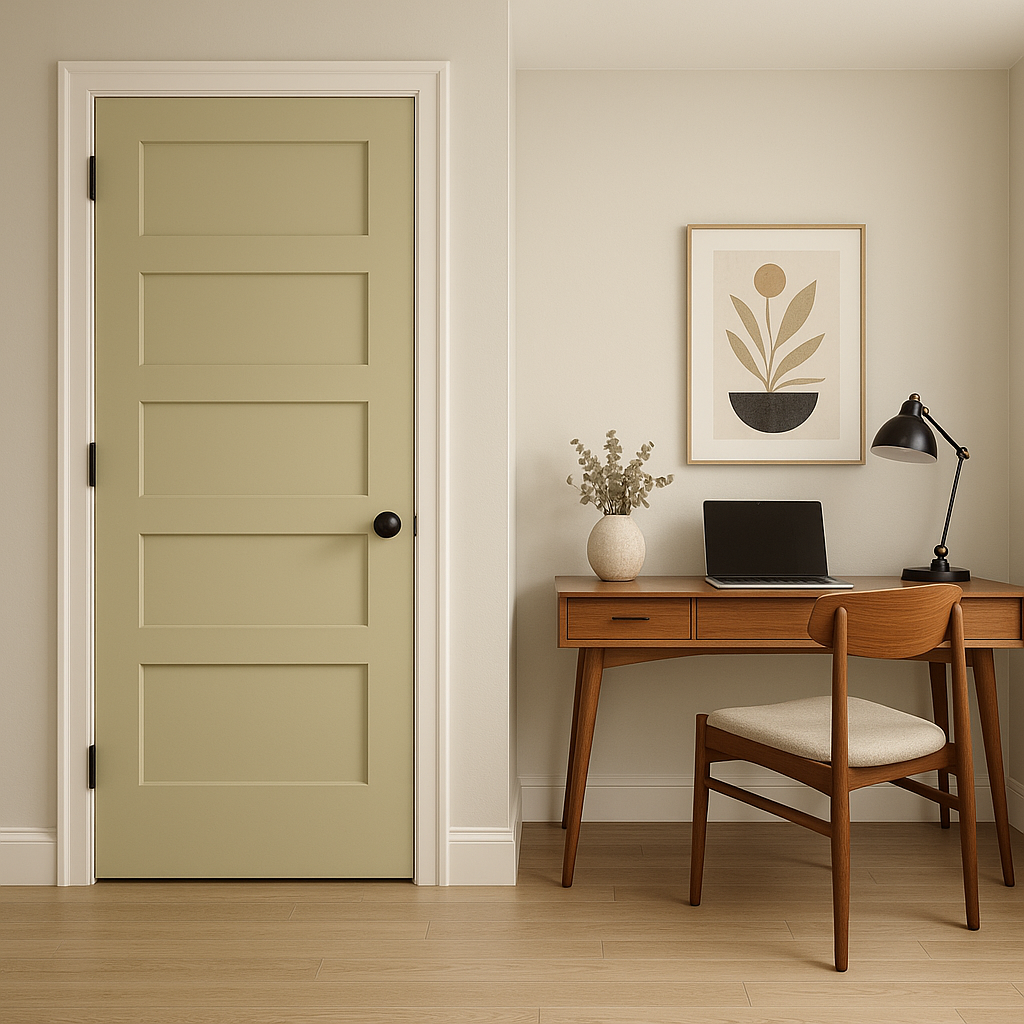
If you’re hesitant to commit to Pale for an entire room, consider using it as an accent wall. It pairs beautifully with neutral tones, adding depth and personality without overpowering the space.
Benjamin Moore Pale (2146-40) stands out for its ability to blend seamlessly into multiple design styles while maintaining its unique, understated charm. Its soft green hue with gray undertones offers a sophisticated yet soothing appeal, making it ideal for spaces where comfort and tranquility are prioritized. Whether you’re refreshing a bedroom, brightening a living room, or creating a calming office environment, Pale (2146-40) is a thoughtful and timeless choice.
By incorporating coordinating colors like White Dove, Kendall Charcoal, Edgecomb Gray, and Black Forest Green, you can tailor this versatile shade to suit your style preferences. Its adaptability ensures that your space will feel harmonious and balanced, no matter how you choose to use it.
View Colors Only by Brand (No Imagery):
Sherwin-Williams
|
Benjamin-Moore
|
Behr
|
Valspar
Live on the Eastern Slope of Colorado and looking for a local painting professional, check out all our painting services and reach out for a free estimate.
Copyright © 2026 : Wild Fox Painting Inc. : 12435 Mead Way, Littleton, CO 80125


