Benjamin Moore Powder (2151-70) is a soft, muted shade that evokes a sense of calm and understated elegance. This pale hue sits at the intersection of warm and cool tones, making it an adaptable choice for various design styles, from modern minimalism to classic sophistication. Powder is part of Benjamin Moore's extensive color palette, offering a subtle yet impactful presence that can transform any space into a sanctuary of tranquility.
Powder (2151-70) carries delicate gray undertones with a whisper of beige, creating a balanced greige effect. These undertones ensure that the color remains versatile, neither too cold nor overly warm. The gray component lends a refined and contemporary feel, while the beige undertones soften the hue, adding a touch of warmth and approachability. This duality makes Powder an excellent choice for spaces that require a neutral backdrop without sacrificing personality.
Benjamin Moore Powder pairs beautifully with a range of complementary shades, allowing for seamless integration into your design scheme. Here are some coordinating colors to enhance its aesthetic:
Powder is a versatile shade that can be used in various rooms and applications. Its neutral yet nuanced character makes it suitable for both large-scale spaces and smaller accents. Below are some suggestions for incorporating Powder into your home:
Powder serves as an excellent base color for living rooms, creating a serene environment that feels open and welcoming. Pair it with plush furnishings in coordinating shades to achieve a harmonious look, or add pops of color with vibrant pillows and accessories for a lively contrast.
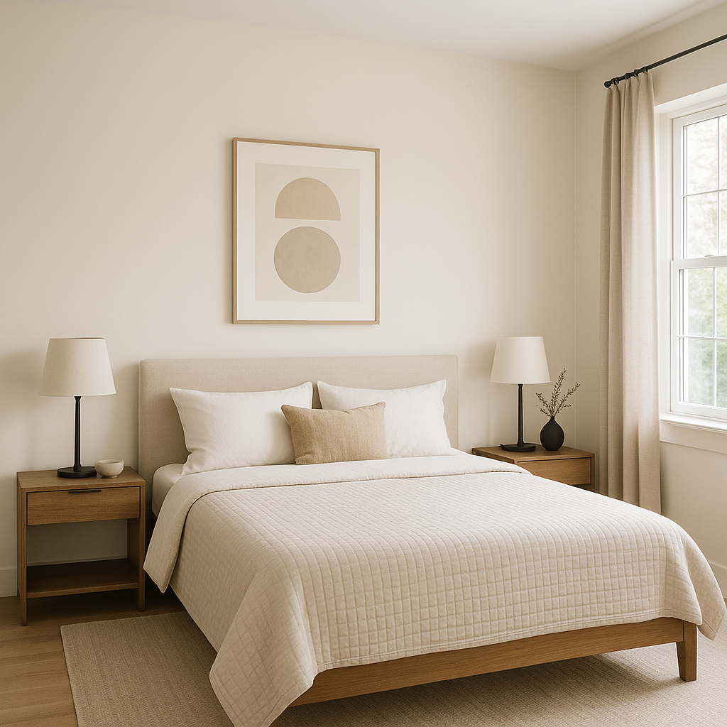
The calming nature of Powder makes it a perfect choice for bedrooms. Whether used on the walls or as an accent color in bedding and decor, it fosters relaxation and comfort. Combine it with soft textures and muted tones for a tranquil retreat.
Powder's clean and sophisticated qualities lend themselves well to bathrooms. Pair it with crisp white fixtures to emphasize its subtle elegance, or incorporate natural materials like wood and stone for a spa-like ambiance.
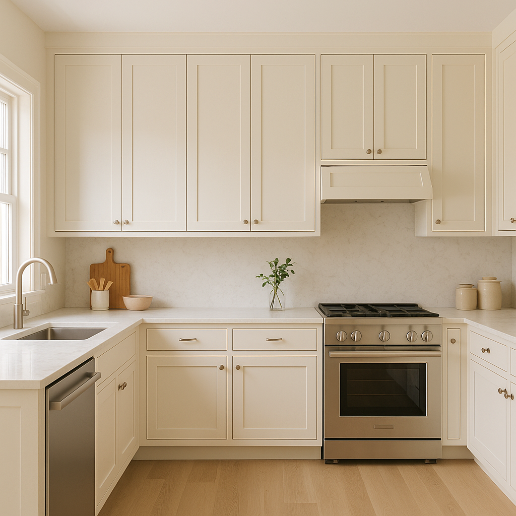
In kitchens, Powder can be used on cabinetry or walls to create a light and airy feel. It pairs beautifully with white marble countertops and stainless steel appliances, resulting in a timeless and polished look.
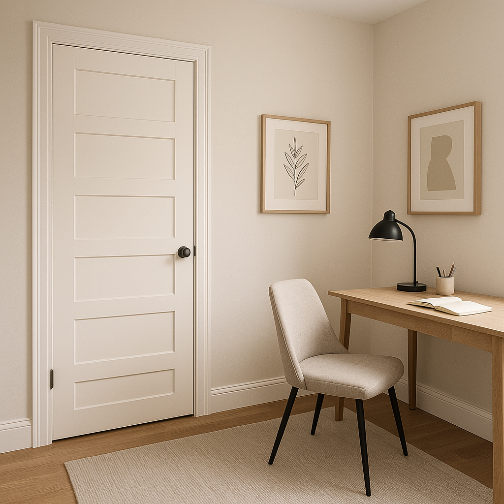
As a neutral yet interesting shade, Powder is ideal for entryways and hallways. It sets an inviting tone while providing a seamless transition between rooms with varying color schemes.
Powder (2151-70) adapts remarkably well to different lighting conditions. In natural daylight, its gray undertones become more pronounced, offering a fresh and contemporary vibe. Under warm artificial lighting, the beige notes take center stage, adding a cozy and welcoming dimension. Testing the color in your space before committing to it can help you understand how it interacts with your specific lighting conditions.
Benjamin Moore Powder (2151-70) is a masterfully balanced neutral that exudes sophistication and versatility. Its ability to adapt to various design styles, color pairings, and lighting conditions makes it an invaluable tool in any interior designer's palette. Whether you're seeking a serene backdrop or a subtle accent, Powder delivers understated beauty with timeless appeal.
View Colors Only by Brand (No Imagery):
Sherwin-Williams
|
Benjamin-Moore
|
Behr
|
Valspar
Live on the Eastern Slope of Colorado and looking for a local painting professional, check out all our painting services and reach out for a free estimate.
Copyright © 2026 : Wild Fox Painting Inc. : 12435 Mead Way, Littleton, CO 80125


