Benjamin Moore Autumn (2152-30) is a rich, warm paint color that evokes the cozy charm of fall foliage and earthy tones. This captivating shade is a golden-brown hue with a subtle amber undertone, making it incredibly versatile for creating inviting spaces with a sense of timeless sophistication. Whether you're designing a rustic retreat or adding character to a modern home, Autumn is a color that can transform your interiors into a haven of warmth and comfort.
Benjamin Moore Autumn is infused with warm undertones that lean toward amber and golden hues. These undertones give the color a soft glow, making it feel welcoming and grounding in any space. Its earthy nature ensures it pairs beautifully with neutral palettes, while the golden undertones make it suitable for accentuating other warm colors, such as terracotta or sun-drenched yellows.
The subtle amber undertones also help balance the richness of the brown base, preventing the shade from feeling too heavy or overly dark. This balance ensures Autumn works equally well in rooms with abundant natural light or spaces with minimal lighting.
Benjamin Moore Autumn is incredibly versatile, and you can pair it with a variety of complementary and contrasting colors to create a harmonious or dynamic design. Consider these coordinating colors for a well-rounded palette:
Benjamin Moore Autumn is a highly versatile color that can shine in a variety of applications, from accent walls to complete room makeovers. Here are some creative ways to incorporate this warm, golden-brown hue into your home:
Autumn is ideal for living rooms, where its warm undertones create a cozy and inviting atmosphere. Pair it with soft beige furniture, textured throw pillows, and natural wood accents for a relaxed yet refined aesthetic. Add metallic finishes in bronze or gold to highlight the color’s amber undertones.
Elevate your dining experience by using Autumn on the walls or as an accent color. Its richness adds depth and elegance, making it the perfect backdrop for intimate gatherings. Pair it with a warm white ceiling and wood dining furniture to achieve a sophisticated look.
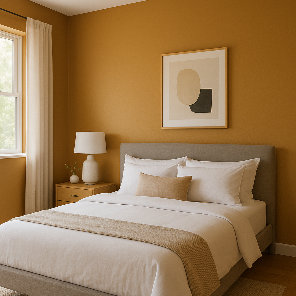
Autumn’s calming nature makes it a wonderful choice for bedrooms. Use it as the primary wall color and pair it with crisp white linens to create a serene retreat. Complement the look with accent pillows in golden yellow or rust tones for added warmth.
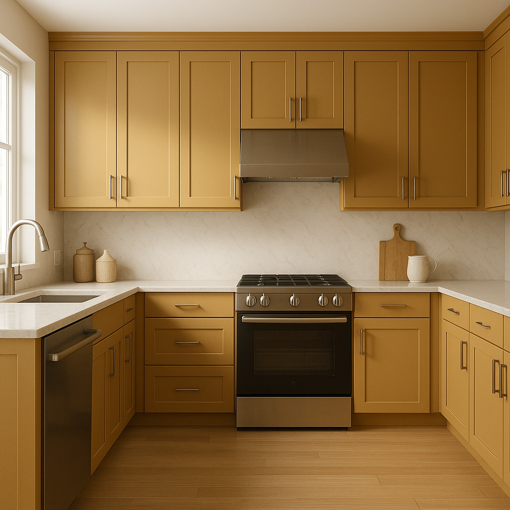
In kitchens, Autumn works beautifully with wood cabinetry and natural stone countertops. It adds a sense of warmth and depth, making the space feel grounded and welcoming. In bathrooms, consider pairing Autumn with white subway tiles and brushed brass hardware for a luxurious yet earthy vibe.
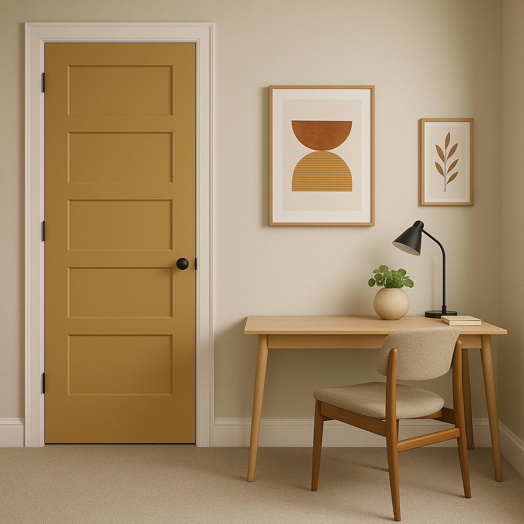
If you’re not ready to commit to Autumn for an entire room, use it as an accent color to highlight architectural features or furniture pieces. A single wall painted in Autumn can become a stunning focal point, especially when paired with lighter neutrals or dark, dramatic tones.
Benjamin Moore Autumn (2152-30) is the perfect choice for homeowners and designers seeking to create spaces that feel warm, grounded, and elegant. Its golden-brown hue is versatile enough to work in both traditional and contemporary interiors, while its amber undertones ensure it brings a touch of sophistication to any palette. Whether used as a primary color or as an accent, Autumn is a timeless shade that transforms spaces into cozy retreats.
With its ability to pair beautifully with neutrals, warm tones, and even cooler shades, Autumn empowers you to craft a design that reflects your unique style while maintaining a sense of balance and harmony.
View Colors Only by Brand (No Imagery):
Sherwin-Williams
|
Benjamin-Moore
|
Behr
|
Valspar
Live on the Eastern Slope of Colorado and looking for a local painting professional, check out all our painting services and reach out for a free estimate.
Copyright © 2026 : Wild Fox Painting Inc. : 12435 Mead Way, Littleton, CO 80125


