Benjamin Moore Butterscotch (2157-30) is a rich, golden caramel hue that exudes warmth, charm, and a touch of nostalgia. This color brings a sense of coziness and sophistication to any space, making it a versatile choice for homeowners who want to create a welcoming atmosphere. Whether used as the primary color in a room or as an accent, Butterscotch delivers a timeless elegance that works beautifully across various design styles.
Benjamin Moore Butterscotch is characterized by warm, golden undertones that lean toward amber and honey. These undertones give the color its depth and glowing appeal, making it feel comforting yet refined. The subtle hints of orange and yellow in its base provide a vibrant energy without overwhelming a space, making it ideal for creating a sunny and cheerful environment. This color avoids cooler or muted tones, ensuring it stays firmly in the realm of warmth, which is perfect for spaces you want to feel inviting and full of life.
To maximize the beauty of Benjamin Moore Butterscotch, consider pairing it with complementary or contrasting colors that enhance its rich character. Here are a few suggestions:
Benjamin Moore Butterscotch is a flexible and charming color that works well in various spaces, whether you’re aiming for bold statements or subtle warmth. Here are some ideas for incorporating this hue into your home:
Create a cozy and inviting atmosphere in shared spaces by using Butterscotch on the walls or as an accent color. Pair it with neutral furniture and textured fabrics like linen or velvet for a balanced, rich aesthetic. Add warm wood tones, such as oak or walnut, to complement the golden hues.
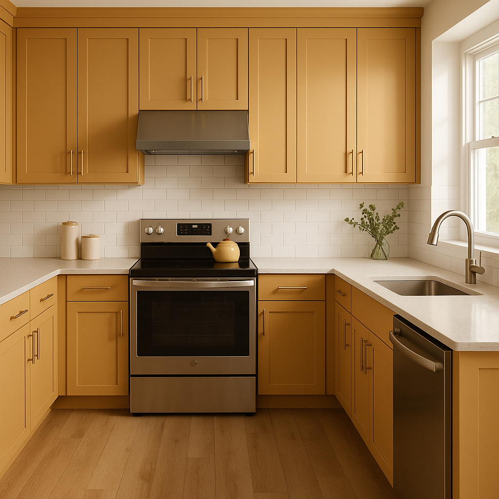
Butterscotch is a fantastic choice for kitchens, as its warmth is reminiscent of glowing sunlight and the joy of shared meals. Use it for cabinetry or as a backsplash accent paired with white countertops and matte black hardware for a modern yet homey look.
In dining rooms, Butterscotch can create a space that feels elegant yet welcoming. Consider using it on the walls to create a golden glow that enhances natural or artificial lighting. Pair it with a wooden dining table and upholstered chairs in neutral shades for a cohesive design.
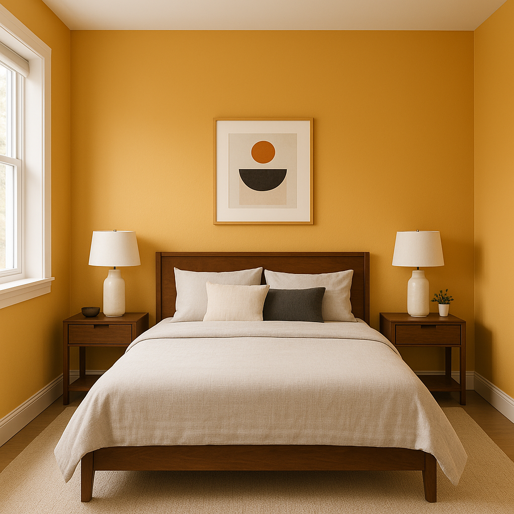
For bedrooms, Butterscotch can be used to craft a serene yet warm retreat. Opt for it as an accent wall behind the bed or incorporate it in textiles like bedding or curtains. Combine it with soft whites and muted greens to maintain a relaxed vibe.
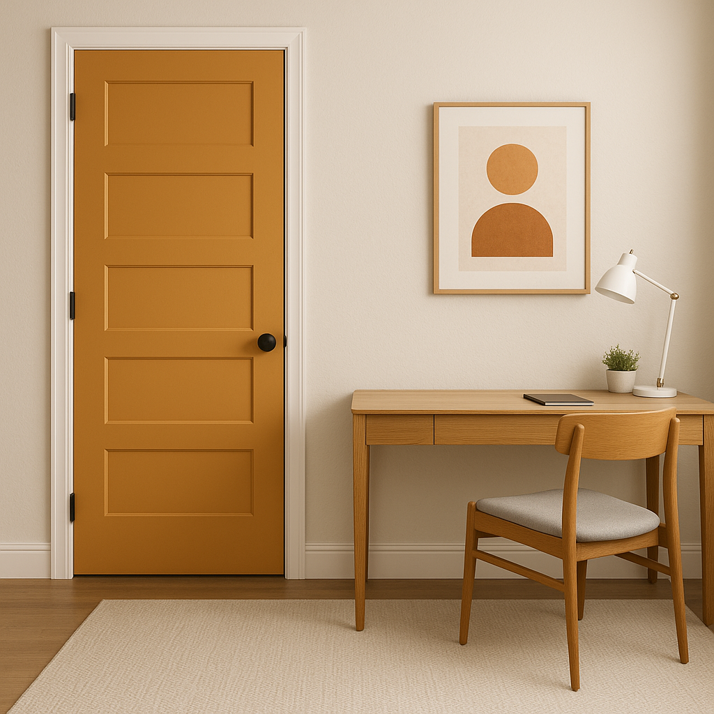
Make a lasting impression with Butterscotch in your entryway or hallway. It’s an ideal color to greet guests with warmth while setting the tone for the rest of your home.
If you’re not ready to commit to Butterscotch on the walls, try incorporating this hue through accent pieces like throw pillows, area rugs, artwork, or painted furniture. It’s a great way to add a pop of color without overwhelming your space.
Benjamin Moore Butterscotch (2157-30) is more than just a paint color—it’s a mood. Its warm, golden tones make it perfect for creating spaces that feel inviting, joyful, and timeless. Whether paired with neutral whites, earthy browns, or contrasting jewel tones, this versatile color adapts to a variety of design styles and preferences. Use it to highlight architectural features, brighten small spaces, or infuse larger rooms with charm and personality.
With its glowing undertones, coordinating color options, and wide range of uses, Benjamin Moore Butterscotch stands out as a fantastic choice for anyone looking to elevate their home’s design with a touch of warmth and sophistication.
View Colors Only by Brand (No Imagery):
Sherwin-Williams
|
Benjamin-Moore
|
Behr
|
Valspar
Live on the Eastern Slope of Colorado and looking for a local painting professional, check out all our painting services and reach out for a free estimate.
Copyright © 2026 : Wild Fox Painting Inc. : 12435 Mead Way, Littleton, CO 80125


