Benjamin Moore Delightful (2158-30) is a radiant, sunny shade that immediately evokes joy, warmth, and positivity. Perfectly nestled between a soft gold and a muted yellow, this color is a versatile choice that can enliven interiors while maintaining an air of sophistication. Its cheerful persona makes it the ideal candidate for spaces where energy and light are desired, yet its subtle undertones lend a refined elegance that feels timeless rather than overpowering.
Delightful carries warm golden undertones that lean slightly toward a buttery richness. These undertones soften its vibrancy, preventing it from appearing overly bright or harsh. The golden base adds depth, making it a more nuanced yellow that feels earthy and grounded. This balance ensures it works beautifully in both modern and traditional spaces, offering a cozy warmth without overwhelming the surrounding elements.
Benjamin Moore Delightful pairs harmoniously with a curated palette of complementary hues. To create a cohesive design, consider the following coordinating colors:
Delightful (2158-30) is a versatile shade that can transform a variety of spaces. Here are some creative applications for this joyful hue:
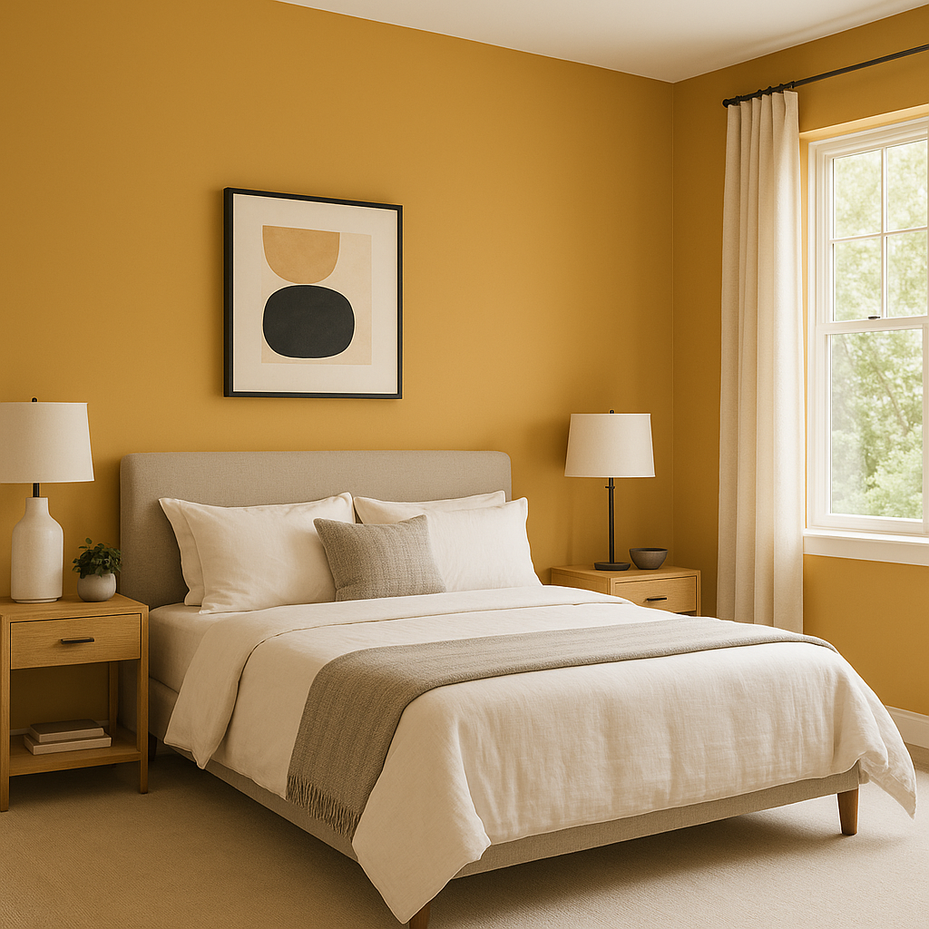
Infuse living areas with energy and warmth by using Delightful on walls. Its inviting nature makes it an excellent choice for spaces where family and friends gather. Pair it with neutral furniture and pops of contrasting colors for a balanced yet lively atmosphere.
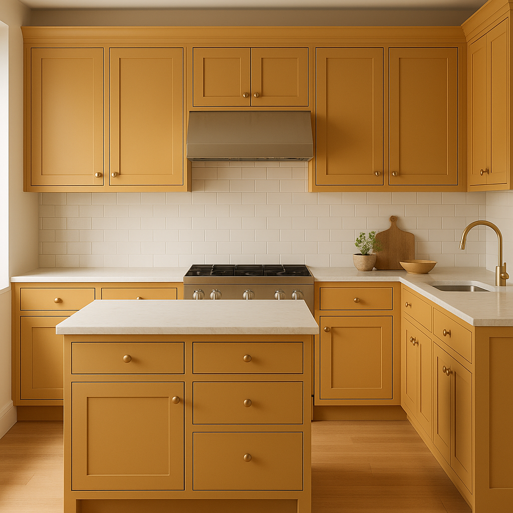
Delightful’s sunny disposition works wonderfully in kitchens and dining areas, creating a welcoming environment that feels fresh and vibrant. Use it on cabinetry or as an accent wall to make the space feel bright and cheerful. Pair with soft whites and natural wood tones for a farmhouse-inspired aesthetic or sleek blacks for a modern twist.
The playful yet sophisticated nature of Delightful makes it ideal for children’s spaces. Its golden undertones provide warmth and comfort while its sunny brightness inspires creativity and joy. Pair with pastel tones for a whimsical, youthful palette.
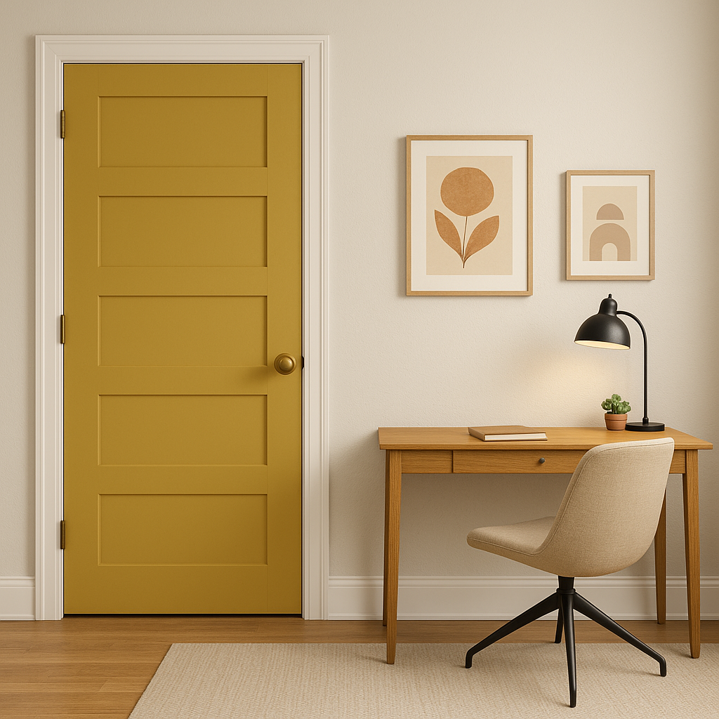
For those who want to incorporate Delightful without committing to full walls, consider using it on an accent wall, furniture, or decor pieces. A painted bookshelf or desk in Delightful can add a pop of color to a neutral room without overpowering the space.
Businesses such as cafés, boutiques, or wellness centers can benefit from the welcoming aura of Delightful. Its warm, inviting tone creates an uplifting environment that resonates with customers and clients alike.
Benjamin Moore Delightful (2158-30) is more than just a paint color—it’s a mood enhancer. With its warm undertones, versatility, and ability to coordinate seamlessly with a variety of hues, it’s the perfect choice for spaces that need to feel welcoming, energetic, and vibrant. Whether used in residential or commercial settings, Delightful brings a sense of optimism and brightness to any environment.
View Colors Only by Brand (No Imagery):
Sherwin-Williams
|
Benjamin-Moore
|
Behr
|
Valspar
Live on the Eastern Slope of Colorado and looking for a local painting professional, check out all our painting services and reach out for a free estimate.
Copyright © 2026 : Wild Fox Painting Inc. : 12435 Mead Way, Littleton, CO 80125


