Benjamin Moore Maple (2160-30) is a rich, golden-brown hue that evokes the warmth and natural beauty of autumn leaves or aged maple wood. With its inviting and grounding presence, this color is perfect for creating a cozy, sophisticated atmosphere in any space. Its balance of earthy and golden undertones makes it a versatile choice that complements various design styles, from traditional to contemporary.
One of the most defining features of Maple is its warm, honeyed undertone. It leans toward the golden side of the spectrum, but there’s also a subtle hint of orange and brown that gives it a depth akin to natural wood finishes. These undertones make it a fantastic choice for spaces where you want to evoke a sense of warmth and comfort, but without overwhelming the room. The golden undertones ensure the color doesn’t feel too heavy or somber, while the earthy brown base keeps it grounded and timeless.
Benjamin Moore Maple pairs beautifully with a range of colors, allowing you to customize your space and create a harmonious palette. Here are a few coordinating options:
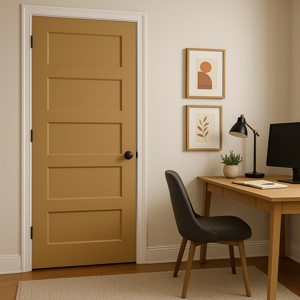
The versatility of Benjamin Moore Maple (2160-30) makes it well-suited for a variety of interior design applications. Here are a few ways to incorporate this stunning hue into your home:
Maple is an excellent choice for living rooms, where it can create a welcoming and cozy environment. Pair it with soft, neutral furnishings for a balanced look, or introduce darker wood tones and metallic accents for a more dramatic effect.
The golden-brown warmth of Maple is perfect for dining areas, where it fosters a sense of comfort and intimacy. Combine it with warm lighting and natural materials like wood or stone to enhance the inviting ambiance.
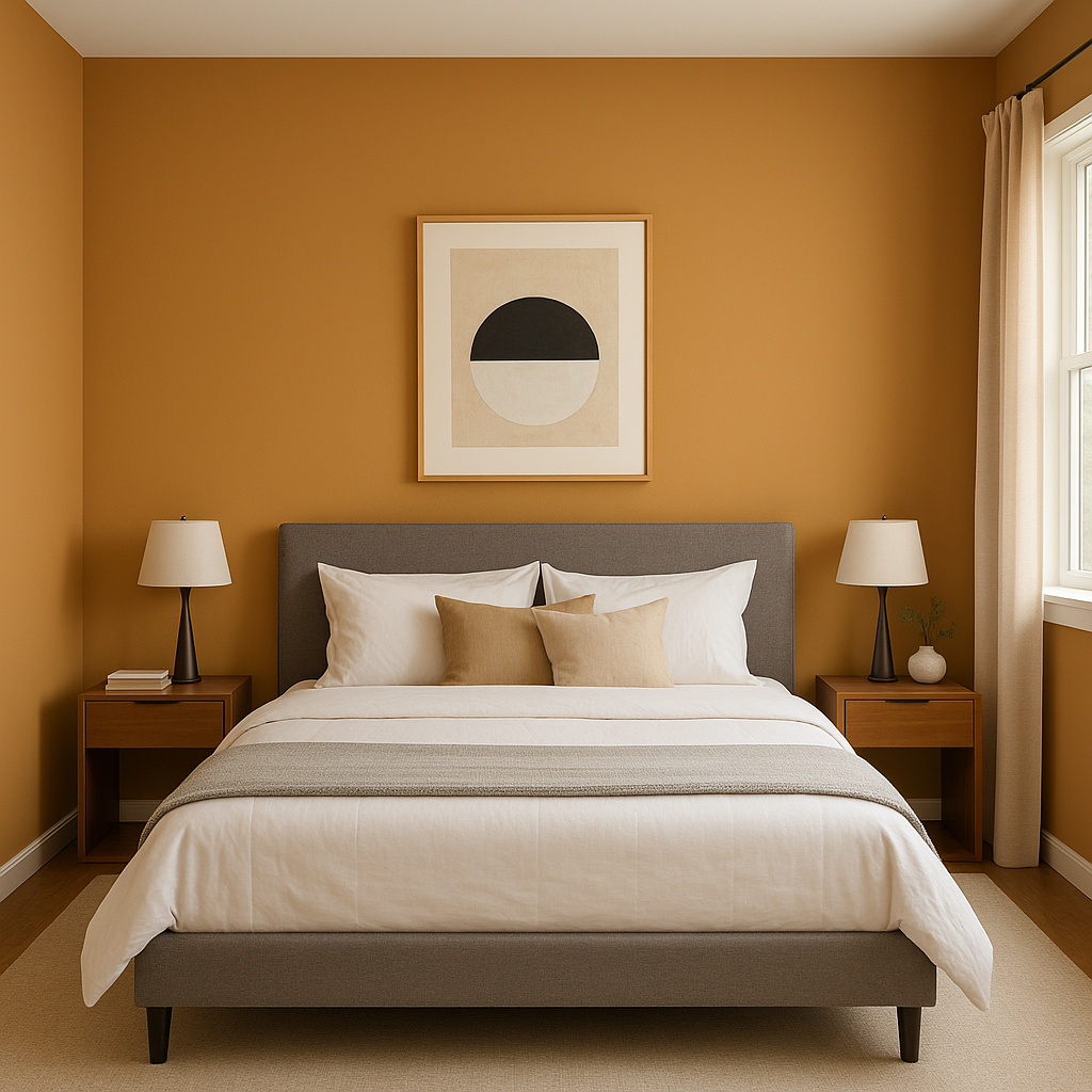
For a restful retreat, use Maple as an accent wall behind the bed or as the main wall color. Complement it with soft linens in cream, beige, or muted blues for a serene and cozy atmosphere.
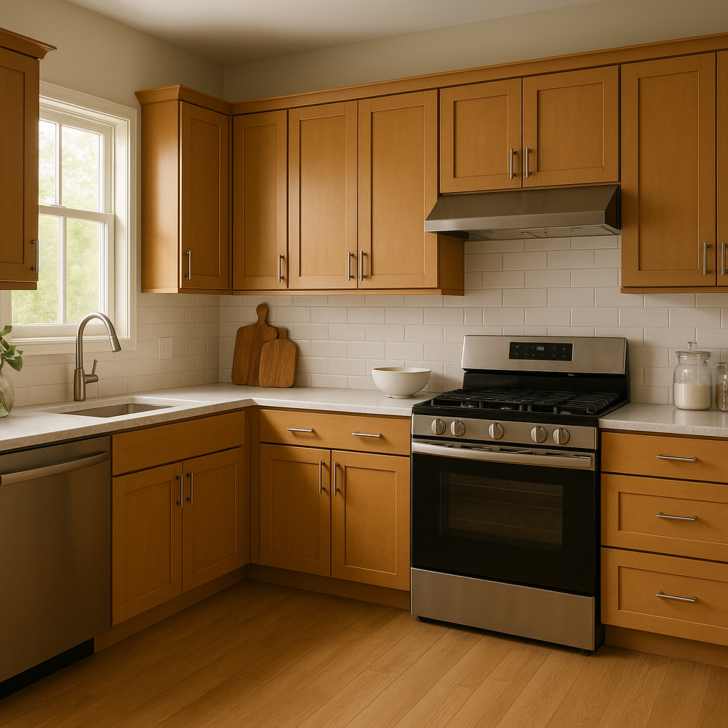
Maple works beautifully in kitchens, especially when paired with white or cream cabinetry. It can also be used as a cabinet color itself, bringing a natural, wood-like finish to your kitchen design.
Create a warm first impression by using Maple in entryways or hallways. It pairs wonderfully with white trim and light wood flooring, offering a polished and welcoming look.
Benjamin Moore Maple (2160-30) is a color that brings warmth, comfort, and timeless elegance to any space. Whether it’s used as a statement hue or a subtle backdrop, its rich undertones and effortless versatility make it a go-to choice for interior designers and homeowners alike.
View Colors Only by Brand (No Imagery):
Sherwin-Williams
|
Benjamin-Moore
|
Behr
|
Valspar
Live on the Eastern Slope of Colorado and looking for a local painting professional, check out all our painting services and reach out for a free estimate.
Copyright © 2026 : Wild Fox Painting Inc. : 12435 Mead Way, Littleton, CO 80125


