Benjamin Moore's Coppertone 2161-10 is a rich, grounded color that evokes a sense of warmth and sophistication. This deep earth tone is perfect for creating cozy, inviting spaces while maintaining a refined and timeless aesthetic. With its striking balance of warmth and depth, Coppertone 2161-10 is a versatile choice for both traditional and modern interiors.
Coppertone is a warm, medium-to-dark shade with distinct red and orange undertones. These undertones give the color its characteristic richness, resembling the earthy warmth of natural clay or weathered copper. The subtle hints of brown within the hue temper the vibrancy, making it feel more grounded and approachable rather than overly bold. This balance of warmth and depth ensures Coppertone can work beautifully as a statement color or a backdrop.
To elevate the beauty of Coppertone, pair it with complementary or contrasting hues that enhance its earthy character. Here are a few coordinating color suggestions:
Coppertone’s versatility makes it a great choice for a variety of spaces and design styles. Its warm, earthy tone can be used to create everything from cozy retreats to bold statement areas. Here are some ideas for incorporating Coppertone into your home:
For a warm and inviting living room or den, use Coppertone as an accent wall or for built-in shelving. Pair it with neutral furnishings and soft textures like plush rugs or linen curtains to create a space that feels both cozy and polished.
Coppertone is an excellent choice for dining rooms, where its rich tone can add an element of drama and sophistication. Complement it with a wooden dining table, upholstered chairs, and warm lighting to create an intimate, welcoming dining area.
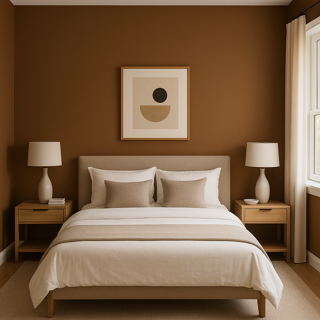
In bedrooms, Coppertone can be used to establish a cocoon-like atmosphere. Consider using it as a feature wall behind the bed or for a ceiling treatment to create a sense of depth and warmth. Pair it with soft, neutral bedding and natural wood furniture for a serene yet stylish retreat.
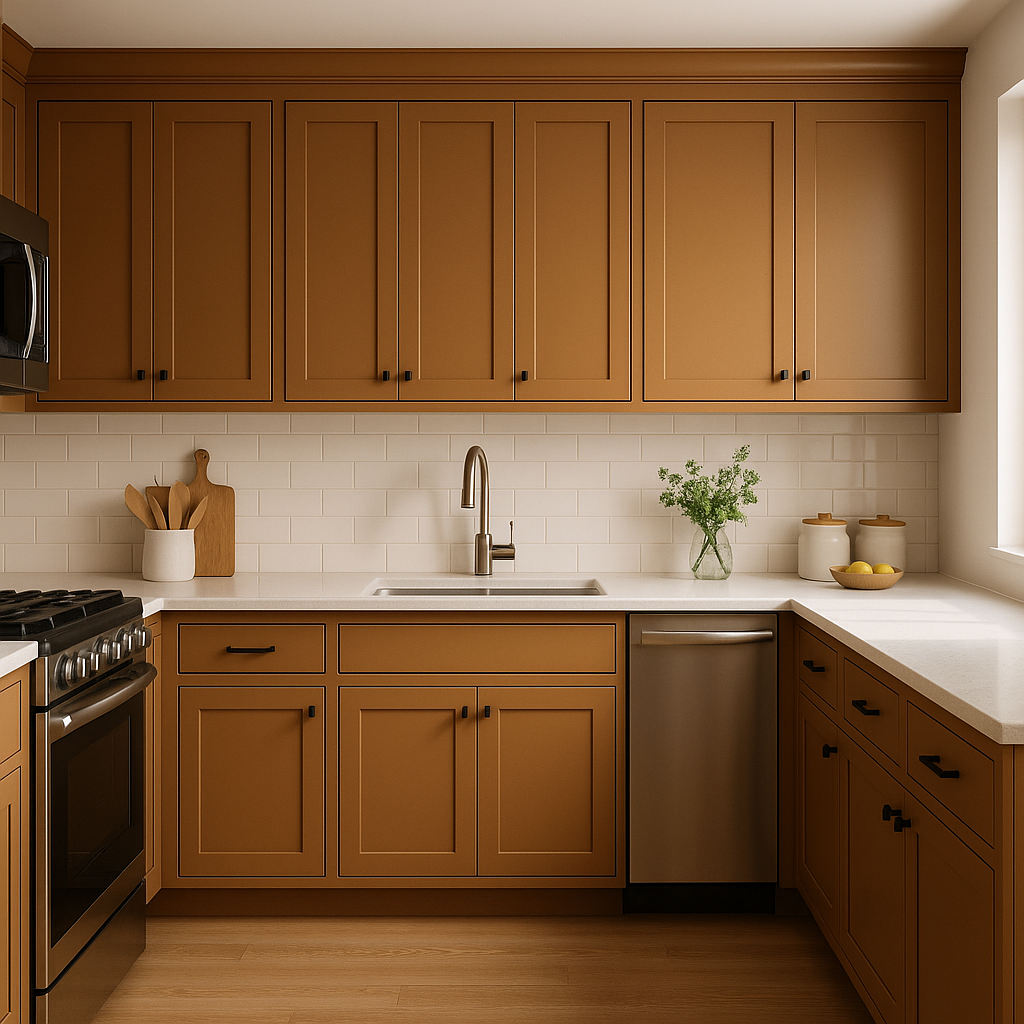
For a bold yet timeless kitchen, use Coppertone for cabinetry or a backsplash. Its earthy undertones pair well with marble or butcher block countertops and brass or copper fixtures, creating a chic and cohesive look.
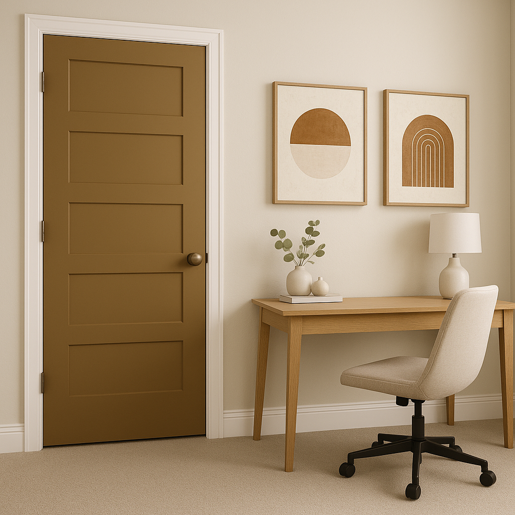
If you’re not ready to commit to painting an entire room, consider using Coppertone for smaller design elements such as a front door,
View Colors Only by Brand (No Imagery):
Sherwin-Williams
|
Benjamin-Moore
|
Behr
|
Valspar
Live on the Eastern Slope of Colorado and looking for a local painting professional, check out all our painting services and reach out for a free estimate.
Copyright © 2026 : Wild Fox Painting Inc. : 12435 Mead Way, Littleton, CO 80125


