Benjamin Moore Hazelnut (2161-60) is a timeless, creamy beige that exudes warmth and sophistication. Perfectly balancing subtle elegance and versatile usability, Hazelnut is a neutral that brings a sense of comfort and tranquility to any space. Its soft, muted tones make it a favorite for homeowners and designers seeking a welcoming atmosphere that feels both classic and modern.
The beauty of Hazelnut lies in its gentle undertones. This shade carries a hint of golden warmth, giving it a slightly sunlit appearance without feeling too yellow. The creamy base is balanced with faint whispers of beige and taupe, ensuring it doesn’t lean overly cool or overly warm. These undertones make Hazelnut an adaptable color that complements a wide variety of palettes and lighting conditions.
In spaces with natural light, Hazelnut showcases its golden undertones, creating a cozy and inviting ambiance. In dimmer or artificial lighting, its neutral beige base takes center stage, offering a subdued and restful vibe. This chameleon-like quality makes Hazelnut a versatile option for rooms of all sizes and styles.
Hazelnut pairs beautifully with a variety of coordinating colors, both bold and subdued. Whether you want to create a monochromatic look or a high-contrast palette, this adaptable neutral can shine in endless combinations.
Hazelnut’s versatility makes it an exceptional choice for a variety of spaces and design styles. Whether you’re furnishing a cozy cottage or a sleek modern home, this neutral hue adapts effortlessly to its surroundings.
Hazelnut is a natural choice for living rooms, where its warm undertones create a welcoming and relaxed ambiance. Pair it with soft white trim and plush furnishings for a tranquil, inviting space.
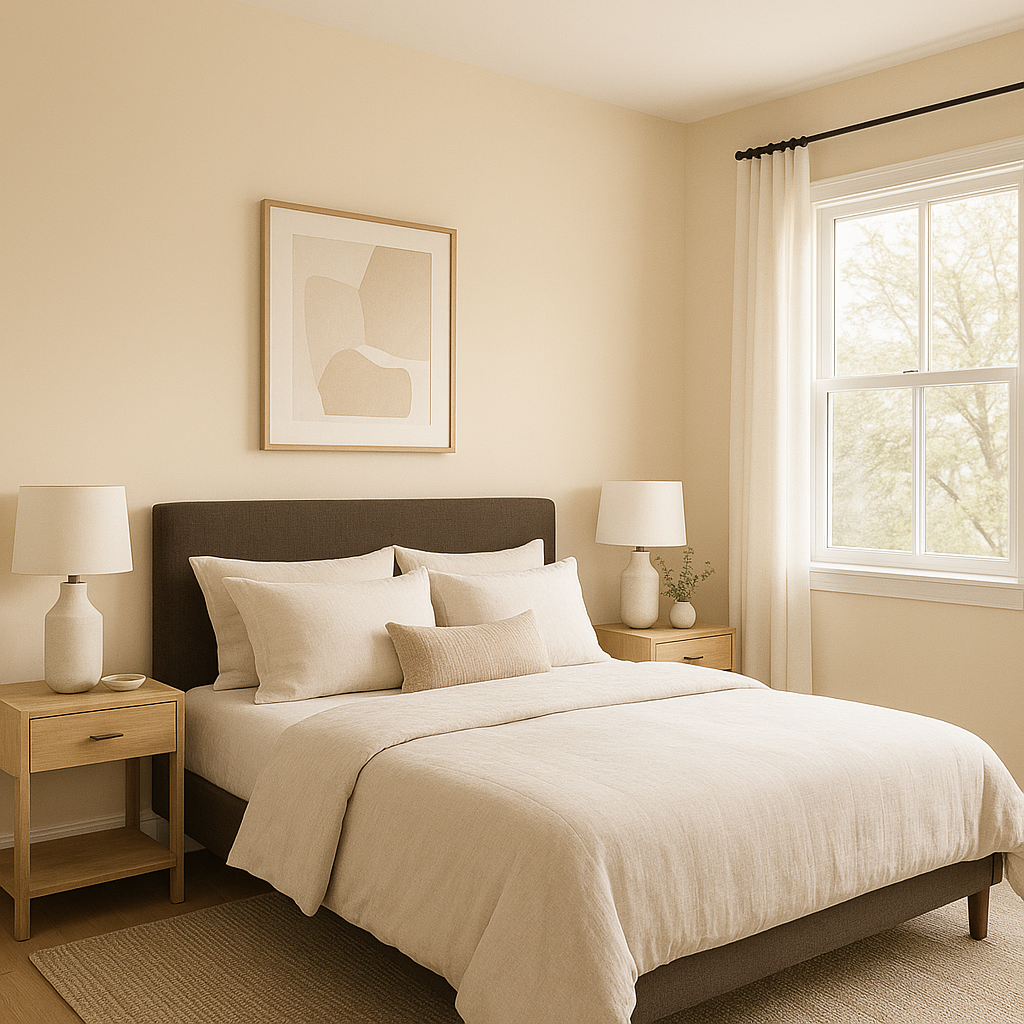
In bedrooms, Hazelnut fosters a sense of calm and serenity, making it ideal for restful retreats. Layer it with coordinating taupe or cream bedding and natural wood accents to enhance its soothing qualities.
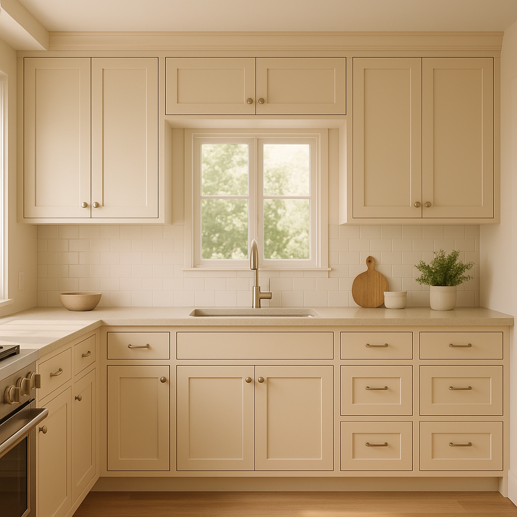
For kitchens, Hazelnut offers a sophisticated backdrop that pairs well with white cabinetry, brushed metal fixtures, and natural stone countertops. Add pops of navy or green for a fresh, contemporary twist.
Transform transitional spaces like hallways and entryways into inviting areas with Hazelnut’s understated elegance. It provides just enough color to warm the space without overwhelming it.
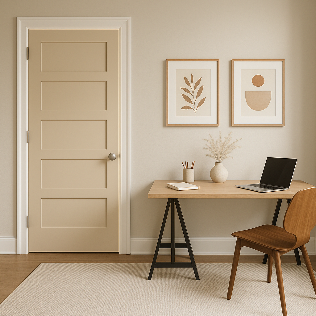
Hazelnut is perfect for home offices, where its neutral tone encourages focus and productivity. Pair it with deep blues or charcoals for a professional yet stylish aesthetic.
Benjamin Moore Hazelnut (2161-60) is more than just a paint color—it’s a mood. Its soft, creamy warmth creates a comforting atmosphere that feels like home. Whether you’re designing a cozy retreat or a sophisticated space for entertaining, Hazelnut’s versatility, timelessness, and understated beauty make it a standout choice for any project.
View Colors Only by Brand (No Imagery):
Sherwin-Williams
|
Benjamin-Moore
|
Behr
|
Valspar
Live on the Eastern Slope of Colorado and looking for a local painting professional, check out all our painting services and reach out for a free estimate.
Copyright © 2026 : Wild Fox Painting Inc. : 12435 Mead Way, Littleton, CO 80125


