Benjamin Moore Woodland (2161-70) is a soft, muted neutral that evokes a sense of understated elegance. Perfectly balanced, this creamy beige offers a warm and inviting presence, making it a versatile choice for any interior design style. Woodland’s ability to adapt to various lighting conditions and pair seamlessly with other hues has made it a favorite among designers seeking a sophisticated yet approachable foundation for their spaces.
Woodland (2161-70) is defined by its gentle warmth, thanks to subtle yellow and tan undertones. These undertones infuse the shade with a sunny disposition that avoids feeling overly golden or brassy. The result is a hue that feels grounded and natural, yet refined. Woodland’s warm undertones make it an excellent choice for creating cozy, welcoming environments, especially in spaces with natural light.
In cooler lighting, Woodland may lean toward a soft taupe, giving it a slightly greige appearance. This adaptability allows it to harmonize well with a wide range of color palettes and ensures it feels balanced in both traditional and modern interiors.
Benjamin Moore Woodland (2161-70) pairs beautifully with complementary shades that enhance its warm undertones. Below are some curated coordinating colors to inspire your design:
Trim/Accent Colors:
Complementary Neutrals:
Bold Accent Colors:
Woodland is ideal for living rooms or family rooms where comfort and cohesion are key. Its soft beige tone creates an inviting canvas for furniture, artwork, and decor. Pair it with textured fabrics like linen and wool for a layered, cozy vibe.
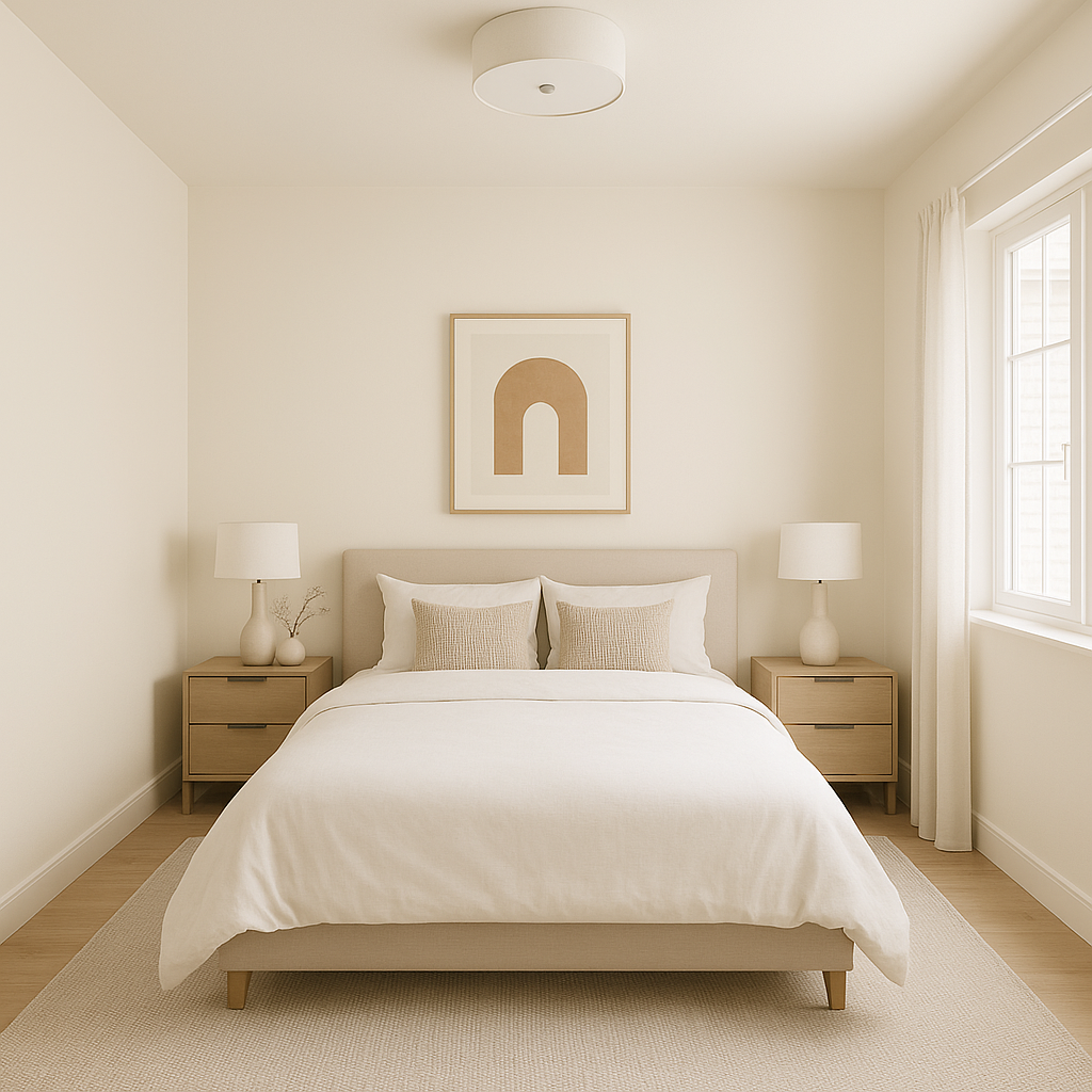
In bedrooms, Woodland offers a soothing backdrop that promotes relaxation. It works well with warm wood tones, such as oak or walnut, and pairs beautifully with plush bedding in neutral or pastel shades.
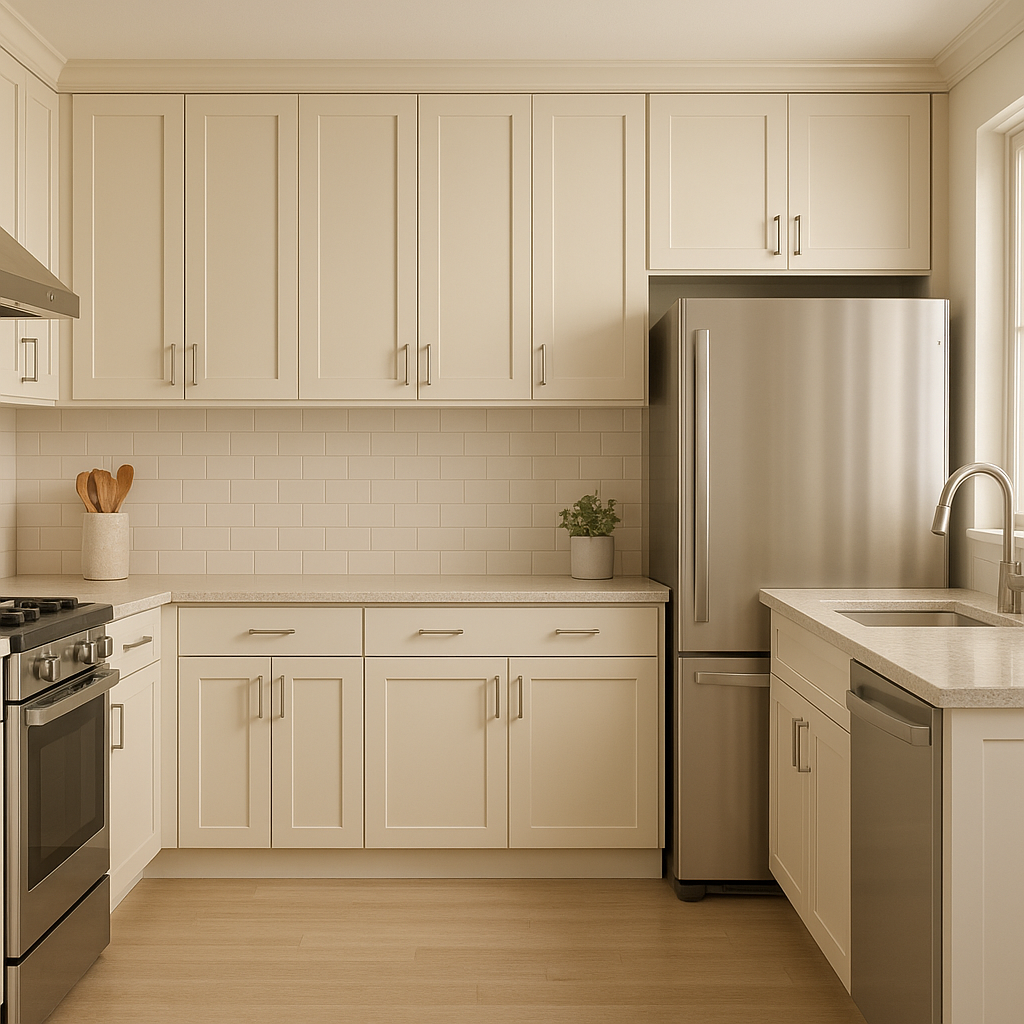
Woodland’s warm undertones are a natural complement to kitchens, especially those featuring wooden cabinetry or brass fixtures. For dining areas, Woodland creates a welcoming atmosphere that feels both elegant and casual.
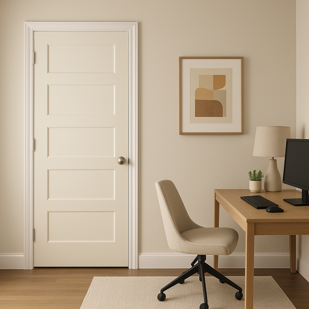
This versatile neutral can help create a calm and focused environment in home offices. Pair it with darker accent colors like charcoal or navy for a sophisticated and productive space.
Woodland’s creamy warmth adds a spa-like quality to bathrooms, especially when paired with crisp white trim and natural stone or marble surfaces.
Woodland’s undertones react beautifully to varying light conditions. In spaces with ample natural light, it feels bright and airy, while in rooms with softer, artificial lighting, Woodland takes on a cozier, more intimate character. This adaptability makes it a reliable choice for spaces where lighting changes throughout the day.
To maximize Woodland’s versatility, pair it with natural materials like wood, jute rugs, or woven baskets. These elements enhance its organic feel and create a timeless, grounded aesthetic. Additionally, consider adding metallic accents like brushed gold or matte black for extra depth and sophistication.
Benjamin Moore Woodland (2161-70) is more than just a neutral—it’s a warm, inviting hue that offers endless possibilities for creating spaces that feel personal, stylish, and serene. Its ability to coordinate with a variety of colors and materials makes it a go-to choice for homeowners and designers alike. Whether you're refreshing a single room or designing an entire home, Woodland provides the perfect foundation for timeless beauty.
View Colors Only by Brand (No Imagery):
Sherwin-Williams
|
Benjamin-Moore
|
Behr
|
Valspar
Live on the Eastern Slope of Colorado and looking for a local painting professional, check out all our painting services and reach out for a free estimate.
Copyright © 2026 : Wild Fox Painting Inc. : 12435 Mead Way, Littleton, CO 80125


