Benjamin Moore Autumn (2162-10) is a rich, earthy hue that brings the warm colors of nature indoors. This deep, burnt orange shade is evocative of crisp autumn leaves, glowing sunsets, and the cozy warmth of seasonal gatherings. It’s a bold yet versatile color that creates an inviting ambiance, whether used as a primary wall color or an accent.
Autumn (2162-10) is a complex color with undertones that enhance its depth and versatility. It carries prominent rusty orange tones with subtle brown undertones that soften its vibrancy, giving it a grounded and sophisticated feel. These earthy qualities make it a timeless choice for interiors, blending warmth with a touch of contemporary edge.
This shade avoids veering too red or too yellow, maintaining a perfect balance that complements both bold and neutral palettes. Its undertones are particularly noticeable in varying lighting conditions—appearing richer and more saturated in dimly lit spaces, yet slightly muted in bright, natural light.
Benjamin Moore Autumn pairs beautifully with a range of complementary and contrasting shades. Whether you're looking to create a monochromatic palette or a dynamic color story, here are some coordinating options:
Neutrals: Pair Autumn with soft neutrals like White Dove (OC-17) or Classic Gray (OC-23) to balance its boldness and create a clean, harmonious look. These shades help lighten the space while allowing Autumn to shine as a focal point.
Earthy Greens: For a nature-inspired palette, combine Autumn with muted greens such as Sagebrush (2139-40) or Mossy Oak (2138-20). These tones enhance the organic feel of the color and create a soothing atmosphere.
Deep Browns: Rich browns like Van Buren Brown (HC-70) or Espresso Bean (2090-30) complement Autumn’s undertones beautifully, adding depth and a sense of coziness to the space.
Metallic Accents: Add a touch of glamour with metallics like rich golds or bronze tones. These accents elevate Autumn’s warmth and create a luxurious finish.
Blues: For striking contrast, pair Autumn with deep navy blues such as Hale Navy (HC-154) or softer shades like Beacon Gray (2118-60). This juxtaposition creates a visually dynamic and modern aesthetic.
Benjamin Moore Autumn is a versatile shade that works in a variety of spaces, from traditional to contemporary designs. Here are some creative ways to incorporate this warm color into your home:
Autumn is ideal for living spaces where comfort and connection are key. Use it as the main wall color to create a cozy, welcoming environment or as an accent wall behind a fireplace or seating area. Pair it with plush textiles in neutral tones or complementary earthy hues for a sophisticated look.
Bring warmth and intimacy to your dining area with Autumn. Its rich undertones make it perfect for spaces where people gather and celebrate. Pair it with wooden furniture and metallic accents to emphasize its rustic charm.
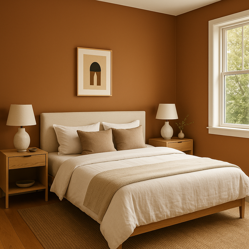
For a bedroom with a bold personality, Autumn can be used to create a cocoon-like effect. Combine it with lighter bedding and decor to maintain balance and prevent the space from feeling too heavy.
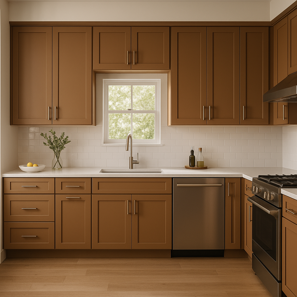
Autumn works beautifully in kitchens, especially when paired with natural wood cabinetry or countertops. It adds a touch of vibrancy while remaining grounded and inviting. Use it in smaller doses, such as an accent wall or backsplash.
Make a statement in entryways with Autumn. It sets the tone for a welcoming and stylish home, especially when paired with contrasting trim in creamy whites or soft grays.
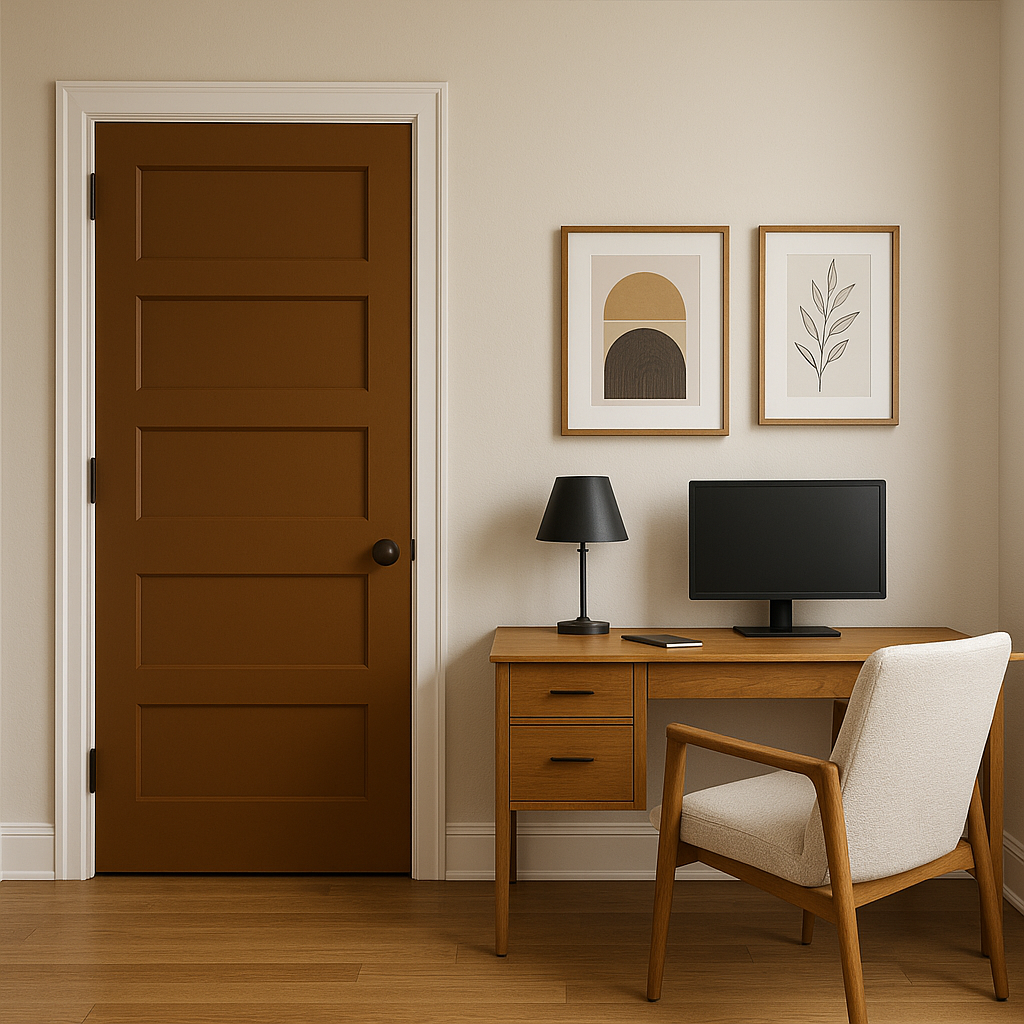
If painting an entire wall feels too bold, consider using Autumn on smaller elements like furniture, shelves, or built-in cabinets. It can also be incorporated into decor items such as throw pillows, rugs, or artwork for a pop of seasonal warmth.
The appearance of Autumn (2162-10) can vary depending on the lighting in your space. In natural daylight, the color's rusty warmth is more pronounced, creating a vibrant yet grounded effect. Under artificial lighting, particularly warm tones like incandescent or soft LED lights, the shade deepens, giving it a cozier and more intimate feel. Always test a sample in your intended space to see how the lighting interacts with the color.
Benjamin Moore Autumn (2162-10) is more than just a paint color—it's a mood. Its warm, earthy tones evoke feelings of comfort and connection, making it perfect for spaces where you want to foster relaxation and conversation. Whether you’re creating a rustic retreat or a modern sanctuary, Autumn adapts beautifully to various design styles, bringing a touch of seasonal charm to your home all year round.
View Colors Only by Brand (No Imagery):
Sherwin-Williams
|
Benjamin-Moore
|
Behr
|
Valspar
Live on the Eastern Slope of Colorado and looking for a local painting professional, check out all our painting services and reach out for a free estimate.
Copyright © 2026 : Wild Fox Painting Inc. : 12435 Mead Way, Littleton, CO 80125


