
Benjamin Moore Winter (2163-70) is a soft, serene off-white with a hint of warmth that evokes the tranquility of a snowy landscape under a soft, muted sky. Perfect for creating a calm and inviting atmosphere, this versatile color blends effortlessly into various design schemes, making it a go-to choice for spaces that need a touch of understated elegance.
Winter leans toward the warmer side of the off-white spectrum with subtle beige undertones. These undertones give the color a slight depth, ensuring it doesn’t feel stark or clinical. Unlike cooler whites that can reflect too much blue or gray, Winter maintains a delicate balance, offering a creamy softness that feels inviting and timeless.
Its gentle warmth makes it adaptable to both traditional and modern interiors, where it can act as a neutral backdrop or a soft accent depending on the surrounding palette.
Benjamin Moore Winter pairs beautifully with a variety of hues, allowing you to tailor its look to suit your design preferences. Here are some coordinating colors to consider:
These combinations can be tailored to evoke different moods, from soft and serene to bold and dramatic.
Winter's versatility makes it suitable for nearly every room and design aesthetic. Here are a few ideas for incorporating this color into your home:
Use Winter as the primary wall color to create an inviting backdrop for warm wood tones, neutral furniture, and layered textures. Its creamy undertones will help the space feel enveloping without being overwhelming.
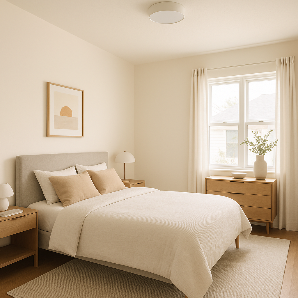
Winter is an excellent choice for bedrooms, as its muted warmth fosters relaxation and rest. Pair it with soft linens in taupe, beige, or light gray for a calming retreat.
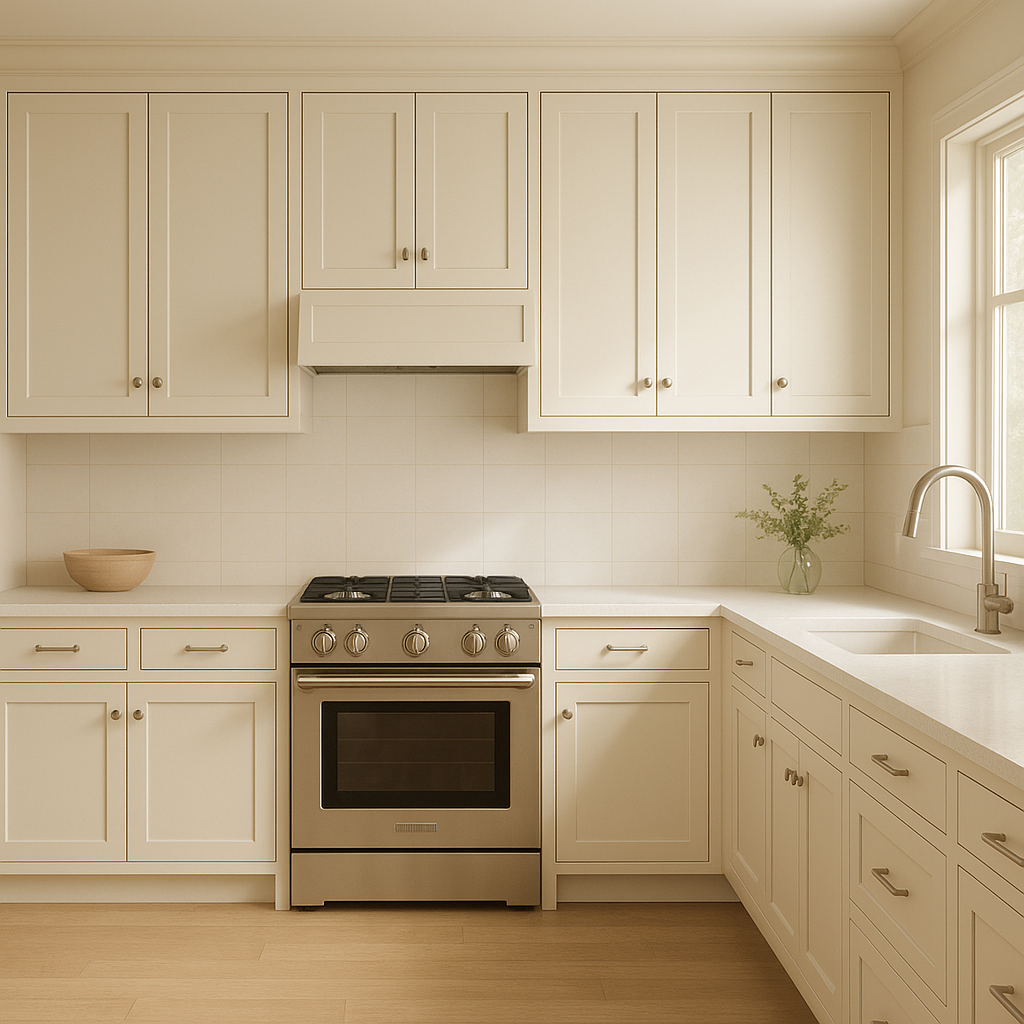
In a kitchen, Winter can be used on cabinetry or walls to achieve a clean, timeless look. Pair it with matte black hardware or polished brass finishes for a touch of modern sophistication.
The subtle warmth of Winter makes it a perfect choice for bathrooms, especially when paired with white subway tile or marble. It creates a spa-like ambiance without feeling cold or sterile.
Winter works beautifully as a trim or ceiling color when paired with deeper hues on the walls, such as pale grays or muted blues. Its soft undertones create a smooth transition and add depth to your space.
For open-concept spaces, Winter can act as a unifying color that ties together multiple areas. Its neutral appeal ensures that it complements different zones while maintaining a cohesive flow.
Benjamin Moore Winter (2163-70) is more than just an off-white—it’s a versatile, elegant hue that adapts to your style while maintaining its timeless appeal. Whether you're creating a cozy retreat, refreshing a high-traffic area, or designing a serene space for relaxation, Winter's subtle warmth and adaptability make it an excellent choice for any home.
Its ability to pair seamlessly with a range of coordinating colors allows you to customize your design while maintaining harmony. From bold accents to soft neutrals, Winter is a color that will elevate your space and stand the test of time.
View Colors Only by Brand (No Imagery):
Sherwin-Williams
|
Benjamin-Moore
|
Behr
|
Valspar
Live on the Eastern Slope of Colorado and looking for a local painting professional, check out all our painting services and reach out for a free estimate.
Copyright © 2026 : Wild Fox Painting Inc. : 12435 Mead Way, Littleton, CO 80125


