Benjamin Moore Butter (2165-70) is a soft, creamy yellow that evokes feelings of warmth, comfort, and timeless elegance. Aptly named, this color has a buttery quality that adds a subtle richness to any space, making it an excellent choice for homeowners looking to create an inviting atmosphere. With its understated yet cheerful personality, Butter is versatile enough to work in both traditional and modern interiors.
Butter is a gentle yellow with warm undertones that lean towards a creamy beige. It doesn’t veer into bright or overly saturated territory, making it a subdued yet sunny color choice. Its warmth ensures it won’t feel stark or cold, while the beige undertone lends it a grounded and classic feel. The undertones help Butter maintain its versatility, ensuring it complements a wide range of palettes without overpowering the space.
Butter pairs beautifully with a variety of colors, thanks to its warm and neutral qualities. Here are some coordinating options to enhance its appeal:
Neutral Pairings: For an understated and cohesive look, pair Butter with creamy whites like Benjamin Moore White Dove (OC-17) or Simply White (OC-117). These soft neutrals create a clean and airy feel, ideal for spaces like kitchens, bathrooms, or living rooms.
Earthy Tones: Enhance the warm undertones of Butter by coordinating it with earthy hues like Benjamin Moore Grant Beige (HC-83) or Lenox Tan (HC-44). These combinations work well in traditional spaces, creating a cozy and grounded aesthetic.
Accent Colors: For a pop of color, consider pairing Butter with muted blues such as Benjamin Moore Quiet Moments (1563) or greens like Benjamin Moore Soft Fern (2144-40). These cooler tones add balance while introducing depth and personality to the space.
Dark Contrasts: If you’re aiming for bold sophistication, pair Butter with deep, dramatic shades like Benjamin Moore Kendall Charcoal (HC-166) or Black Ink (2127-20). This high-contrast palette adds visual intrigue and works well in contemporary or transitional designs.
Butter’s gentle warmth makes it an ideal choice for a variety of spaces and design styles. Here are some creative ways to incorporate this color into your interiors:
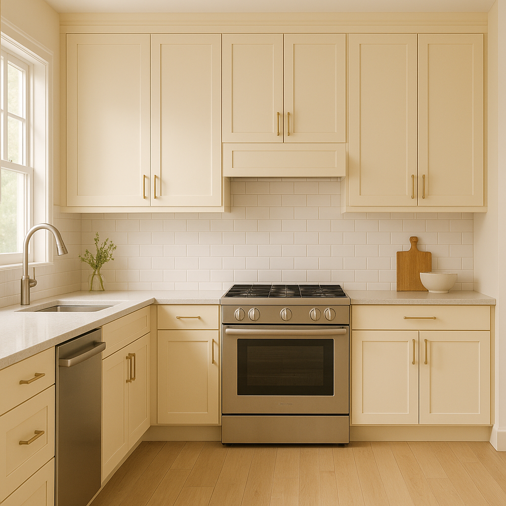
Kitchen Walls or Cabinets: Butter brings a sunny charm that’s perfect for kitchens. Use it for walls to brighten the space, or as a cabinet color to create a farmhouse-inspired aesthetic with a modern twist.
Living Rooms: In living areas, Butter creates a welcoming ambiance that feels cozy yet sophisticated. Pair it with plush neutral furniture and natural wood tones for a balanced and timeless look.
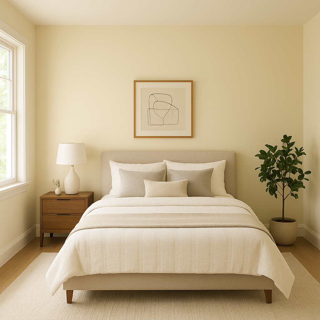
Bedrooms: This creamy yellow is soothing enough for bedrooms, promoting relaxation while adding a subtle dose of cheer. Pair it with soft textiles in whites, taupes, or light pastels for a serene retreat.
Nurseries and Kids' Rooms: Butter’s playful yet refined tone makes it a great option for nurseries or children’s rooms. Combine it with soft greens, blues, or whimsical patterns for a delightful and nurturing environment.
Bathrooms: Butter can bring warmth and elegance to bathrooms, especially when paired with crisp white tiles, polished chrome fixtures, and natural stone accents.
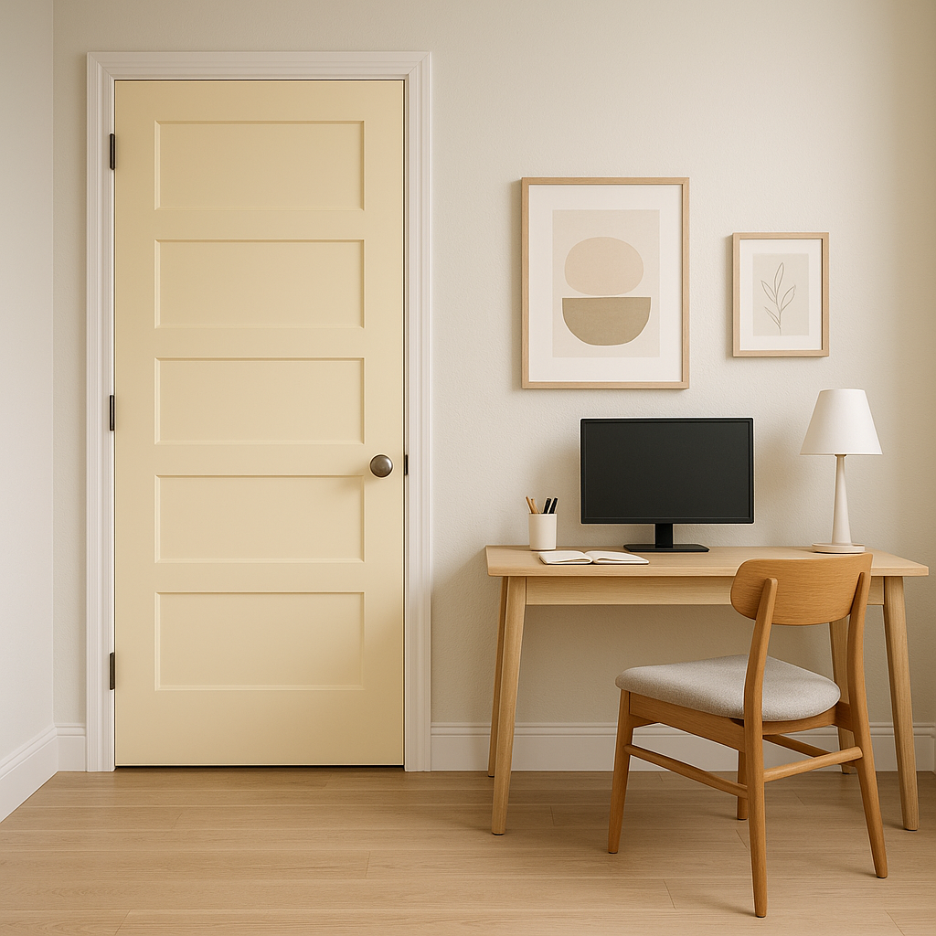
Accent Wall or Furniture: For a more restrained use of Butter, consider incorporating it as an accent color on one wall, a piece of furniture, or even small décor items like lamps or picture frames.
Butter strikes the perfect balance between warm and neutral, making it a highly adaptable color that suits a wide variety of design preferences. Its understated charm allows it to work equally well in formal spaces and casual areas, and its ability to coordinate effortlessly with other hues makes it a reliable choice for any color palette. Whether you’re aiming to brighten a room or add a touch of welcoming warmth, Benjamin Moore Butter (2165-70) is a timeless option that will elevate your interior design.
View Colors Only by Brand (No Imagery):
Sherwin-Williams
|
Benjamin-Moore
|
Behr
|
Valspar
Live on the Eastern Slope of Colorado and looking for a local painting professional, check out all our painting services and reach out for a free estimate.
Copyright © 2026 : Wild Fox Painting Inc. : 12435 Mead Way, Littleton, CO 80125


