
Benjamin Moore Creamy (2166-50) is a soft, welcoming shade that exudes understated elegance and versatility. Perfectly balanced between warm and cool tones, this creamy beige has a gentle richness that makes it feel both comforting and sophisticated. Whether you're designing a cozy living space or a serene bedroom retreat, Creamy provides a blank canvas that harmonizes effortlessly with a variety of design styles, from traditional to modern.
Creamy (2166-50) is a warm neutral with subtle yellow and tan undertones. These undertones lend a sunny disposition to the color, making it feel inviting and cheerful without being overpowering. The warmth in this shade prevents it from reading as stark or sterile, ensuring it maintains a "lived-in" feel that works beautifully in spaces meant to relax and rejuvenate. However, its yellow undertones are soft and muted, so the color remains refined rather than overly saturated. This delicate balance of warmth and brightness makes Creamy an excellent choice for spaces that need a touch of warmth without veering into golden or overly beige territory.
Benjamin Moore Creamy pairs seamlessly with a variety of colors, making it a versatile choice for both monochromatic palettes and bold contrasts. Here are some coordinating options:
Creamy’s versatility makes it a standout choice for nearly every room in your home. Its warmth and subtle undertones allow it to adapt to different lighting conditions, creating a cozy and inviting atmosphere. Below are some of its ideal applications:
Creamy is the perfect backdrop for living rooms, lending a sense of comfort and sophistication. Pair it with soft neutrals like taupe or gray for a cohesive look, or introduce bold accents like navy or emerald green for an eye-catching design. Its warm undertones work well with natural wood furniture and textures like linen or jute.
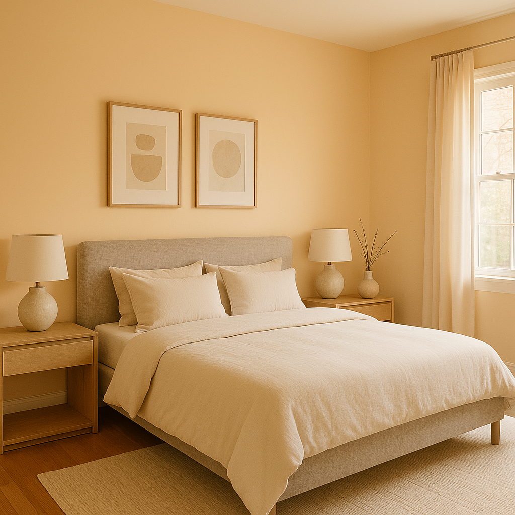
Bring tranquility to your bedroom with Creamy’s soothing presence. This color promotes restfulness and relaxation. Complement it with crisp white bedding, soft pastel accents, or muted metallics like brushed gold or antique brass for a chic, serene vibe.
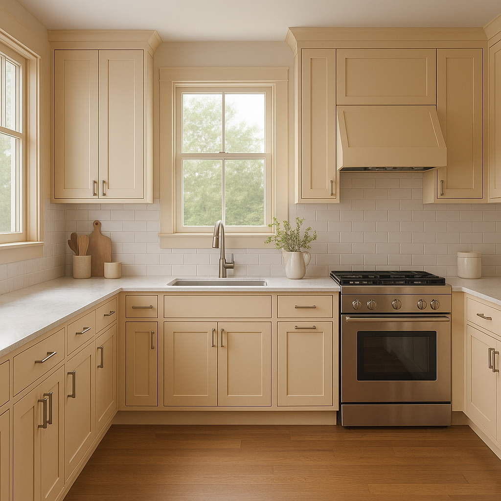
Creamy's warm undertones shine in kitchens, especially when paired with white cabinetry and natural stone countertops. It creates a welcoming atmosphere that’s perfect for entertaining or enjoying quiet mornings. Add depth with darker accents like slate blue or charcoal gray in hardware or backsplash tiles.
Transform your bathroom into a spa-like retreat with Creamy on the walls. Pair it with gleaming white tiles, chrome fixtures, and soft green or blue accents for a fresh and inviting look.
Creamy is an excellent choice for transitional spaces like hallways and entryways. Its neutral tone helps unify the design flow of your home while making these areas feel bright and open. Pair it with elegant lighting fixtures and textured rugs for added dimension.
Benjamin Moore Creamy (2166-50) is a timeless neutral that offers warmth, versatility, and sophistication. Its ability to adapt to different lighting and pair effortlessly with a wide range of colors makes it a favorite among interior designers and homeowners alike. Whether you're looking to create a cozy atmosphere or a polished, elegant space, Creamy is the perfect foundation for your design vision.
View Colors Only by Brand (No Imagery):
Sherwin-Williams
|
Benjamin-Moore
|
Behr
|
Valspar
Live on the Eastern Slope of Colorado and looking for a local painting professional, check out all our painting services and reach out for a free estimate.
Copyright © 2026 : Wild Fox Painting Inc. : 12435 Mead Way, Littleton, CO 80125


