Benjamin Moore Pale (2166-60) is a soft and serene neutral that effortlessly evokes a sense of understated elegance. This delicate hue sits at the intersection of beige and cream, offering a subtle warmth that transforms any space into a soothing retreat. Its versatility makes it an ideal choice for both modern and traditional interiors, seamlessly complementing a variety of design styles. Whether you're aiming to create a cozy living room, a tranquil bedroom, or an inviting entryway, Benjamin Moore Pale delivers timeless sophistication.
One of the defining features of Benjamin Moore Pale is its gentle warmth, enhanced by soft yellow undertones. These undertones provide a touch of brightness, ensuring the color feels fresh and airy rather than flat or overly muted. Pale has a creamy richness that prevents it from feeling stark, making it a perfect alternative to cooler neutrals like gray. The subtle yellow undertones work harmoniously with natural light, giving rooms a luminous quality during the day while maintaining coziness under artificial lighting at night.
Benjamin Moore Pale is a team player when it comes to coordinating with other hues. Its adaptable nature allows it to pair beautifully with a range of colors, creating harmonious palettes for any design vision. Here are some coordinating colors to consider:
Deep Accents: For a bold and dramatic contrast, pair Pale with rich, saturated hues like Benjamin Moore Hale Navy (HC-154) or Kendall Charcoal (HC-166). These deeper tones create a striking visual impact, perfect for accent walls or furniture pieces.
Soft Complements: Enhance the subtle warmth of Pale by pairing it with gentle pastels and softer hues like Benjamin Moore Gray Mist (962) or Morning Dew (1493). These combinations result in a serene and cohesive look, ideal for bedrooms or spa-like bathrooms.
Earthy Neutrals: Create a grounded and organic aesthetic by combining Pale with earthy tones like Benjamin Moore Edgecomb Gray (HC-173) or Revere Pewter (HC-172). These pairings work particularly well in living rooms or open-concept spaces.
Crisp Whites: To modernize the look, pair Pale with clean, crisp whites such as Benjamin Moore Chantilly Lace (OC-65) or Simply White (OC-117). This combination creates a fresh and timeless feel, perfect for kitchens or entryways.
Benjamin Moore Pale is a versatile shade that works across a variety of settings and applications. Its soft, neutral nature makes it ideal for spaces where you want a welcoming yet unobtrusive backdrop. Below are some ways to use this color effectively:
Pale creates a warm and inviting atmosphere in living rooms, serving as an excellent canvas for layering textures and accent colors. Pair it with natural wood furniture, woven textiles, and pops of color in throw pillows or artwork for a cozy, curated look.
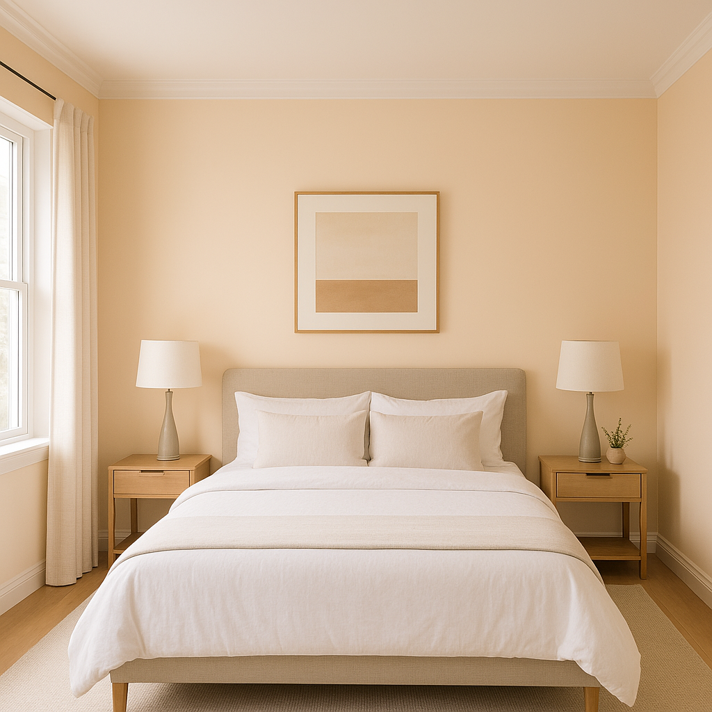
The soothing undertones of Pale make it a perfect choice for bedrooms. Use it to establish a tranquil environment that promotes relaxation. Pair the color with soft pastels or muted greens for a restful retreat.
Bring a sense of spa-like serenity to your bathroom by using Pale on the walls. Pair it with marble countertops, brushed nickel fixtures, and a crisp white trim for a luxurious and rejuvenating feel.
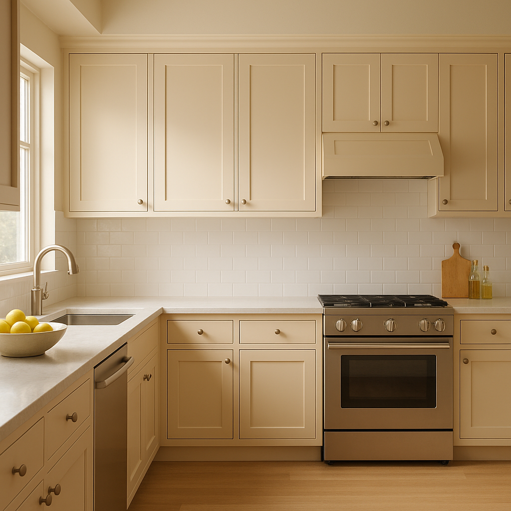
Benjamin Moore Pale is a standout choice for kitchens, especially when paired with white cabinetry and natural wood accents. Its subtle warmth complements stainless steel appliances and stone countertops beautifully.
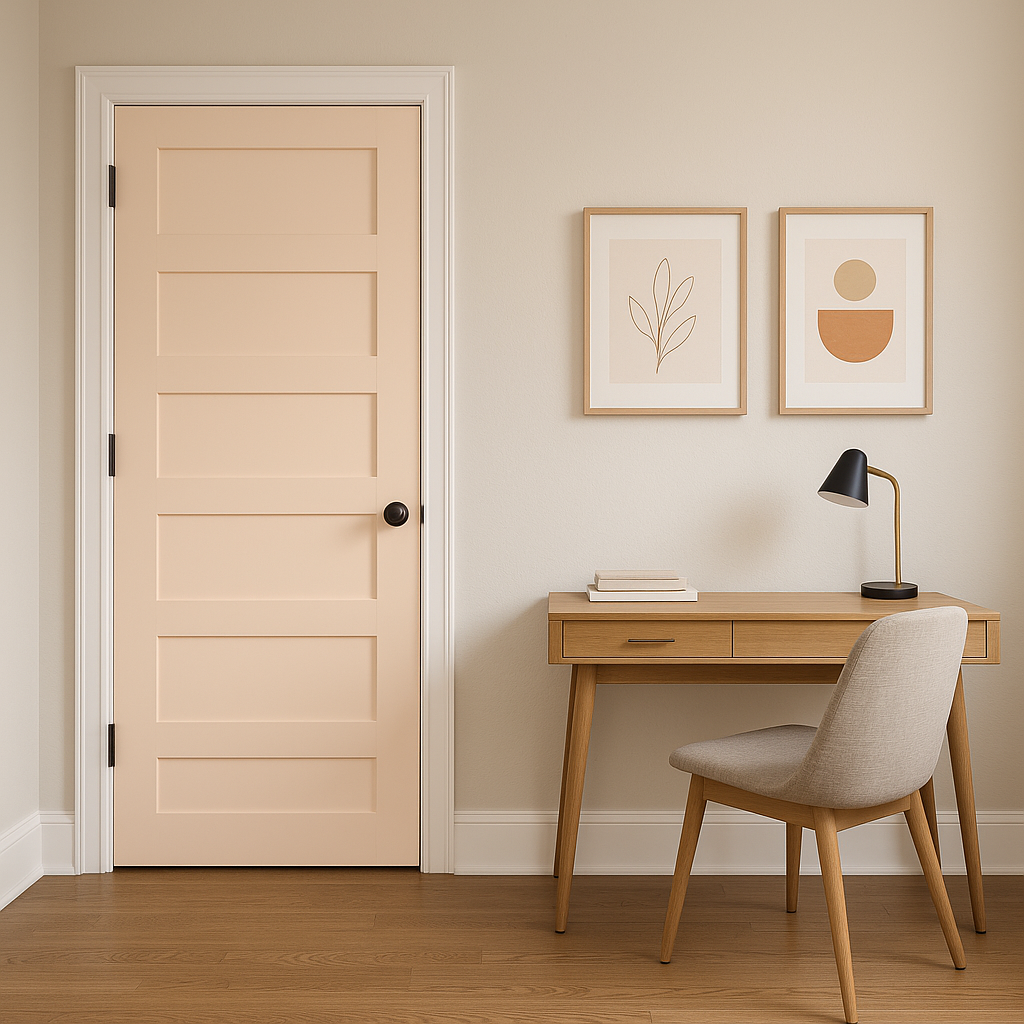
Enhance smaller spaces like hallways or entryways with the subtle brightness of Pale. Its ability to reflect light makes narrow or dim areas feel more expansive and welcoming.
If you're seeking a neutral paint color that exudes warmth, sophistication, and versatility, Benjamin Moore Pale (2166-60) is an excellent choice. Its gentle yellow undertones, ability to coordinate with a wide range of colors, and adaptability across various rooms make it a timeless favorite for homeowners and interior designers alike. Whether you're revamping a single space or designing an entire home, Benjamin Moore Pale delivers both style and functionality, creating interiors that feel effortlessly elegant yet supremely comfortable.
View Colors Only by Brand (No Imagery):
Sherwin-Williams
|
Benjamin-Moore
|
Behr
|
Valspar
Live on the Eastern Slope of Colorado and looking for a local painting professional, check out all our painting services and reach out for a free estimate.
Copyright © 2026 : Wild Fox Painting Inc. : 12435 Mead Way, Littleton, CO 80125


