Benjamin Moore Adobe (2166-70) is a timeless and versatile neutral paint color that exudes warmth, comfort, and sophistication. This sandy beige hue draws inspiration from the earthy tones found in natural adobe clay, making it a perfect choice for creating inviting interiors with a grounded and organic feel. Its ability to seamlessly complement a wide range of design styles—from traditional to modern—makes it a favorite among interior designers and homeowners alike.
Adobe (2166-70) has subtle warm undertones that lean towards a soft peachy beige. These undertones add depth and richness to the color, ensuring it never feels flat or overly stark. The warmth in Adobe makes it an excellent option for spaces where you want to create a cozy and welcoming atmosphere. While it’s primarily a neutral, the peachy hints give it a touch of personality, helping it stand out from other beige tones without overwhelming the space.
The undertones also shift slightly depending on lighting conditions. In rooms with ample natural light, Adobe appears lighter and airier, while in dimmer spaces, the warmth becomes more pronounced, casting a soothing glow.
Benjamin Moore Adobe pairs beautifully with a variety of complementary and accent colors. Its neutral warmth makes it a versatile backdrop for both muted and bold palettes. Here are some coordinating options to consider:
For bold pops of color, Adobe also works well with terracotta, deep navy, or golden yellows, making it an excellent base for eclectic or global-inspired designs.
Benjamin Moore Adobe is incredibly versatile and can be used in almost any room of the house. Here are some ideas for incorporating this warm neutral into your interior spaces:
Adobe is a superb choice for living rooms where you want to set a relaxed yet refined tone. Use it as the main wall color and pair it with plush furniture in complementary hues. Add texture with natural materials like jute rugs, woven baskets, and wooden accents to enhance its earthy charm.
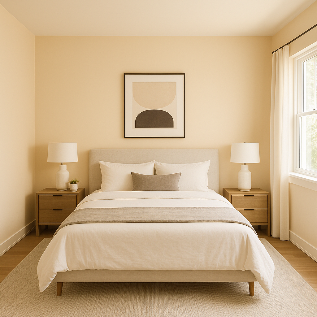
Transform your bedroom into a cozy retreat by using Adobe on the walls. Its warm undertones create a soothing environment perfect for rest and relaxation. Pair it with soft linens in whites or muted greens for a serene vibe, or introduce darker accent colors for a striking contrast.
For dining spaces that feel welcoming and elegant, Adobe is an excellent choice. It works beautifully alongside wood furniture and metallic accents like brass or copper, creating an elevated yet approachable atmosphere.
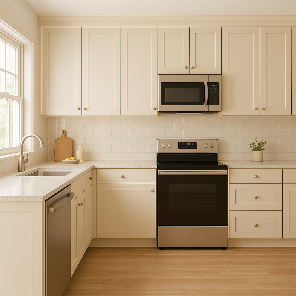
Adobe can bring warmth to kitchens and bathrooms without overpowering the space. Use it on walls or cabinetry and pair it with white subway tiles, natural stone countertops, or brushed nickel fixtures for a balanced and timeless look.
Make a great first impression by using Adobe in entryways or hallways. Its neutral tone ensures a bright and inviting space while providing a subtle backdrop for artwork or decorative accents.
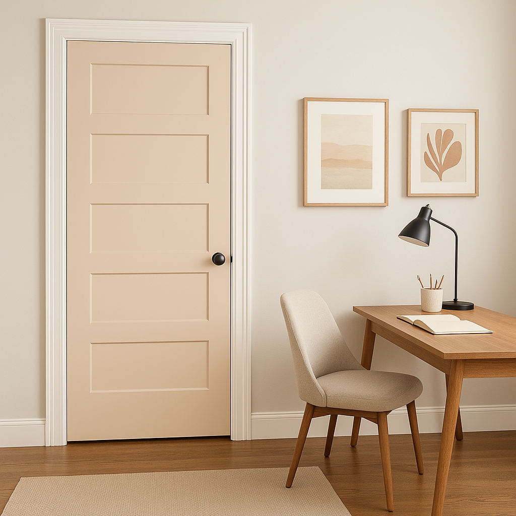
If you’re designing a home office, Adobe’s warm and grounding qualities can help foster focus and productivity. Pair it with sleek furniture and minimalist décor for a clean yet inspiring workspace.
Benjamin Moore Adobe is more than just a neutral; it’s a color that brings warmth, sophistication, and versatility to any space. Its ability to adapt to different lighting conditions and pair effortlessly with a wide range of coordinating colors makes it a reliable choice for both small and large-scale design projects. Whether you’re looking to refresh your walls, create a cozy retreat, or design an elegant entertaining space, Adobe offers the perfect balance of warmth and neutrality.
View Colors Only by Brand (No Imagery):
Sherwin-Williams
|
Benjamin-Moore
|
Behr
|
Valspar
Live on the Eastern Slope of Colorado and looking for a local painting professional, check out all our painting services and reach out for a free estimate.
Copyright © 2026 : Wild Fox Painting Inc. : 12435 Mead Way, Littleton, CO 80125


