Benjamin Moore Pumpkin (2167-20) is a rich, warm orange that perfectly encapsulates the cozy charm and earthy vibrance of fall. With its bold yet approachable personality, this color evokes the essence of freshly carved pumpkins, autumn leaves, and the comforting glow of seasonal decor. Whether you’re looking to energize a space or create a grounding atmosphere, Pumpkin is a versatile choice that brings warmth and life to any room.
Pumpkin (2167-20) carries warm golden undertones that enhance its inviting nature, making it feel sunlit and cheerful. These subtle yellow undertones soften the intensity of the orange, ensuring it doesn’t feel overly bright or overwhelming. At the same time, it has earthy red-brown notes that ground the shade and lend it a rustic, natural aesthetic. These undertones make Pumpkin a dynamic shade that feels equally at home in traditional, farmhouse, or contemporary interiors.
When designing with Benjamin Moore Pumpkin, selecting complementary colors can help create a balanced and harmonious palette. Here are some suggestions for coordinating colors:
Neutral Pairings: Pair Pumpkin with soft neutrals like White Dove (OC-17) or Cloud White (967) for a fresh, clean look that allows the orange to take center stage. Creamy whites and beige tones also work well to soften its vibrancy.
Earthy Complements: Enhance its natural warmth with deep browns like Kendall Charcoal (HC-166) or muted greens such as Sagebrush (CC-646). These earthy hues create an organic, grounded feel.
Bold Contrasts: For a more dramatic aesthetic, pair Pumpkin with a rich navy like Hale Navy (HC-154) or a deep charcoal such as Black Panther (2125-10). These darker tones provide a striking contrast that makes the orange pop.
Accent Colors: Add hints of golden yellow, such as Hawthorne Yellow (HC-4), or warm reds like Caliente (AF-290) to create a cohesive, autumn-inspired palette.
Pumpkin (2167-20) is an incredibly versatile shade that can infuse warmth and personality into a variety of spaces. Here’s how you can use it in your home:
Pumpkin is perfect for creating a cozy, inviting atmosphere in living rooms or family spaces. Use it on accent walls to bring focus to one area of the room, such as behind a fireplace or a bookshelf. Pair it with neutral furniture and accessories to balance its vibrancy, or layer it with earthy tones for a rustic vibe.
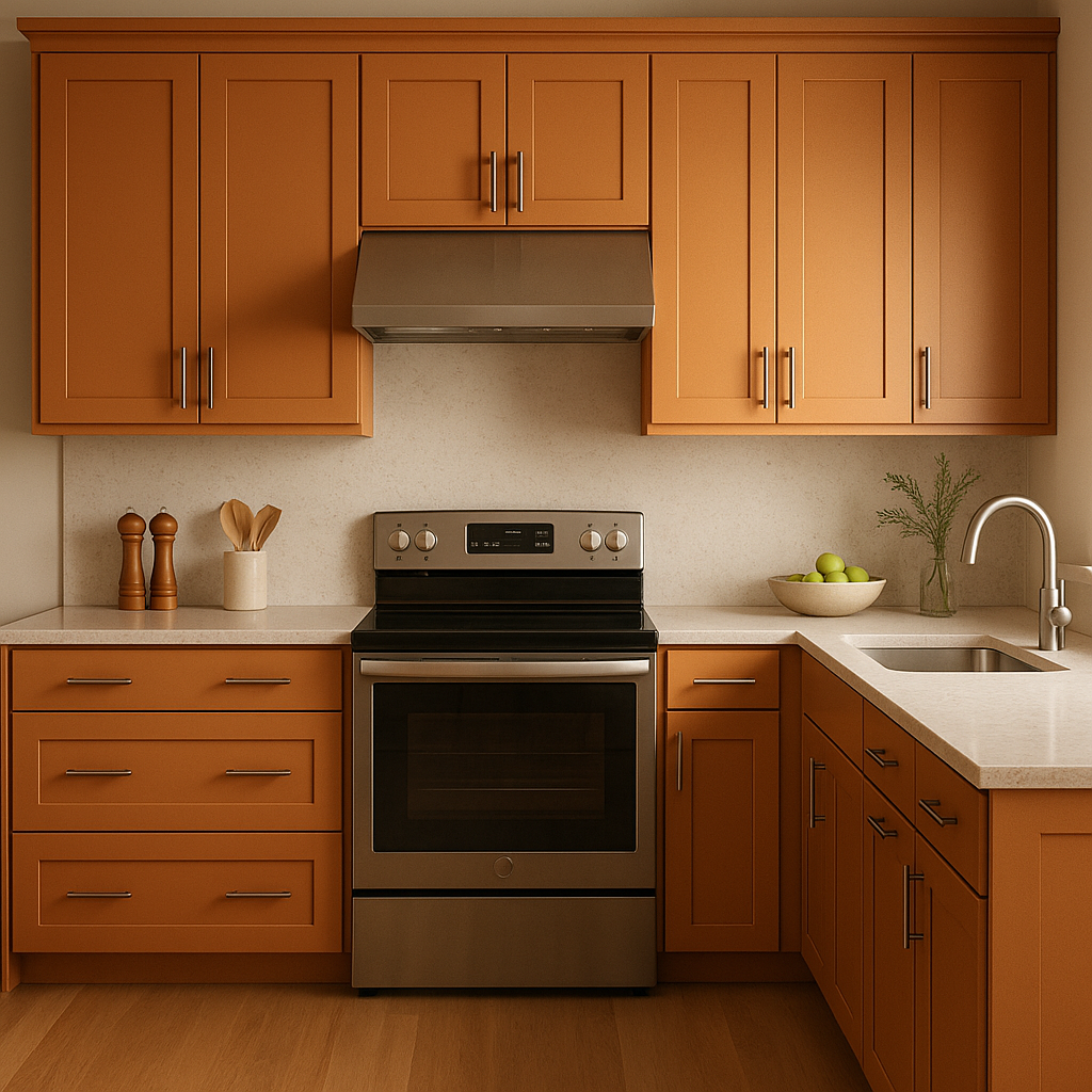
As a warm and energizing color, Pumpkin works beautifully in kitchens and dining areas. It can be used on cabinetry or walls to create a lively space that encourages conversation and connection. Pair it with wood finishes, such as oak or walnut, for an organic look that feels timeless.
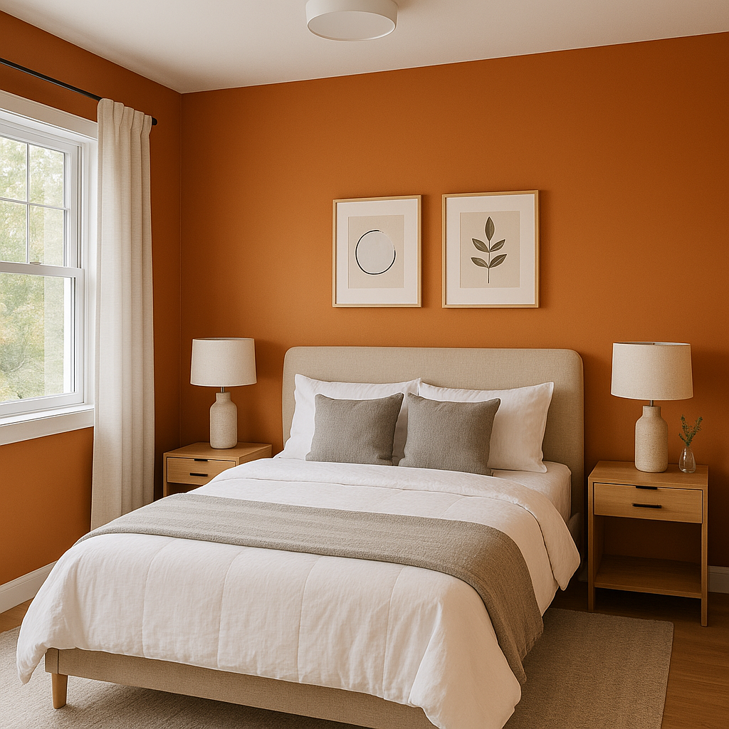
While bold, Pumpkin can be softened in bedrooms when paired with creamy whites, plush textiles, and warm lighting. Use it sparingly as an accent color on furniture, bedding, or decor to bring warmth without overpowering the space.
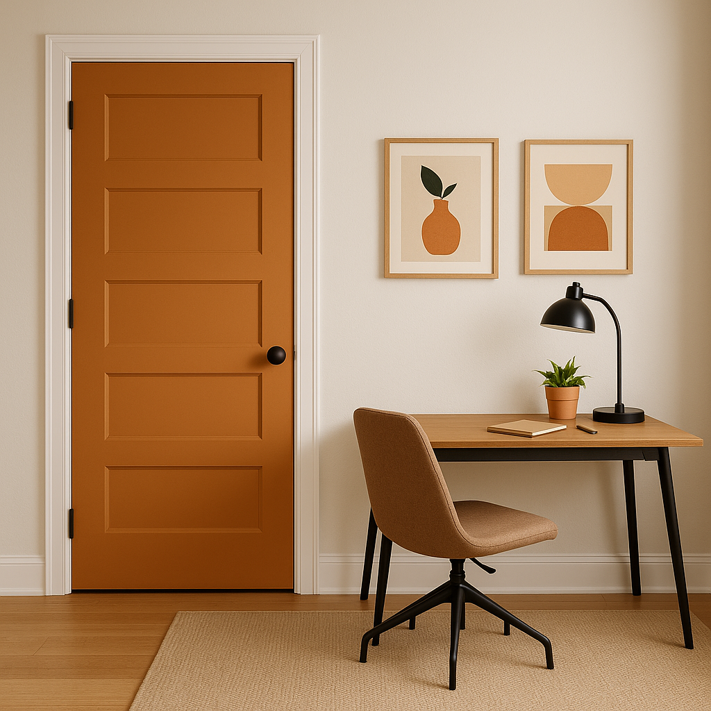
Make a bold first impression by incorporating Pumpkin in your entryway or hallway. Its uplifting hue is perfect for welcoming guests and creating a sense of warmth and hospitality. Pair it with crisp white trim to keep the space feeling fresh and balanced.
Pumpkin isn’t just for interiors—it’s a fantastic choice for exteriors as well. Consider it for a front door or shutters to create a cheerful and inviting curb appeal. When surrounded by natural greenery, its earthy undertones shine, making it a great choice for homes in rural or suburban settings.
Benjamin Moore Pumpkin (2167-20) is more than just a color—it's a mood. Its warm, saturated tones exude friendliness and vitality, making it ideal for spaces where connection and comfort are key. Whether you're designing a rustic retreat, a vibrant kitchen, or an eye-catching accent wall, Pumpkin effortlessly brings warmth and personality to any environment. With its golden undertones and versatile pairing options, it's a shade that feels timeless yet modern, bold yet approachable.
Embrace the charm and energy of Benjamin Moore Pumpkin in your next design project to create a space that radiates warmth, sophistication, and seasonal beauty.
View Colors Only by Brand (No Imagery):
Sherwin-Williams
|
Benjamin-Moore
|
Behr
|
Valspar
Live on the Eastern Slope of Colorado and looking for a local painting professional, check out all our painting services and reach out for a free estimate.
Copyright © 2026 : Wild Fox Painting Inc. : 12435 Mead Way, Littleton, CO 80125


