Benjamin Moore Pumpkin (2168-20) is a radiant, earthy orange that exudes the warmth and vibrancy of autumn's most iconic fruit. Energizing yet grounded, this rich color combines bold personality with timeless appeal, making it an excellent choice for a variety of interior spaces. With its inviting charm, Pumpkin can easily transform a room into a cozy retreat or a spirited focal point.
Pumpkin features subtle golden-yellow undertones that enhance its warmth and luminosity. These undertones give the color a slightly sunlit glow, making it feel cheerful and dynamic while retaining its earthy essence. The golden notes soften the boldness of the orange, ensuring that it doesn’t feel overwhelming, even when used in larger applications.
To maximize the impact of Benjamin Moore Pumpkin, pair it with complementary or contrasting colors that balance its intensity. Here are some ideas for coordinating hues:
Neutral Pairings:
To tone down the vibrancy and create a harmonious look, opt for soft neutrals like Benjamin Moore White Dove (OC-17) or Benjamin Moore Cloud Cover (OC-25). These creamy whites provide a calming backdrop while allowing Pumpkin to take center stage.
Earthy Complements:
Enhance the organic feel by pairing Pumpkin with earthy tones such as Benjamin Moore Tate Olive (HC-112) or Benjamin Moore Briarwood (HC-175). These shades evoke the natural beauty of autumn landscapes.
Contrasting Blues:
For a striking visual impact, combine Pumpkin with deep blues like Benjamin Moore Hale Navy (HC-154) or Benjamin Moore Newburyport Blue (HC-155). The coolness of blue creates a bold juxtaposition that energizes the space.
Warm Accents:
Amplify the warmth by incorporating golden yellows such as Benjamin Moore Concord Ivory (HC-12) or rich browns like Benjamin Moore Wenge (AF-180). These tones reinforce the cozy, autumnal aesthetic.
Benjamin Moore Pumpkin is a versatile color that can be used to add personality and warmth to various rooms and design styles. Here are some ideas for incorporating Pumpkin into your space:
Pumpkin is perfect for creating a welcoming and lively living room. Use it on an accent wall to bring energy to the space while pairing it with neutral furniture and decor for balance. Add throw pillows and rugs with earthy patterns to tie the look together.
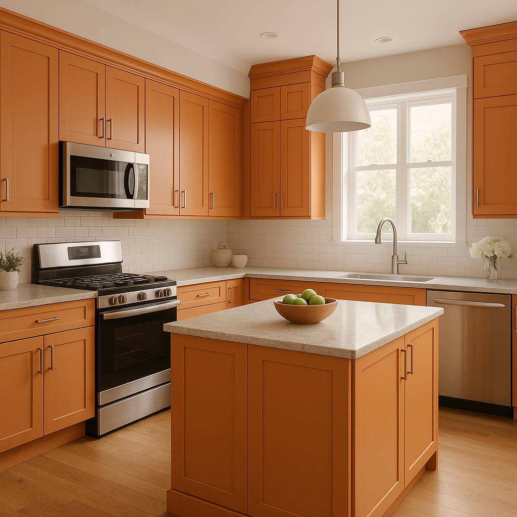
Infuse a sense of warmth into kitchens or dining rooms by using Pumpkin on cabinetry, islands, or even walls. The hue pairs beautifully with wood finishes, brass hardware, and natural stone countertops, creating a rustic yet sophisticated ambiance.
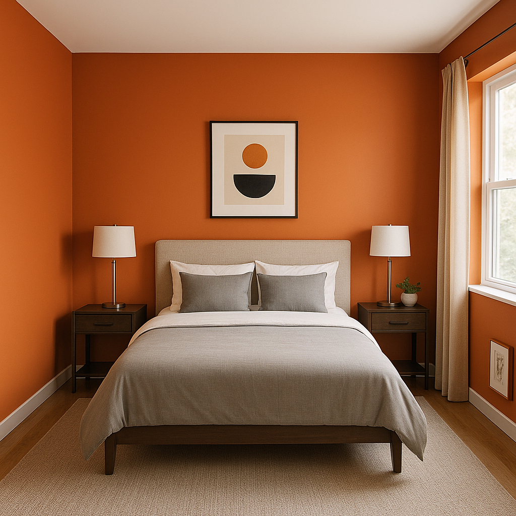
While bold, Pumpkin can also work in bedrooms when used thoughtfully. Consider incorporating it as an accent color on bedding, curtains, or a statement piece of furniture. Pair it with soft whites and muted greens for a serene yet cozy retreat.
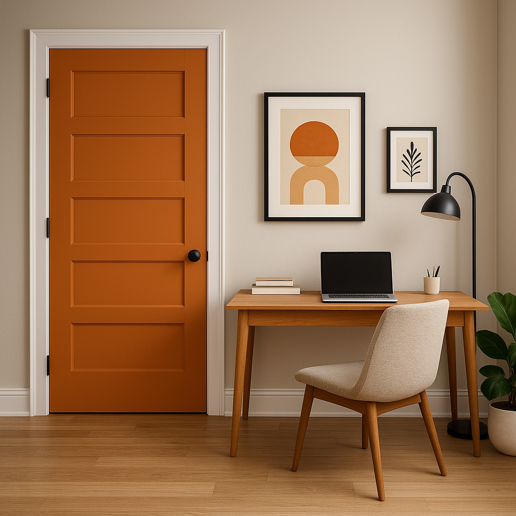
Pumpkin can energize a home office, making it an ideal choice for those who want a productive yet creative environment. Use it sparingly on a feature wall or decorative accessories to avoid overstimulation.
Make a bold first impression with Pumpkin in your entryway or foyer. Its warm, welcoming nature will set the tone for the rest of your home, especially when paired with neutral trim and natural textures like wood or stone.
Benjamin Moore Pumpkin fits seamlessly into various design aesthetics:
Benjamin Moore Pumpkin (2168-20) is more than just a color; it’s a statement. With its golden undertones, versatile pairing options, and ability to warm up any space, this hue is a fantastic choice for those looking to bring a touch of autumn’s charm into their home year-round.
View Colors Only by Brand (No Imagery):
Sherwin-Williams
|
Benjamin-Moore
|
Behr
|
Valspar
Live on the Eastern Slope of Colorado and looking for a local painting professional, check out all our painting services and reach out for a free estimate.
Copyright © 2026 : Wild Fox Painting Inc. : 12435 Mead Way, Littleton, CO 80125


