
Benjamin Moore Autumn (2170-30) is a rich, earthy orange that exudes warmth, comfort, and subtle sophistication. This stunning shade captures the essence of the fall season, evoking images of golden leaves, cozy gatherings, and the soft glow of autumnal light. With its robust yet approachable personality, Autumn is a versatile color that can transform any space into an inviting sanctuary.
Autumn (2170-30) is more than just a simple orange; it carries nuanced undertones that bring depth and complexity to the shade. Its warm base is balanced with soft brown undertones, giving it an earthy, grounded quality. There’s also a faint hint of red, which adds vibrancy and a touch of energy to the color without overpowering its overall warmth. These undertones make Autumn a versatile choice for spaces that need a balance of boldness and comfort.
Benjamin Moore Autumn pairs beautifully with a variety of complementary and contrasting shades, offering endless possibilities for crafting cohesive color schemes. Here are some standout coordinating colors:
Neutral Companions: Pair Autumn with soft neutrals like Benjamin Moore White Dove (OC-17) or Edgecomb Gray (HC-173) to create a balanced and serene backdrop. These lighter hues help highlight the warmth and richness of Autumn while keeping the palette airy and approachable.
Earthy Complements: Enhance the natural feel of Autumn by combining it with earthy tones like Chelsea Gray (HC-168) or Revere Pewter (HC-172). These muted shades bring a sense of harmony and sophistication to the overall design.
Bold Contrasts: For a bolder look, pair Autumn with deep blues such as Hale Navy (HC-154) or a deep green like Salamander (2050-10). The contrast between the warm orange and cool jewel tones creates a striking and dynamic effect.
Warm Accent Colors: Amplify the cozy vibe by adding warm accent colors like Rust (2175-30) or Dijon (193). These shades work seamlessly with Autumn, enhancing its fiery undertones for a cohesive and inviting palette.
Autumn (2170-30) is a versatile paint color that can be used in a variety of settings to evoke warmth and character. Here are some ways to incorporate it into your home:
Autumn creates a cozy, inviting atmosphere in living rooms and family spaces. Its warm, earthy tones make it perfect for areas where people gather, encouraging relaxation and connection. Pair it with textured fabrics, natural wood furniture, and soft lighting to enhance the room's comforting ambiance.
As a color that stimulates both appetite and conversation, Autumn is an excellent choice for dining rooms. Its rich hue brings a sense of warmth and intimacy to mealtimes, making it ideal for creating a space where family and friends can linger over dinner.
If you’re drawn to Autumn but prefer a more subdued approach, consider using it as an accent wall. This allows you to enjoy the vibrancy of the color without overwhelming the space. Pair the accent wall with neutral tones on the surrounding walls to create balance.
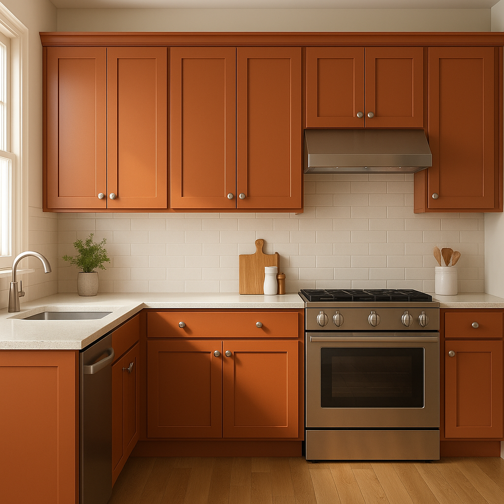
Infuse your kitchen with energy and personality by incorporating Autumn. Whether used on cabinetry, an island, or walls, this color brings warmth and life to the heart of the home. Pair it with natural materials like butcher block countertops or stone backsplashes for a cohesive look.
Autumn is a fantastic choice for a front door or exterior accent. Its rich, welcoming hue makes an inviting statement that enhances your home’s curb appeal. Combine it with crisp whites or deep grays for a polished and timeless exterior color scheme.
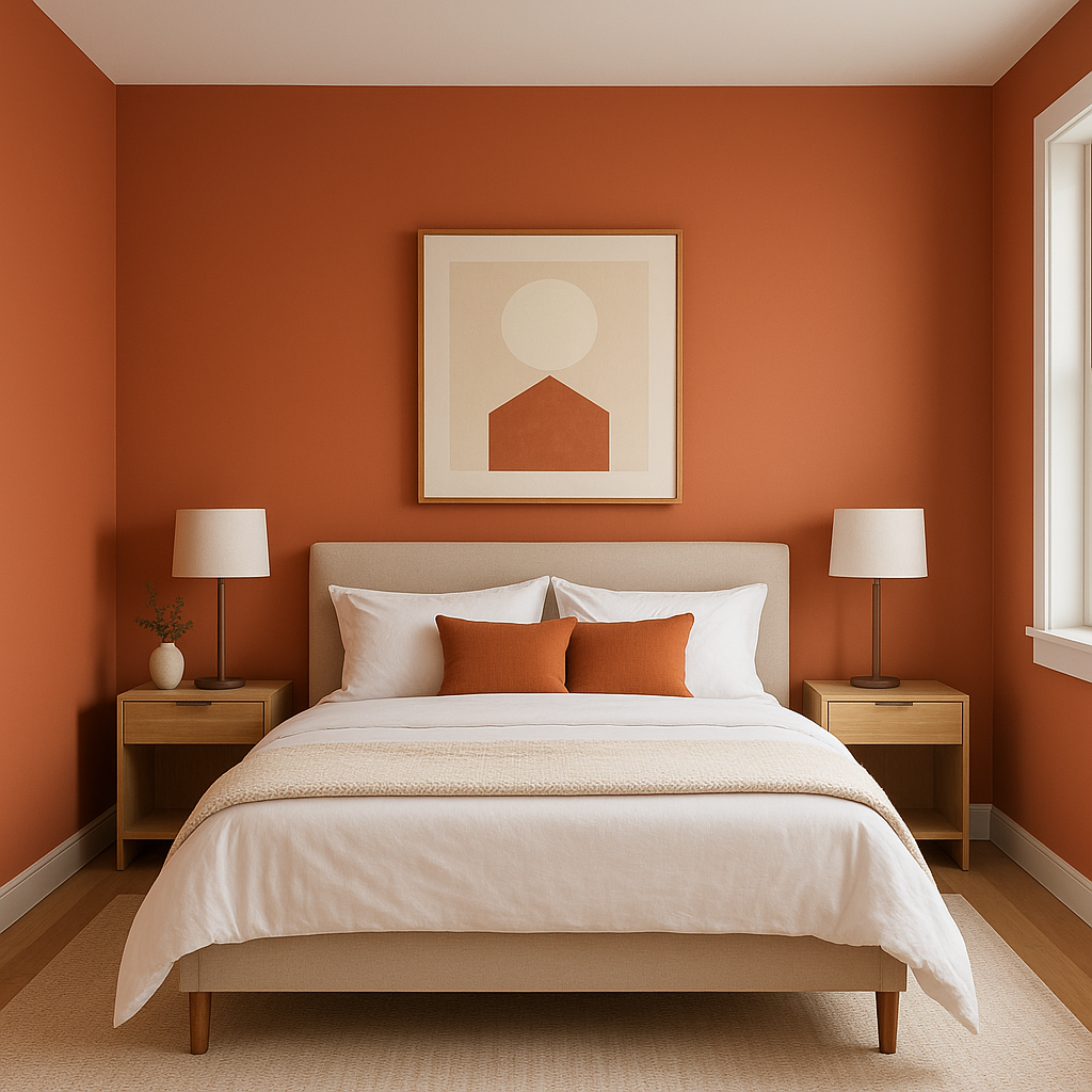
While bold, Autumn can also create a cocooning effect in the bedroom, especially when paired with soft, earthy tones. Use it sparingly on an accent wall or incorporate it through textiles, décor, or furniture to establish a warm and restful retreat.
Lighting plays a significant role in how Benjamin Moore Autumn appears in your space. In natural light, the color leans towards a vibrant, golden orange, while in artificial lighting, the brown undertones become more pronounced, creating a cozier and slightly muted effect. Always test the color in your specific lighting conditions to ensure it achieves the desired look.
Benjamin Moore Autumn (2170-30) is a color that radiates warmth, energy, and versatility. Whether used as the main hue or as an accent, it brings a sense of timeless comfort to any space. By understanding its undertones, coordinating colors, and best uses, you can confidently incorporate this rich shade into your design and create a home that feels welcoming and inspired.
View Colors Only by Brand (No Imagery):
Sherwin-Williams
|
Benjamin-Moore
|
Behr
|
Valspar
Live on the Eastern Slope of Colorado and looking for a local painting professional, check out all our painting services and reach out for a free estimate.
Copyright © 2026 : Wild Fox Painting Inc. : 12435 Mead Way, Littleton, CO 80125


