

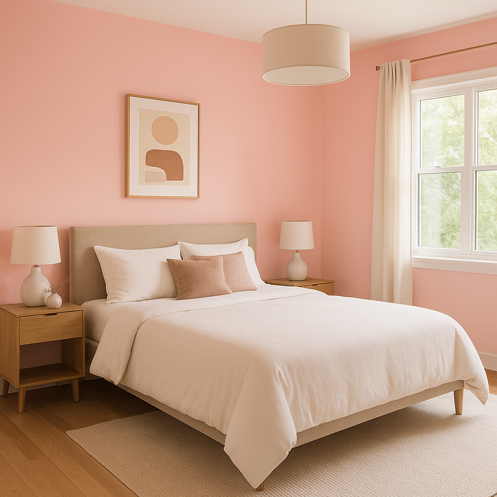
Benjamin Moore Pearly (2171-50) is a delicate, warm neutral that radiates sophistication and charm. This versatile hue captures the essence of understated elegance, offering a creamy, off-white backdrop that gently leans into subtle beige undertones. Pearly is perfect for creating serene and inviting spaces, effortlessly complementing both classic and modern interior designs.
Pearly is characterized by its soft beige undertones, which lend the color a warm and cozy feel. With just the faintest touch of yellow, Pearly avoids appearing overly cool or stark, making it an ideal choice for spaces that need a touch of warmth without becoming overly saturated. The subtle undertones make this shade adaptable, ensuring it harmonizes beautifully with a variety of palettes and lighting conditions.
Benjamin Moore Pearly pairs seamlessly with a range of complementary and contrasting shades, making it a versatile choice for any space. Here are some coordinating colors to consider:
These coordinating colors allow for flexibility in design, whether you’re looking to create a monochromatic space or infuse bold accents.
Thanks to its warm neutrality, Pearly (2171-50) is an incredibly versatile paint color that works in a variety of spaces and applications. Here are some of the best ways to use this shade in your interior design projects:
Benjamin Moore Pearly (2171-50) is an exceptional choice for anyone seeking a neutral that exudes warmth without overwhelming a space. Its ability to adapt to various lighting conditions and its compatibility with a wide range of coordinating colors make it a go-to shade for designers and homeowners alike. Whether you’re creating a cozy, intimate environment or a bright, airy ambiance, Pearly delivers the perfect balance of sophistication and subtlety.
Transform your home with the timeless beauty of Benjamin Moore Pearly—an elegant neutral that elevates any space it graces.
View Colors Only by Brand (No Imagery):
Sherwin-Williams
|
Benjamin-Moore
|
Behr
|
Valspar
Live on the Eastern Slope of Colorado and looking for a local painting professional, check out all our painting services and reach out for a free estimate.
Copyright © 2026 : Wild Fox Painting Inc. : 12435 Mead Way, Littleton, CO 80125


