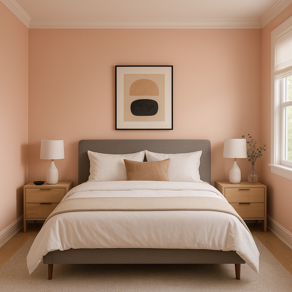
Benjamin Moore Eraser (2174-50) is a soft, muted neutral that exudes elegance and versatility. This understated hue strikes a delicate balance between beige and blush, offering a timeless and approachable option for interiors that prioritize warmth and subtle sophistication. With its gentle presence, Eraser feels equally at home in modern spaces, traditional settings, and transitional designs—making it a favorite among homeowners and interior designers alike.
The beauty of Eraser lies in its nuanced undertones. This color features a faint blush-pink undertone that softens its beige foundation, lending a warm and inviting vibe. These undertones prevent Eraser from feeling overly stark or cold, giving it a cozy aesthetic without veering into overly saturated territory. The blush notes are subtle enough to work as a neutral but distinct enough to add a touch of personality to your space.
This warm undertone makes Eraser particularly appealing for rooms that receive ample natural light, as it reflects a gentle glow that feels serene and welcoming. In dimly lit spaces, the blush undertone may appear slightly richer, creating a more intimate and cocoon-like ambiance.
Eraser’s versatility shines through when paired with complementary and coordinating colors. Its warm blush-beige tones open the door to a range of pairings that can enhance its beauty:
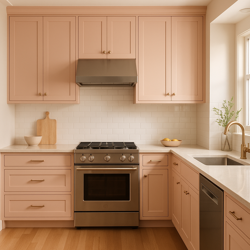
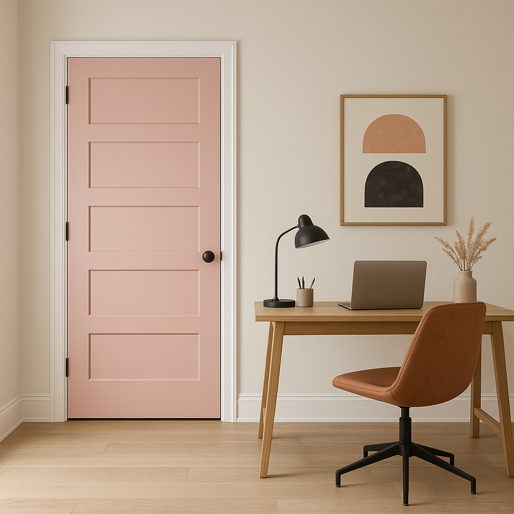
Eraser’s versatility makes it suitable for a wide range of applications throughout your home. Whether you're designing a cozy retreat or a sophisticated communal area, this color can adapt effortlessly to various design styles:
Benjamin Moore Eraser is a neutral with character—a tone that feels timeless yet fresh. Its subtle blush undertones provide warmth and personality, making it a perfect backdrop for a variety of color palettes and design styles. Whether you're looking to create a cozy retreat or a polished, elegant space, Eraser delivers understated charm and versatility for any room in your home.
View Colors Only by Brand (No Imagery):
Sherwin-Williams
|
Benjamin-Moore
|
Behr
|
Valspar
Live on the Eastern Slope of Colorado and looking for a local painting professional, check out all our painting services and reach out for a free estimate.
Copyright © 2026 : Wild Fox Painting Inc. : 12435 Mead Way, Littleton, CO 80125


