
Benjamin Moore Chatsworth (225) is a refined and elegant paint color that effortlessly combines tradition and sophistication. This hue is a soft, golden beige with warm undertones that evoke a sense of comfort and timeless charm. Its gentle warmth and versatility make it an ideal choice for those looking to create a welcoming and serene atmosphere in their homes.
Chatsworth is characterized by warm undertones of muted gold and beige, with subtle hints of honey and tan. These undertones lend the color its unique ability to adapt to various lighting conditions. In spaces with ample natural light, Chatsworth may appear slightly brighter and sunnier, while in dimmer settings, it transforms into a cozy and intimate shade. The warmth of Chatsworth ensures that it never feels sterile or overly cool, making it a favorite for creating spaces that feel inviting and lived-in.
To design a harmonious and visually appealing space, pair Benjamin Moore Chatsworth with complementary colors that enhance its golden-beige warmth. Here are some top coordinating options:
By integrating these coordinating colors, you can craft a balanced and layered look that suits both traditional and contemporary interiors.
Chatsworth's understated elegance makes it a versatile choice for a variety of applications in interior design:
Chatsworth creates a warm and inviting setting for living rooms. Pair it with plush textiles like velvet or linen in soft creams and taupes for a cozy yet elevated ambiance. Add metallic accents such as brass or gold to enhance its golden undertones.
For bedrooms, Chatsworth offers a tranquil backdrop that promotes relaxation. Combine it with soft, neutral bedding and accent pillows in warm tones to create a restful retreat. To add depth, consider complementing it with darker furniture pieces in walnut or espresso finishes.
Chatsworth shines in dining rooms, where its warmth fosters an intimate and welcoming environment. Pair it with darker wood furniture and rich upholstery in earthy tones for a classic and sophisticated look.
As a wall color for hallways and entryways, Chatsworth brings a sense of cohesion and continuity to your home. Its golden-beige hue works beautifully to brighten transitional spaces while maintaining a polished feel.
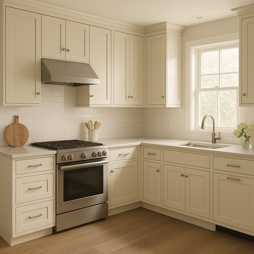
Chatsworth pairs elegantly with cream or off-white cabinetry and natural stone countertops, such as marble or granite. Incorporate warm metallics like copper or gold fixtures to create a balanced and timeless kitchen design.
Chatsworth is a tried-and-true favorite for those seeking a paint color that combines warmth, versatility, and sophistication. Its adaptability to varying lighting conditions makes it suitable for both large open spaces and smaller, cozier nooks. Whether you're designing a modern minimalist space or a traditional home, Chatsworth serves as an exquisite backdrop that harmonizes with a wide range of styles and aesthetics.
Choose Benjamin Moore Chatsworth (225) to elevate your interiors with its understated elegance and enduring appeal.
View Colors Only by Brand (No Imagery):
Sherwin-Williams
|
Benjamin-Moore
|
Behr
|
Valspar
Live on the Eastern Slope of Colorado and looking for a local painting professional, check out all our painting services and reach out for a free estimate.
Copyright © 2026 : Wild Fox Painting Inc. : 12435 Mead Way, Littleton, CO 80125


