Benjamin Moore Cream (233) is a versatile, warm neutral that exudes sophistication and charm. This hue is anything but ordinary, offering a soft and creamy backdrop that can transform any space into a haven of comfort and elegance. Whether you're curating a serene bedroom retreat or an inviting living room, Cream (233) is a timeless choice that adapts beautifully to varying styles and aesthetics.
Benjamin Moore Cream (233) carries subtle yellow undertones, which give it a warm and sunny disposition without overpowering the space. These undertones create a soft radiance that feels nurturing and uplifting, making it ideal for rooms where you want a welcoming atmosphere. The color balances warmth with neutrality, ensuring it doesn’t lean too heavily into golden hues or appear overly beige. Its refined undertones make it a harmonious choice for both traditional and modern interiors.
Pairing Benjamin Moore Cream (233) with complementary colors can elevate its charm and enhance your design scheme. Here are some excellent options to consider:
The adaptability of Cream (233) makes it an excellent choice for a variety of applications across your home or commercial space. Its warmth and neutrality contribute to its ability to blend seamlessly with both bold and understated design styles.
Cream (233) creates an inviting and cozy atmosphere, making it perfect for living rooms. Pair it with soft white trim, warm wood flooring, and neutral furnishings for a space that feels timeless and elegant. Add pops of color through throw pillows, rugs, or artwork to personalize the room.
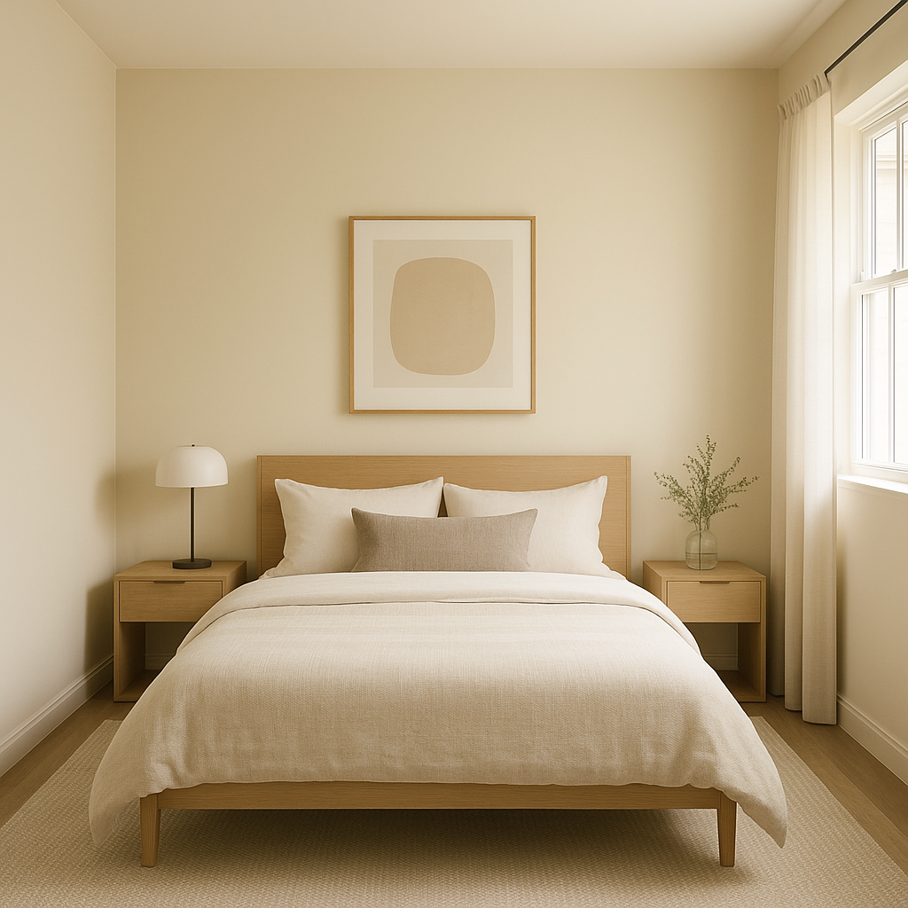
This shade’s soothing qualities make it ideal for bedrooms, where relaxation is key. Use Cream (233) as the main wall color, complemented by light gray bedding and soft white curtains for a serene retreat. Accent with natural textures like woven baskets or linen throws to enhance the overall coziness.
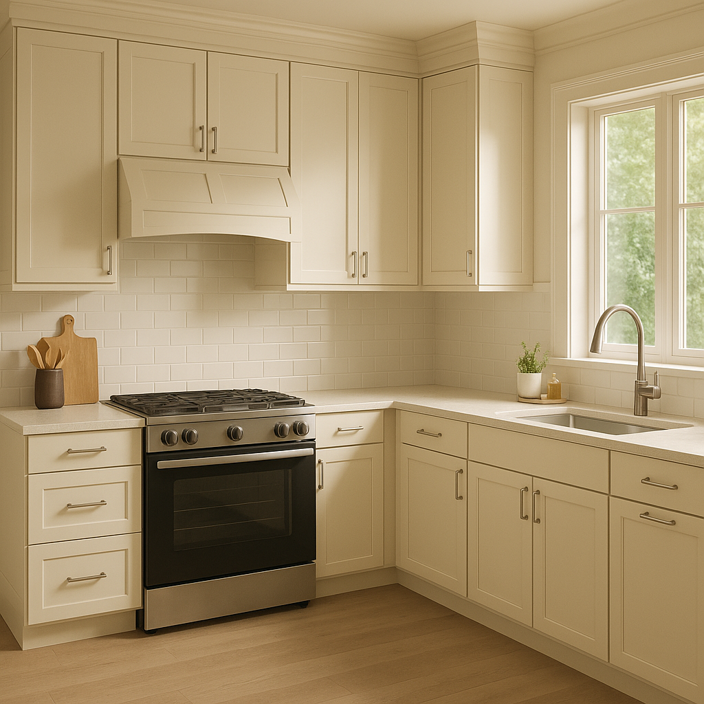
Cream (233) is a wonderful choice for kitchen walls or cabinetry, as its warm undertones pair beautifully with natural wood or quartz countertops. Add brushed brass or matte black hardware for a modern twist that highlights the creamy backdrop.
In bathrooms, Cream (233) can lend a spa-like tranquility. Use it alongside white subway tiles, marble accents, and metallic fixtures for a clean yet warm aesthetic. Consider adding greenery for a refreshing touch.
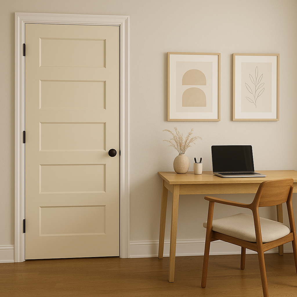
Hallways and entryways painted in Cream (233) feel welcoming and expansive, especially when paired with bright white trim. It’s a versatile color that makes these transitional spaces feel connected to the rest of the home.
Cream (233) is also a great choice for commercial interiors, such as boutique shops, offices, or hospitality spaces. Its neutral warmth creates a professional yet approachable ambiance that appeals to a wide audience.
Benjamin Moore Cream (233) is more than just a paint color—it’s a design foundation that brings warmth, sophistication, and versatility to your space. Whether used as the main star or as part of a harmonious palette, this creamy neutral has the power to transform your interiors into timeless works of art.
View Colors Only by Brand (No Imagery):
Sherwin-Williams
|
Benjamin-Moore
|
Behr
|
Valspar
Live on the Eastern Slope of Colorado and looking for a local painting professional, check out all our painting services and reach out for a free estimate.
Copyright © 2026 : Wild Fox Painting Inc. : 12435 Mead Way, Littleton, CO 80125


