Benjamin Moore Porter (250) is a stunning paint color that effortlessly blends sophistication, warmth, and versatility. This hue strikes a perfect balance between a rich, earthy tone and a modern neutrality, making it a favorite among interior designers and homeowners alike. Porter is part of Benjamin Moore's Classic Colors collection, known for its timeless appeal and ability to complement a wide range of design styles, from traditional to contemporary.
Porter (250) is a deep, muted brown with subtle undertones of gray that give it an elegant softness. These gray undertones prevent the color from feeling overly heavy or saturated, making it adaptable to various lighting conditions. In spaces with warm lighting, Porter may reveal a slightly reddish tint, while cooler light will emphasize its grayish components, resulting in a more subdued and sophisticated appearance.
This versatile hue pairs beautifully with a wide range of coordinating colors, allowing you to create harmonious and impactful designs. Here are some complementary shades to consider:
Neutral Pairings:
Accent Colors:
Earthy Tones:
When selecting coordinating colors, consider your desired ambiance. Pair Porter with lighter neutrals for an airy and balanced look, or introduce deeper hues for a cozy and dramatic aesthetic.
Porter (250) is an incredibly versatile color that can be used throughout your home to create a sense of depth and elegance. Here are some ideas for incorporating this hue into your interiors:
Porter’s warm yet sophisticated tone makes it an ideal choice for living rooms or dens. Use it on walls to create a cozy and inviting space, especially when paired with plush furnishings and soft lighting. Coordinate with lighter neutral trim or ceilings to keep the room feeling open and balanced.
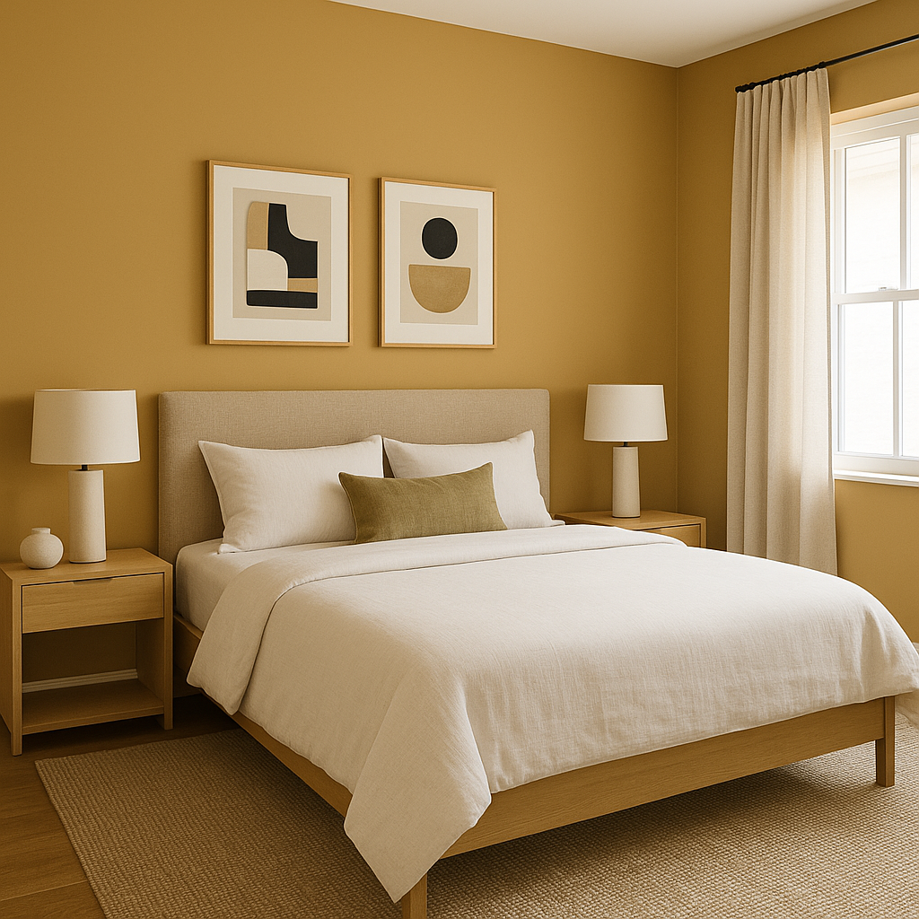
Transform your bedroom into a serene retreat by using Porter on an accent wall. Its muted richness fosters relaxation and comfort. Pair it with crisp white bedding and warm metallic accents, such as brass or gold, to add a touch of luxury.
Create an intimate and elegant dining experience by using Porter on all four walls. This color pairs beautifully with wood furniture, especially darker stains like walnut or mahogany. Add pops of color through table settings or artwork to complement the warm undertones of Porter.
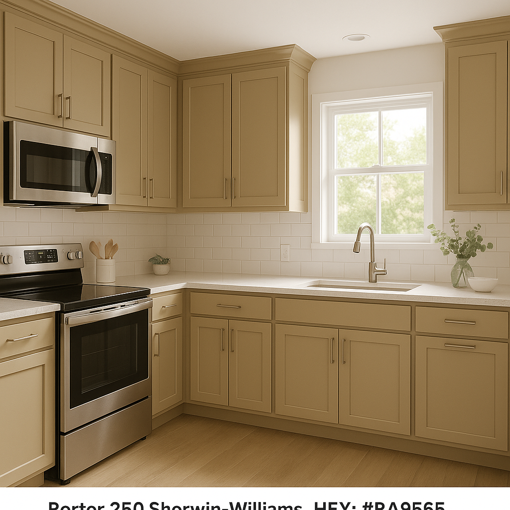
For a modern and earthy kitchen, incorporate Porter into cabinetry or island designs. Its grounding presence works beautifully with natural materials like marble, butcher block countertops, and brushed metal fixtures. Pair it with light walls or backsplash tiles to maintain a balanced and fresh look.
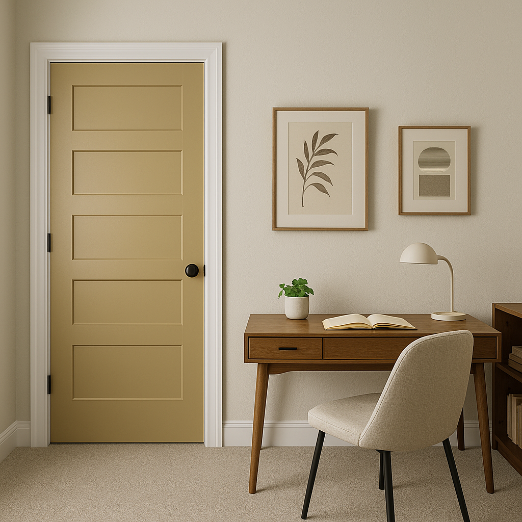
Porter is a fantastic choice for a productive yet calming home office. Its gray undertones promote focus, while its earthy richness adds warmth to the space. Pair it with sleek furniture and minimalistic decor for a clean and professional aesthetic.
Porter is equally stunning as an exterior color. Use it for siding or shutters to create a refined and timeless curb appeal. Pair it with crisp whites or soft grays for trim to enhance its depth and character.
Benjamin Moore Porter (250) is more than just a paint color; it’s a design statement. Its ability to adapt to different lighting and pair seamlessly with a variety of other hues makes it an excellent choice for both large and small spaces. Whether you’re revamping a single room or designing an entire home, Porter delivers a timeless sophistication that enhances any interior or exterior.
Let Porter (250) elevate your space with its understated elegance and versatility. It’s a color that tells a story of warmth, refinement, and modern appeal.
View Colors Only by Brand (No Imagery):
Sherwin-Williams
|
Benjamin-Moore
|
Behr
|
Valspar
Live on the Eastern Slope of Colorado and looking for a local painting professional, check out all our painting services and reach out for a free estimate.
Copyright © 2026 : Wild Fox Painting Inc. : 12435 Mead Way, Littleton, CO 80125


