Benjamin Moore Wandering (264) is a captivating neutral that strikes the perfect balance between warmth and coolness, making it an incredibly versatile choice for your interior design palette. This soft, muted gray-green exudes a calming presence, ideal for creating serene spaces that feel both modern and timeless. Its subtle color shifts under different lighting conditions, making it dynamic yet soothing—a true chameleon that adapts beautifully to its surroundings.
Wandering (264) is characterized by delicate green undertones with hints of gray, lending it an earthy yet sophisticated charm. The green undertones are neither overpowering nor overly saturated, ensuring the shade remains versatile and understated. In rooms with ample natural light, the green undertones become more pronounced, offering a fresh and airy vibe. In dimmer spaces, the gray takes center stage, adding depth and sophistication to the room.
This balance of undertones makes Wandering (264) a serene and grounding color, perfect for spaces where relaxation and tranquility are key.
Benjamin Moore Wandering (264) pairs beautifully with a variety of complementary hues, thanks to its neutral yet distinctive character. Here are some recommended coordinating colors:
By combining Wandering with these coordinating colors, you can achieve anything from a light, airy aesthetic to a bold, moody atmosphere, depending on your design preferences.
Wandering (264) is incredibly versatile and works well in a variety of spaces and design styles. Its understated elegance makes it suitable for both residential and commercial interiors.
Transform your living room into a sanctuary of calm by using Wandering on the walls. Pair it with natural textures like linen curtains or jute rugs to enhance the organic feel. Add pops of white and muted greens for a cohesive, nature-inspired palette.
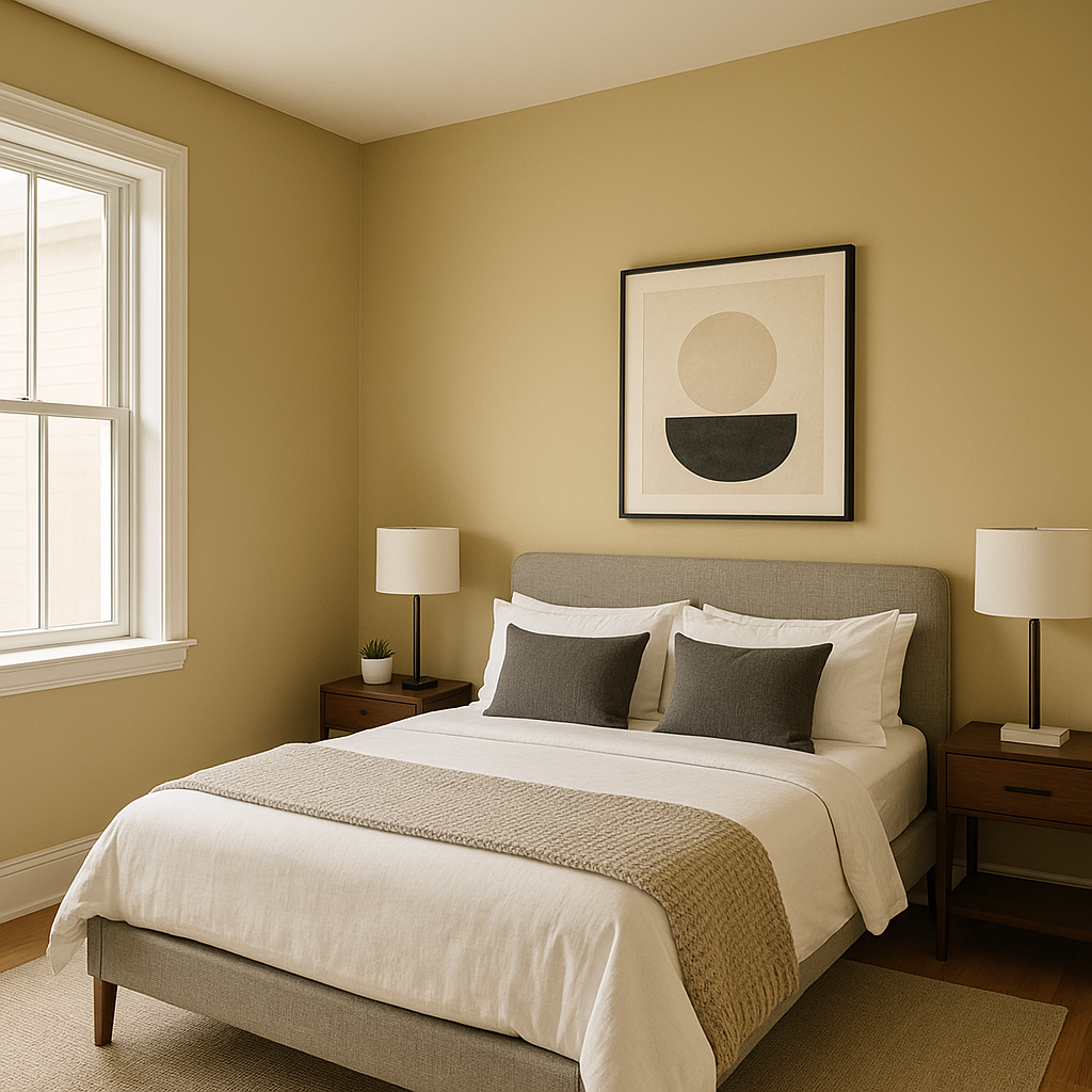
Wandering is perfect for bedrooms, where tranquility is paramount. Its soft gray-green undertones create a restful ambiance, especially when paired with crisp white bedding and warm wooden furniture.
For spa-like bathrooms, Wandering brings a sophisticated touch. Pair it with white subway tiles, brushed nickel fixtures, and soft towels in coordinating neutral tones for a fresh and serene retreat.
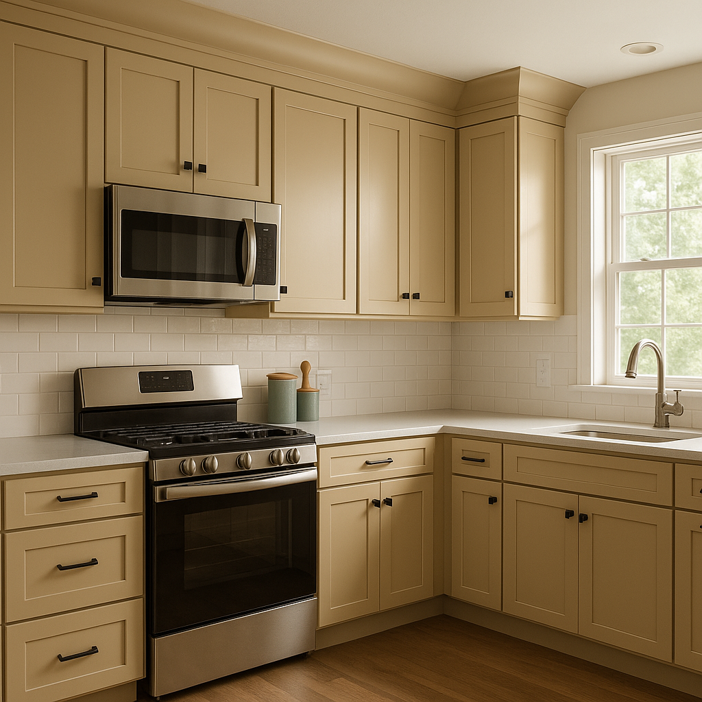
In kitchens, Wandering offers a modern yet timeless vibe. Use it on cabinetry or walls, and pair it with marble countertops and matte black or brass hardware for a refined look.
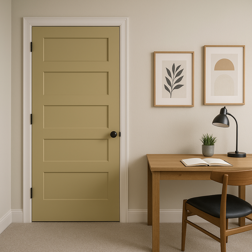
Create a productive yet calming workspace by incorporating Wandering into your home office. Its neutral tone fosters focus and creativity without being distracting.
Wandering (264) is an exceptional choice for those seeking a neutral with character. Its subtle green undertones and balanced gray base make it adaptable to various design styles, from minimalistic to traditional. Whether you're designing a cozy retreat or a contemporary masterpiece, Wandering brings a sense of quiet sophistication that enhances any space.
Make Benjamin Moore Wandering (264) your go-to color for creating interiors that inspire peace, elegance, and timeless beauty.
View Colors Only by Brand (No Imagery):
Sherwin-Williams
|
Benjamin-Moore
|
Behr
|
Valspar
Live on the Eastern Slope of Colorado and looking for a local painting professional, check out all our painting services and reach out for a free estimate.
Copyright © 2026 : Wild Fox Painting Inc. : 12435 Mead Way, Littleton, CO 80125


