Benjamin Moore Oatmeal 268 is a versatile, soft neutral that combines warmth and sophistication, making it an excellent choice for a variety of interior design styles. This understated hue brings a sense of calm and coziness to any space, while its subtle complexity ensures it pairs effortlessly with a wide range of colors and finishes. Whether you're designing a modern, traditional, or transitional space, Oatmeal 268 offers a timeless foundation that can anchor your design vision.
Oatmeal 268 is a warm beige with gentle yellow and taupe undertones. These undertones give the color its inviting, earthy character while ensuring it remains neutral enough to complement diverse palettes. The slight taupe influence adds depth, preventing it from leaning too golden or overly warm. Its balanced nature allows it to adapt beautifully to different lighting conditions, appearing warmer in artificial lighting and more subdued in natural light.
This chameleon-like quality makes Oatmeal 268 a reliable choice for spaces that need a neutral backdrop with just a touch of warmth.
One of the standout features of Benjamin Moore Oatmeal 268 is its ability to harmonize with a variety of coordinating colors. Here are some excellent pairings to consider:
Whites and Creams
For a classic and clean look, pair Oatmeal 268 with soft whites like Benjamin Moore White Dove (OC-17) or creamy tones like Simply White (OC-117). These shades create a crisp contrast while maintaining a sense of warmth and harmony.
Earthy Taupes and Browns
Enhance the naturally grounded feel of Oatmeal 268 with deeper taupes and browns. Consider Benjamin Moore Revere Pewter (HC-172) or Edgecomb Gray (HC-173) for a layered, monochromatic look.
Dusty Blues and Greens
Introduce a soothing, nature-inspired vibe by pairing Oatmeal 268 with muted blues and greens. Shades like Benjamin Moore Palladian Blue (HC-144) or Saybrook Sage (HC-114) create a relaxed and inviting palette.
Deep Charcoals and Navy Blues
For a dramatic contrast, pair Oatmeal 268 with deeper tones like Benjamin Moore Kendall Charcoal (HC-166) or Hale Navy (HC-154). These bold accents make the neutral base pop, adding a touch of sophistication to your space.
Oatmeal 268's neutral warmth makes it incredibly versatile, suitable for nearly any room in your home. Here are some ideas on how to incorporate this color into your interiors:
As a wall color, Oatmeal 268 creates a cozy yet refined backdrop for living spaces. Its neutral tone allows furniture, artwork, and decor to shine without overpowering the room. Pair it with plush textiles and warm wood finishes for a welcoming atmosphere.
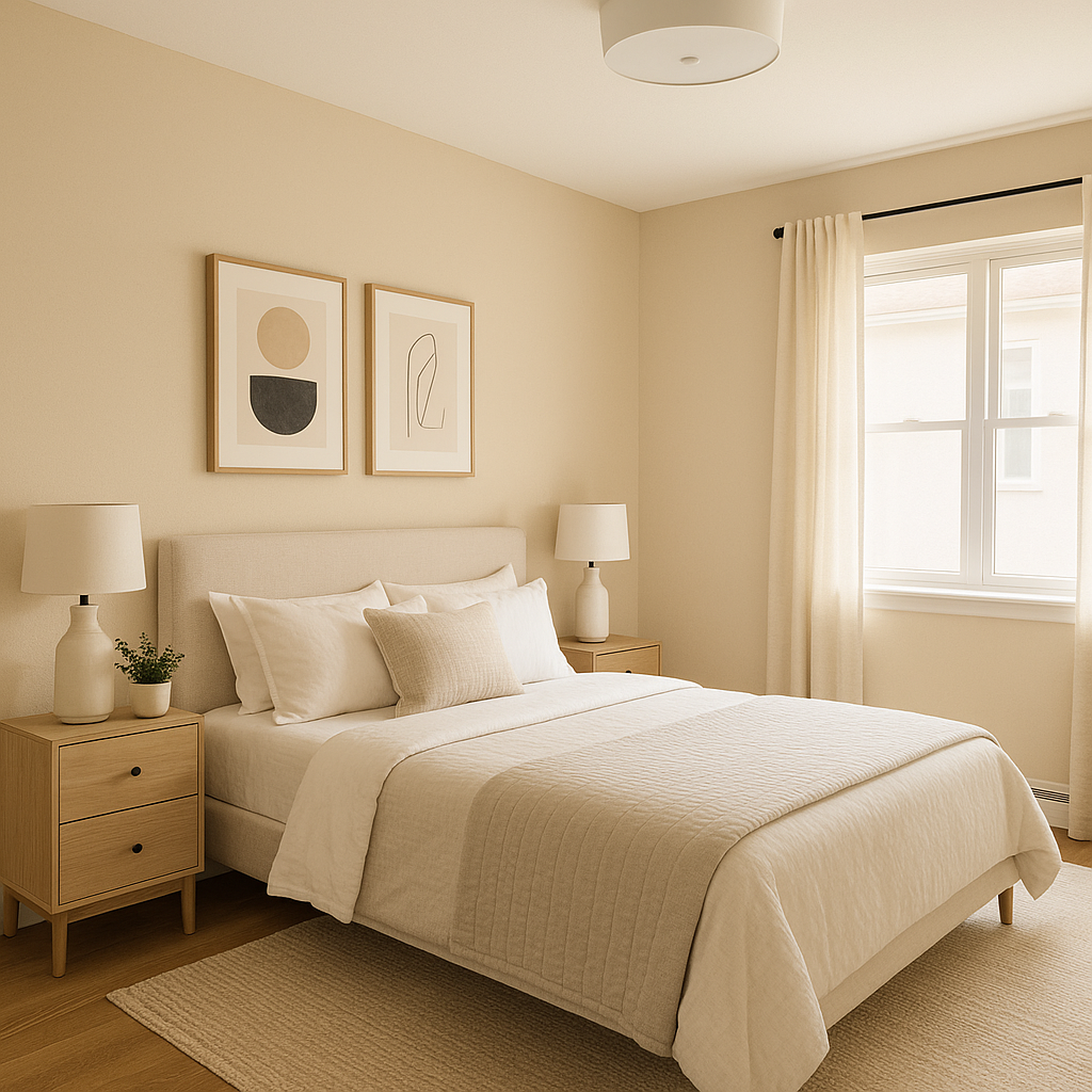
In bedrooms, Oatmeal 268 promotes relaxation and tranquility. Its warm undertones pair beautifully with soft linens and layered textures, creating a serene retreat. Add accent colors through throw pillows, rugs, or artwork to personalize the space.
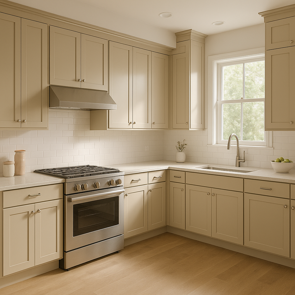
Oatmeal 268 can add an understated elegance to kitchens and dining rooms. Use it on walls or cabinetry to create a timeless, neutral foundation. Pair it with white or marble countertops, brushed brass hardware, and natural wood tones for a chic, cohesive look.
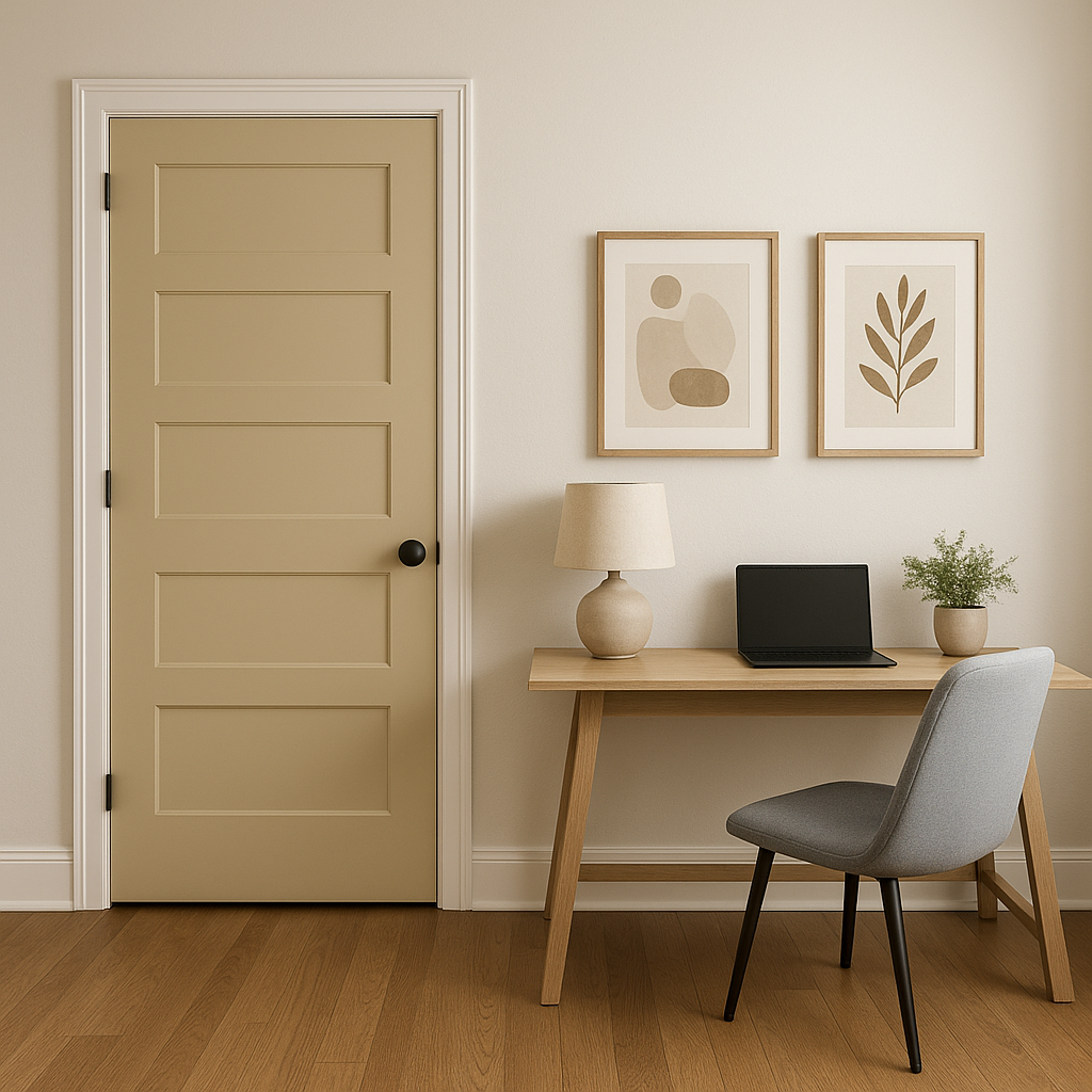
As a neutral color, Oatmeal 268 is perfect for high-traffic areas like hallways and entryways. It provides a polished look that transitions seamlessly between rooms,
View Colors Only by Brand (No Imagery):
Sherwin-Williams
|
Benjamin-Moore
|
Behr
|
Valspar
Live on the Eastern Slope of Colorado and looking for a local painting professional, check out all our painting services and reach out for a free estimate.
Copyright © 2026 : Wild Fox Painting Inc. : 12435 Mead Way, Littleton, CO 80125


