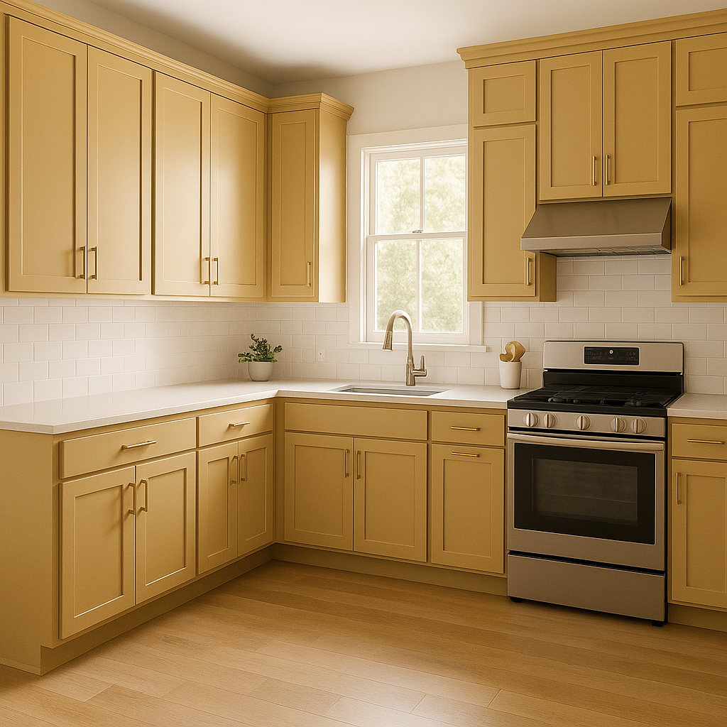
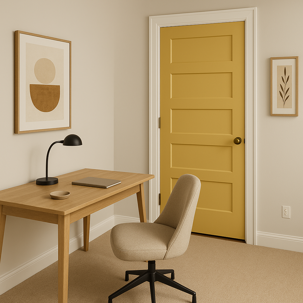
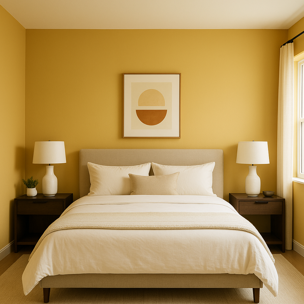
Benjamin Moore Goldfield (292) is a radiant, golden-yellow paint color that evokes a sense of warmth, charm, and understated elegance. Its vibrant yet earthy tone makes it the perfect choice for creating cozy, welcoming spaces with a touch of sophistication. Goldfield balances the richness of gold with a slightly muted quality that prevents it from overpowering a room, making it versatile for various design styles.
Goldfield has subtle undertones of ochre and a whisper of amber, which enhance its warm and grounded nature. These undertones give it a timeless quality, making it neither overly bright nor excessively dark. While the golden-yellow base is dominant, the nuanced presence of earthy tones adds depth and complexity to the color.
Depending on the lighting conditions, Goldfield can shift slightly in appearance. In spaces with abundant natural light, it may appear more luminous and golden, while under artificial light, its warmer, amber-like undertones come forward, giving it a cozy glow.
Goldfield pairs beautifully with a variety of coordinating colors, making it a flexible choice for designing harmonious palettes.
Goldfield's versatility makes it suitable for various applications in both residential and commercial settings. Its warm, inviting nature ensures it works beautifully in spaces where comfort and connection are key.
Lighting plays a crucial role in how Benjamin Moore Goldfield (292) appears in your space. In rooms with ample natural light, it takes on a brighter, more golden character, evoking a sense of energy and cheerfulness. In dimmer spaces or under warm artificial lighting, its earthy undertones become more pronounced, creating a quieter, cozier feeling.
Benjamin Moore Goldfield (292) is a rich, golden-yellow hue with earthy undertones that make it both lively and grounded. Its versatility allows it to work wonderfully across a range of spaces, from living rooms to kitchens and beyond. By pairing it with complementary colors like soft neutrals, muted greens, or bold navies, you can create a palette that suits your design vision. Whether you’re seeking to energize a space or create a warm, comforting ambiance, Goldfield is a timeless choice that brings both vibrancy and elegance to any room.
View Colors Only by Brand (No Imagery):
Sherwin-Williams
|
Benjamin-Moore
|
Behr
|
Valspar
Live on the Eastern Slope of Colorado and looking for a local painting professional, check out all our painting services and reach out for a free estimate.
Copyright © 2026 : Wild Fox Painting Inc. : 12435 Mead Way, Littleton, CO 80125


