Benjamin Moore Imperial (314) is a bold, rich blue that exudes sophistication and timeless elegance, making it a standout choice for interiors that aim to evoke a sense of regal refinement. This deep, saturated shade has a classic appeal, yet its versatility ensures it works beautifully in both traditional and modern spaces. Whether you're creating a dramatic focal point or using it as your primary wall color, Imperial delivers depth and personality to any room.
Imperial (314) carries subtle cool undertones that lean toward a soft indigo, giving it depth without feeling overly bright or too muted. These undertones ensure the color maintains its rich vibrancy without veering into purple territory or becoming overly gray. The underlying coolness makes this shade perfect for pairing with other cool-toned hues, as well as crisp neutrals. Its balanced undertones also allow it to adapt beautifully to different lighting conditions, appearing more regal and bold in low light and brighter and fresher in spaces with ample natural light.
Imperial (314) pairs effortlessly with a variety of complementary shades, making it an excellent choice for crafting a cohesive palette. Here are some suggestions for coordinating colors:
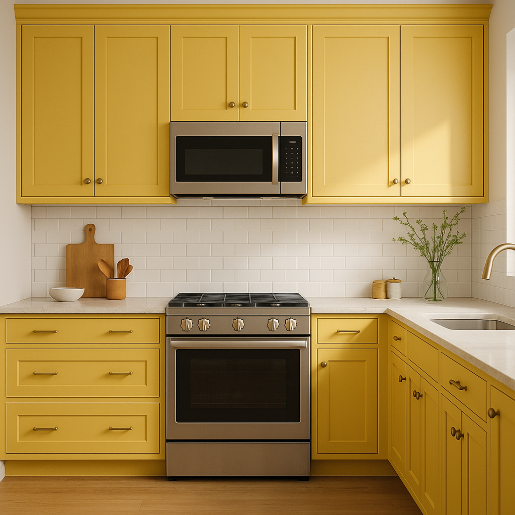
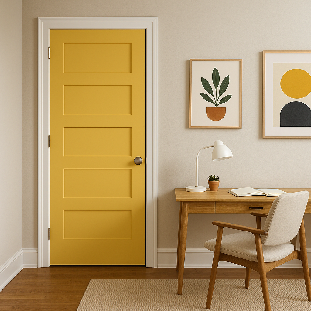
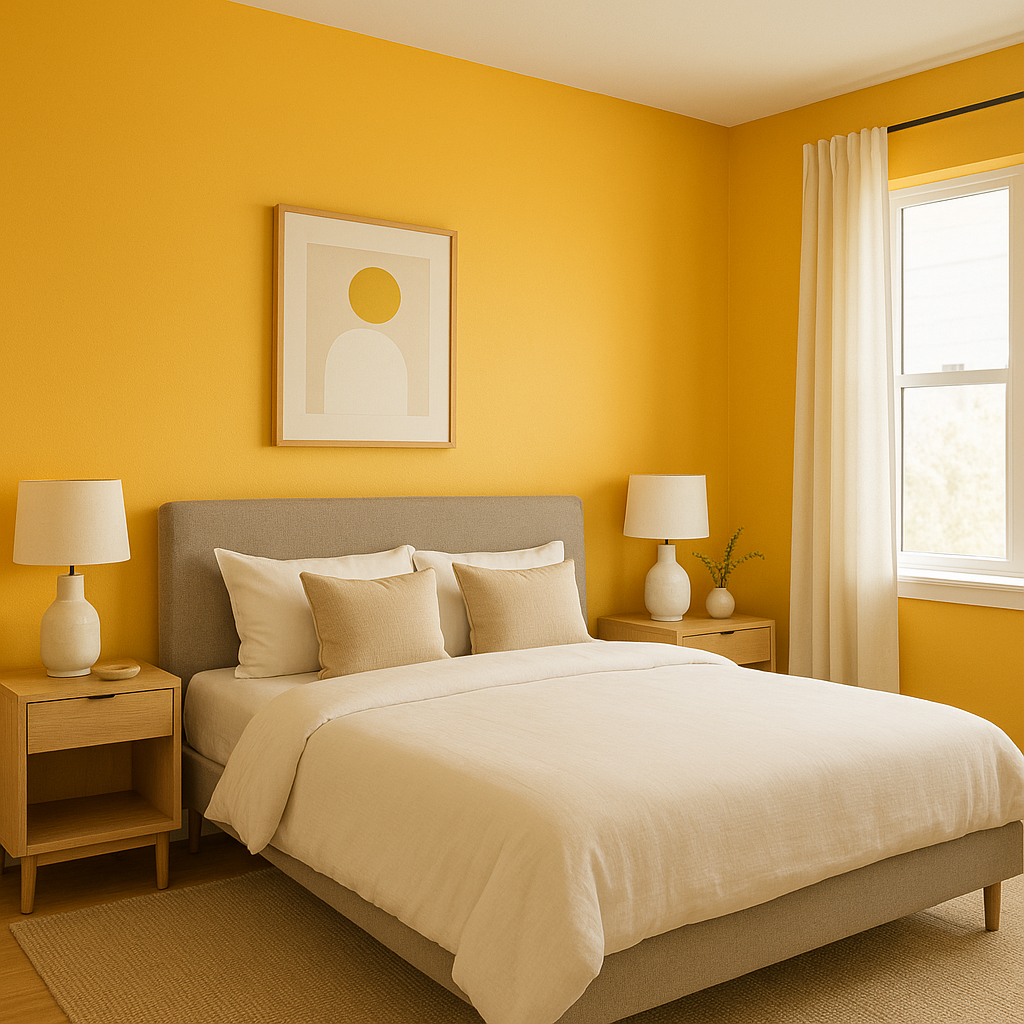
Imperial (314) is a versatile shade that can be used in a variety of ways to elevate your home interiors:
The appearance of Imperial (314) can shift depending on the lighting in a space. In rooms with ample natural light, the blue will appear brighter and more vibrant. In spaces with limited light or artificial lighting, the color deepens, creating a cozy and intimate atmosphere. To maximize its impact, consider testing it in your space under different light conditions to ensure it matches your vision.
Benjamin Moore Imperial (314) is the perfect choice for homeowners and designers seeking a color that balances boldness with sophistication. Its adaptability across various styles and its ability to pair seamlessly with both classic and contemporary palettes make it an essential tool in any designer's arsenal. Whether you're looking to create a single standout feature or completely transform a space, Imperial (314) delivers with grace and timeless appeal.
View Colors Only by Brand (No Imagery):
Sherwin-Williams
|
Benjamin-Moore
|
Behr
|
Valspar
Live on the Eastern Slope of Colorado and looking for a local painting professional, check out all our painting services and reach out for a free estimate.
Copyright © 2026 : Wild Fox Painting Inc. : 12435 Mead Way, Littleton, CO 80125


