Benjamin Moore Pure (327) is a beautifully clean, neutral white that exudes simplicity and sophistication. Its luminous quality makes it a go-to choice for those seeking a fresh and timeless backdrop for their interior spaces. Whether you’re designing a modern minimalist home, a breezy coastal retreat, or a traditional setting, Pure (327) offers unmatched versatility and elegance.
One of the most appealing aspects of Benjamin Moore Pure is its subtle undertones. This shade is a true neutral white, carefully balanced without leaning too warm or too cool. It carries just the faintest hint of softness, which keeps it from feeling overly stark or sterile. Unlike some whites that can appear grayish or yellow in certain lighting conditions, Pure (327) maintains a crisp and modern appearance in a variety of lighting environments.
This ability to remain balanced makes it an excellent choice for spaces with both natural and artificial light. It adapts beautifully to its surroundings, making it a reliable option for any room in the home.
Benjamin Moore Pure (327) offers endless opportunities for color coordination. Here are some complementary hues to elevate your design:
Soft Neutrals: Pair Pure (327) with warm, sandy tones like Edgecomb Gray (HC-173) or Classic Gray (OC-23) to create a serene, layered look. These soft neutrals enhance the warmth of Pure without overpowering its clean aesthetic.
Bold Contrast: For a dramatic and modern contrast, consider pairing it with Kendall Charcoal (HC-166) or Hale Navy (HC-154). These deep, moody hues allow the crispness of Pure to pop, adding depth and sophistication to your space.
Earthy Accents: Earth tones like Revere Pewter (HC-172) or Pashmina (AF-100) work beautifully with Pure (327) in creating a harmonious, grounded palette. These shades add warmth and texture to the overall design.
Playful Pops of Color: If you’re looking to inject some personality, consider pairing Pure with vibrant shades like Calypso Blue (727) or Raspberry Blush (2008-30) for a lively and cheerful aesthetic.
Benjamin Moore Pure is an incredibly versatile white that can be used across a variety of settings and applications. Its adaptability makes it a top choice for both residential and commercial interiors. Here are some of its best uses:
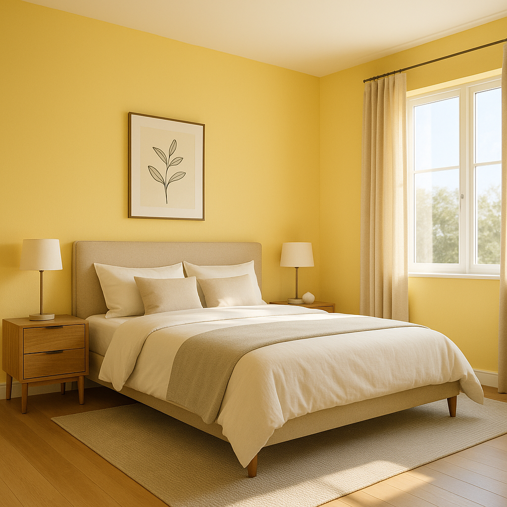
Pure (327) is perfect for walls in living rooms, bedrooms, and dining areas. It creates a clean and inviting canvas that allows furniture and décor to take center stage. Its neutral tone makes it an excellent choice for open-concept spaces, ensuring cohesion across different areas of the home.
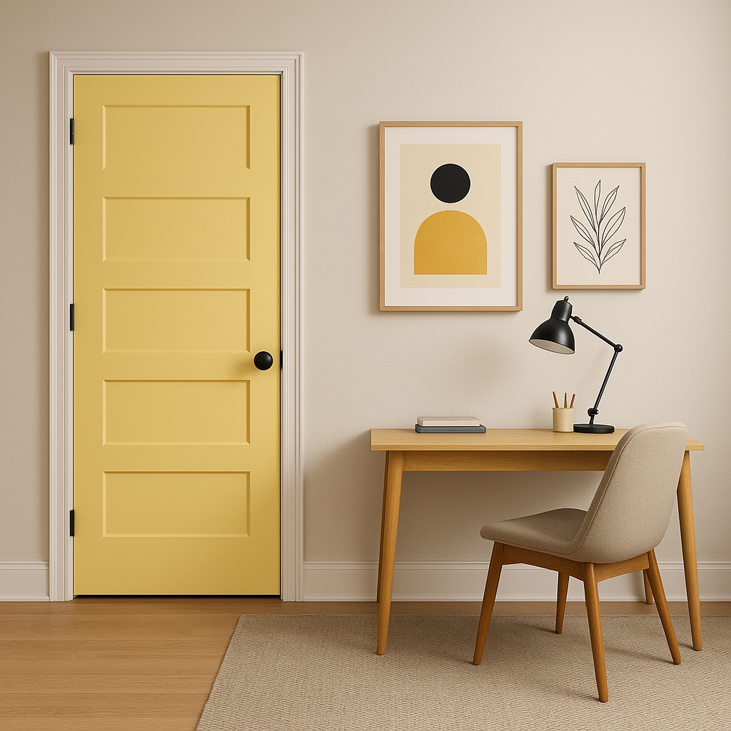
When used on trim, crown molding, and baseboards, Pure (327) provides a classic, polished look. It pairs seamlessly with both bold and subtle wall colors, enhancing architectural details without competing for attention.
As a ceiling color, Pure (327) reflects light beautifully, helping to brighten and visually enlarge a room. Its clean finish gives the ceiling a fresh and airy feel, contributing to a sense of spaciousness.
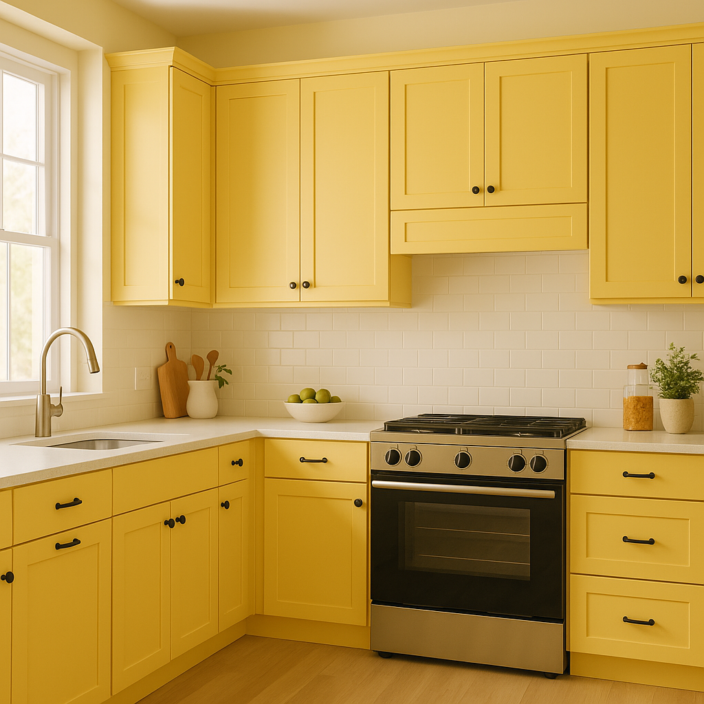
In kitchens and bathrooms, Pure (327) provides a clean, hygienic look that feels fresh and modern. It’s an ideal choice for cabinetry, wainscoting, or backsplash areas, especially when paired with natural stone countertops or sleek stainless-steel appliances.
Although primarily celebrated for interior use, Pure (327) can also be employed as an exterior color for shutters, trim, or siding. Its clean, neutral white enhances curb appeal while complementing a wide range of architectural styles.
Benjamin Moore Pure (327) is a designer favorite for good reason. Its ability to seamlessly blend with virtually any color palette while maintaining its own crisp, clean character makes it a must-have in your paint selection. Whether you’re creating a serene retreat, a bold statement, or a light-filled haven, this versatile white will elevate your design to the next level.
View Colors Only by Brand (No Imagery):
Sherwin-Williams
|
Benjamin-Moore
|
Behr
|
Valspar
Live on the Eastern Slope of Colorado and looking for a local painting professional, check out all our painting services and reach out for a free estimate.
Copyright © 2026 : Wild Fox Painting Inc. : 12435 Mead Way, Littleton, CO 80125


