Benjamin Moore Lightning (340) is a refined and versatile shade that brings a clean, airy elegance to any space. This soft, cool off-white has a subtle gray undertone, making it a sophisticated neutral that complements a wide range of design aesthetics. Perfectly balancing light and depth, Lightning (340) is an ideal choice for brightening interiors while maintaining a sense of warmth and character.
While Lightning (340) may initially appear as a pure off-white, its delicate gray undertones provide a serene and grounded feel. These undertones give the color dimension, ensuring it won't feel overly stark or sterile. The gray influences lend a touch of coolness, making it a particularly great fit for spaces with ample natural light or for those seeking a calm, minimalist palette.
One of the many reasons Lightning (340) is a designer favorite is its versatility with coordinating colors. Whether you're aiming for a monochromatic scheme or pops of contrast, this hue works beautifully with a variety of tones. Here are a few coordinating options to consider:
Benjamin Moore Lightning (340) is a highly adaptable paint color that can be used throughout the home. Its versatility makes it suitable for a variety of rooms and design styles:
Lightning is perfect for creating an open, airy feel in living rooms, family rooms, or open-plan spaces. Its soft undertones make it a welcoming backdrop for both modern and traditional interiors. Pair it with plush textures and natural wood furniture for a cozy yet contemporary look.
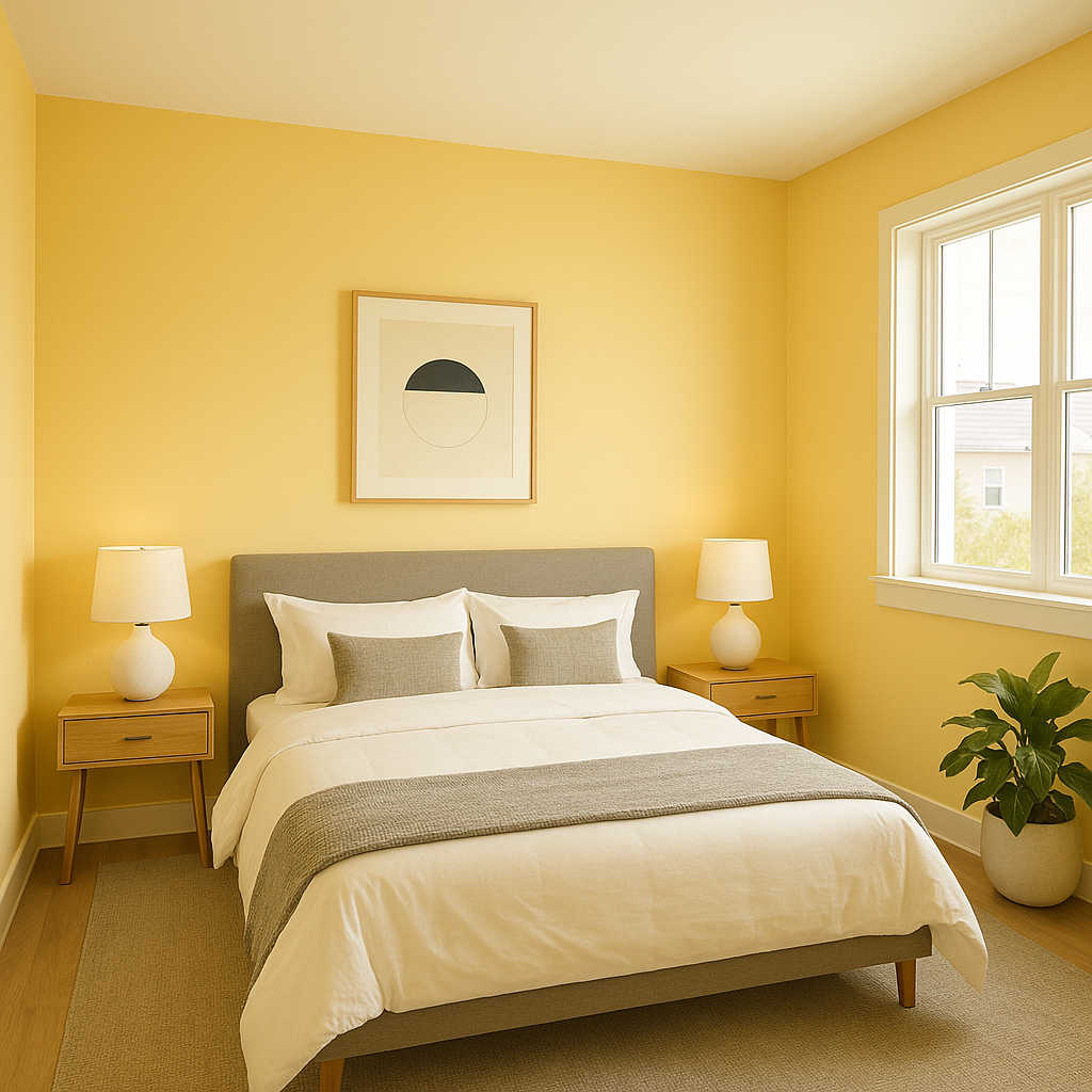
This shade's serene, cool undertones make it an excellent choice for bedrooms. It creates a tranquil and restful atmosphere, especially when paired with soft blues, muted greens, or warm metallic accents.
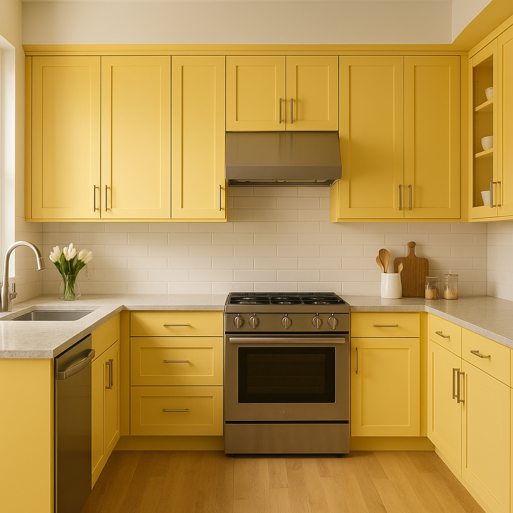
The crisp, clean feel of Lightning works especially well in kitchens and bathrooms. Use it for walls, cabinetry, or even subway tile backsplashes. Pair it with stainless steel hardware or matte black fixtures for a modern, polished aesthetic.
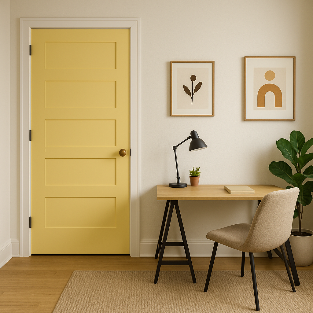
Lightning's soft gray undertones help foster focus and calm, making it a great option for a productive home office. Add pops of color through artwork or textiles to keep the space dynamic and inspiring.
As with any paint color, lighting plays a crucial role in how Benjamin Moore Lightning (340) will appear in your space. In rooms with abundant natural light, the hue will lean more toward its soft white side, while in dimmer spaces, the gray undertones will become more pronounced. Be sure to test the color in your room under different lighting conditions to see how it interacts with your space.
Benjamin Moore Lightning (340) is the perfect neutral for homeowners and designers seeking a clean, sophisticated, and versatile color. Its delicate balance of soft white and cool gray undertones allows it to adapt beautifully to any space, style, or lighting condition. Whether you're creating a peaceful retreat, a modern minimalist look, or a bright and inviting living area, Lightning (340) is a paint color that delivers timeless appeal.
View Colors Only by Brand (No Imagery):
Sherwin-Williams
|
Benjamin-Moore
|
Behr
|
Valspar
Live on the Eastern Slope of Colorado and looking for a local painting professional, check out all our painting services and reach out for a free estimate.
Copyright © 2026 : Wild Fox Painting Inc. : 12435 Mead Way, Littleton, CO 80125


