Benjamin Moore Glimmer 342 is a soft, calming shade that brings an air of subtle sophistication to any space. This delicate color sits at the intersection of green and gray, offering a modern yet timeless aesthetic that works beautifully across a wide range of interior styles. Whether you're designing a cozy retreat, a minimalist-inspired space, or a fresh and airy room, Glimmer 342 is a versatile choice that exudes understated elegance.
The beauty of Benjamin Moore Glimmer 342 lies in its nuanced undertones. At its core, this shade is a light, muted green, but it features subtle gray undertones that temper its vibrancy. This combination creates a grounded, tranquil quality that feels both fresh and sophisticated. Depending on the lighting in the room, you may notice Glimmer leaning slightly cooler with its gray tones or showcasing a soft green warmth under natural sunlight.
This duality makes Glimmer 342 a fantastic backdrop, as it can adapt to different environments and moods. It pairs well with both warm and cool color schemes, giving you the flexibility to incorporate it into a variety of design palettes.
Benjamin Moore Glimmer 342 is incredibly versatile when it comes to coordinating colors. Here are some suggestions to help you build a harmonious color palette:
Neutrals: Pair Glimmer 342 with soft whites like Benjamin Moore White Dove (OC-17) or Chantilly Lace (OC-65) for a clean, light-filled look. These crisp neutrals enhance the subtle green-gray undertones of Glimmer, creating a serene and airy atmosphere.
Deeper Greens: Add depth and contrast with richer greens like Benjamin Moore Saybrook Sage (HC-114) or October Mist (1495). These tones complement the green undertones in Glimmer while adding a touch of drama.
Earthy Accents: For a nature-inspired palette, consider grounding Glimmer 342 with warm, earthy hues like Benjamin Moore Revere Pewter (HC-172) or Kendall Charcoal (HC-166). These shades create a cozy, sophisticated vibe.
Soft Blues: Highlight the cool undertones of Glimmer by pairing it with soft blues such as Benjamin Moore Palladian Blue (HC-144) or Beach Glass (1564). This combination evokes a serene coastal feel.
Metallics and Textures: Incorporate metallic accents like brushed nickel or aged brass to add a layer of sophistication. Textured natural materials like jute, linen, or wood can enhance the organic feel of the color.
The adaptability of Benjamin Moore Glimmer 342 makes it suitable for a variety of applications across your home:
Living Rooms: Use Glimmer 342 as a primary wall color to create a calm and inviting gathering space. Pair it with neutral furniture and natural textures for a relaxed, modern look.
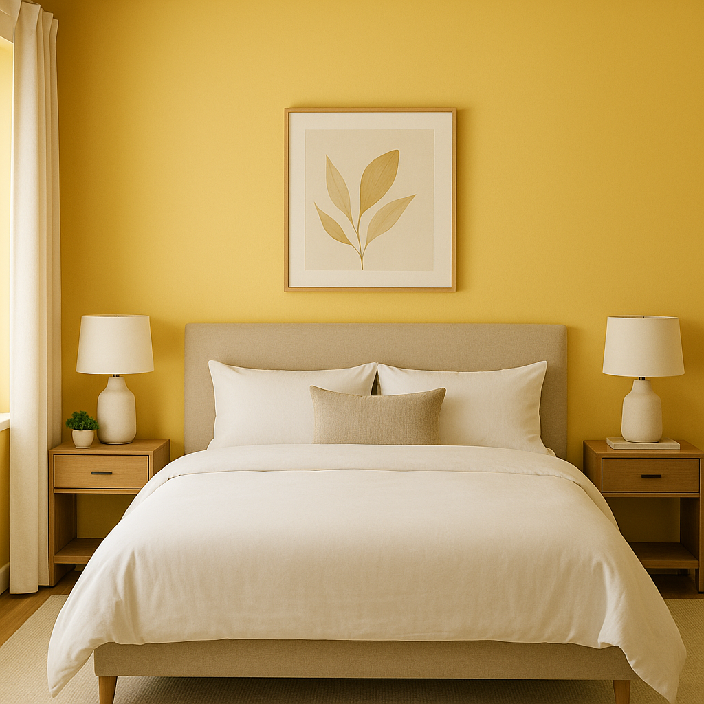
Bedrooms: Its soothing undertones make it an excellent choice for bedrooms. This hue fosters a sense of tranquility, perfect for unwinding after a long day.
Bathrooms: Glimmer 342 can transform a bathroom into a spa-like retreat. Combine it with white tiles, soft towels, and chrome fixtures for a crisp, clean aesthetic.
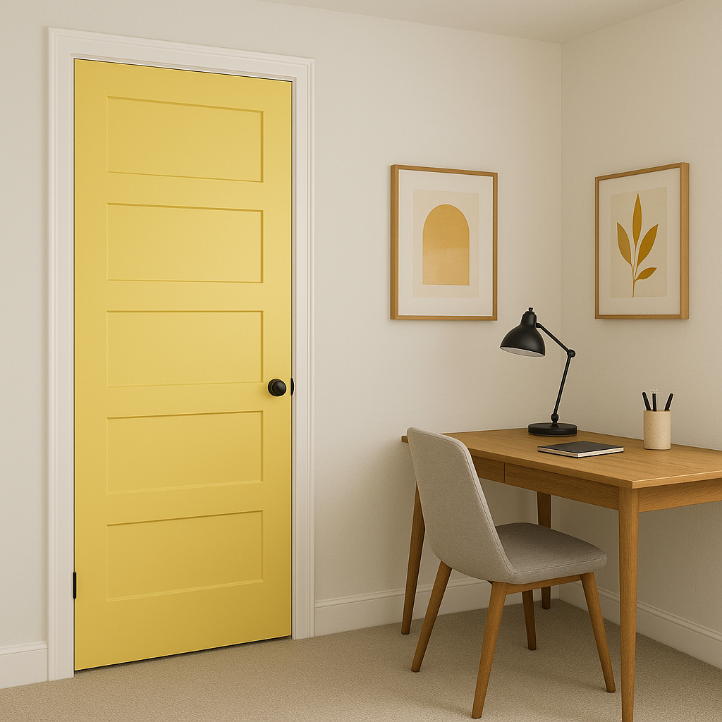
Home Offices: Foster focus and creativity by painting your home office walls with this tranquil shade. Its understated elegance creates a peaceful workspace that minimizes distractions.
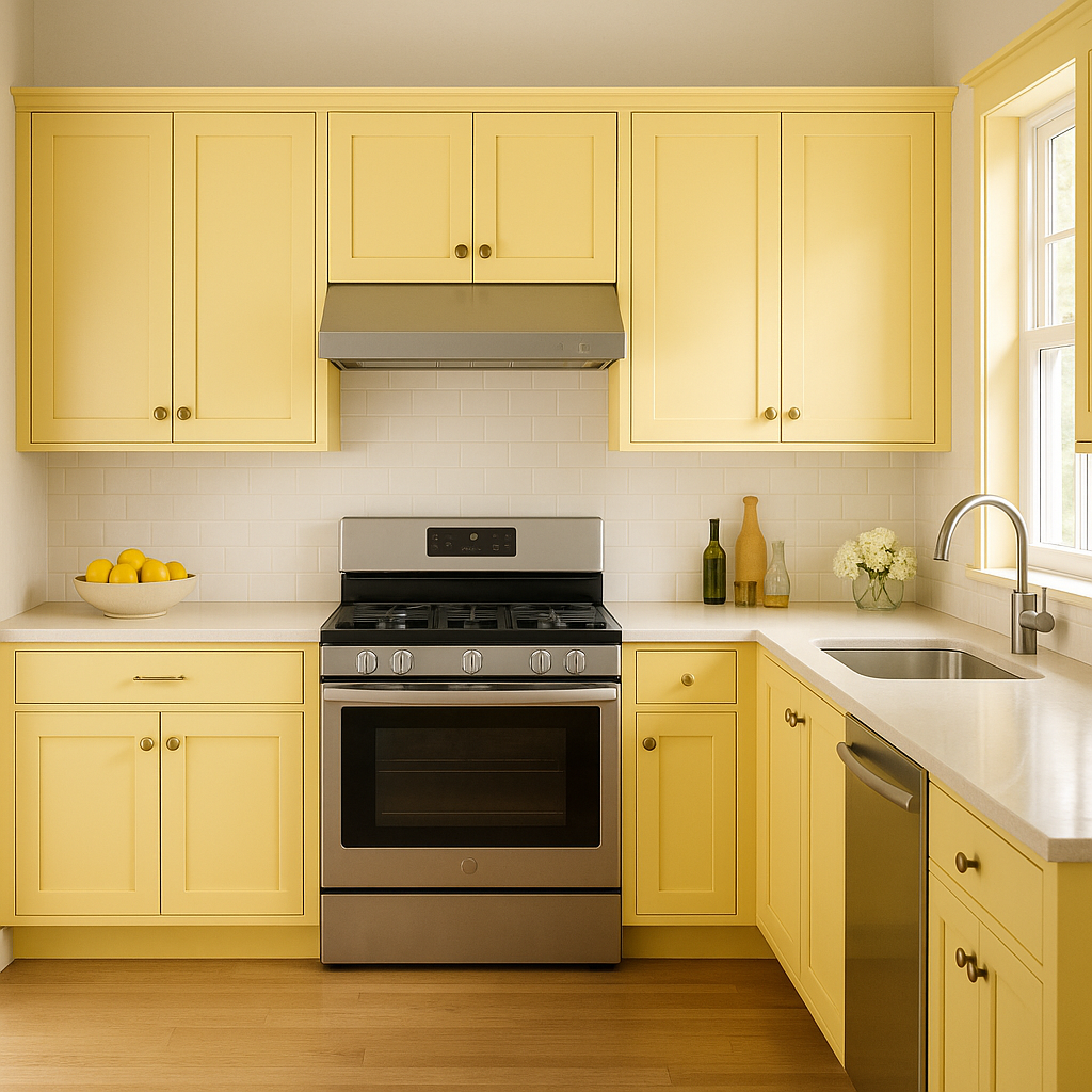
Kitchens: For a fresh and modern take on kitchen design, use Glimmer 342 for cabinetry or walls. Pair it with white countertops and stainless-steel appliances for a polished look.
Hallways and Entryways: Give transitional spaces a touch of character with this soft, inviting color. Its neutrality ensures it complements adjacent rooms without overwhelming the space.
View Colors Only by Brand (No Imagery):
Sherwin-Williams
|
Benjamin-Moore
|
Behr
|
Valspar
Live on the Eastern Slope of Colorado and looking for a local painting professional, check out all our painting services and reach out for a free estimate.
Copyright © 2026 : Wild Fox Painting Inc. : 12435 Mead Way, Littleton, CO 80125


