
Benjamin Moore Winter (345) is a timeless, elegant shade of cool gray that exudes quiet sophistication and versatility. Its balanced, neutral character makes it an ideal choice for a wide range of interior styles, from modern minimalist to classic traditional. This shade evokes the serene stillness of a winter morning, creating a calming and composed atmosphere in any space. Its understated beauty and adaptability ensure it remains a favorite among homeowners and interior designers alike.
Winter (345) has subtle undertones of blue and green, which give the color a gentle coolness without feeling stark or cold. These undertones add depth and complexity to the hue, allowing it to shift slightly depending on the lighting and surrounding colors in a room. In north-facing spaces with cooler natural light, the blue undertones may become more pronounced, lending a crisp and airy feel. In warmer, south-facing spaces, the green undertones may subtly emerge, offering a softer, more grounded aesthetic. This adaptability makes Winter an excellent choice for creating a serene, harmonious ambiance in different lighting conditions.
Benjamin Moore Winter (345) pairs beautifully with a variety of colors, allowing you to create a cohesive and well-balanced design scheme. Here are some coordinating color suggestions to enhance its versatility:
Whites and Off-Whites: Pair Winter with clean, crisp whites like Benjamin Moore Chantilly Lace (OC-65) or slightly warmer whites like White Dove (OC-17) for a fresh, airy look. These combinations are perfect for trim, cabinetry, or ceiling accents.
Deep Grays and Charcoal Tones: For a monochromatic and sophisticated palette, consider pairing Winter with deeper grays like Kendall Charcoal (HC-166) or Chelsea Gray (HC-168) to create depth and contrast.
Soft Blues and Greens: Complement Winter's cool undertones with calming shades like Palladian Blue (HC-144) or Woodlawn Blue (HC-147). These colors enhance the tranquil vibe and create a seamless, nature-inspired aesthetic.
Earthy Neutrals and Tans: Add warmth and balance with earthy tones like Revere Pewter (HC-172) or Edgecomb Gray (HC-173). This pairing works well in transitional and traditional spaces, offering a grounded yet modern feel.
Pops of Bold Color: Introduce vibrancy with accent colors like Hale Navy (HC-154) or Yorkshire Green (HC-119) for a striking and dynamic contrast.
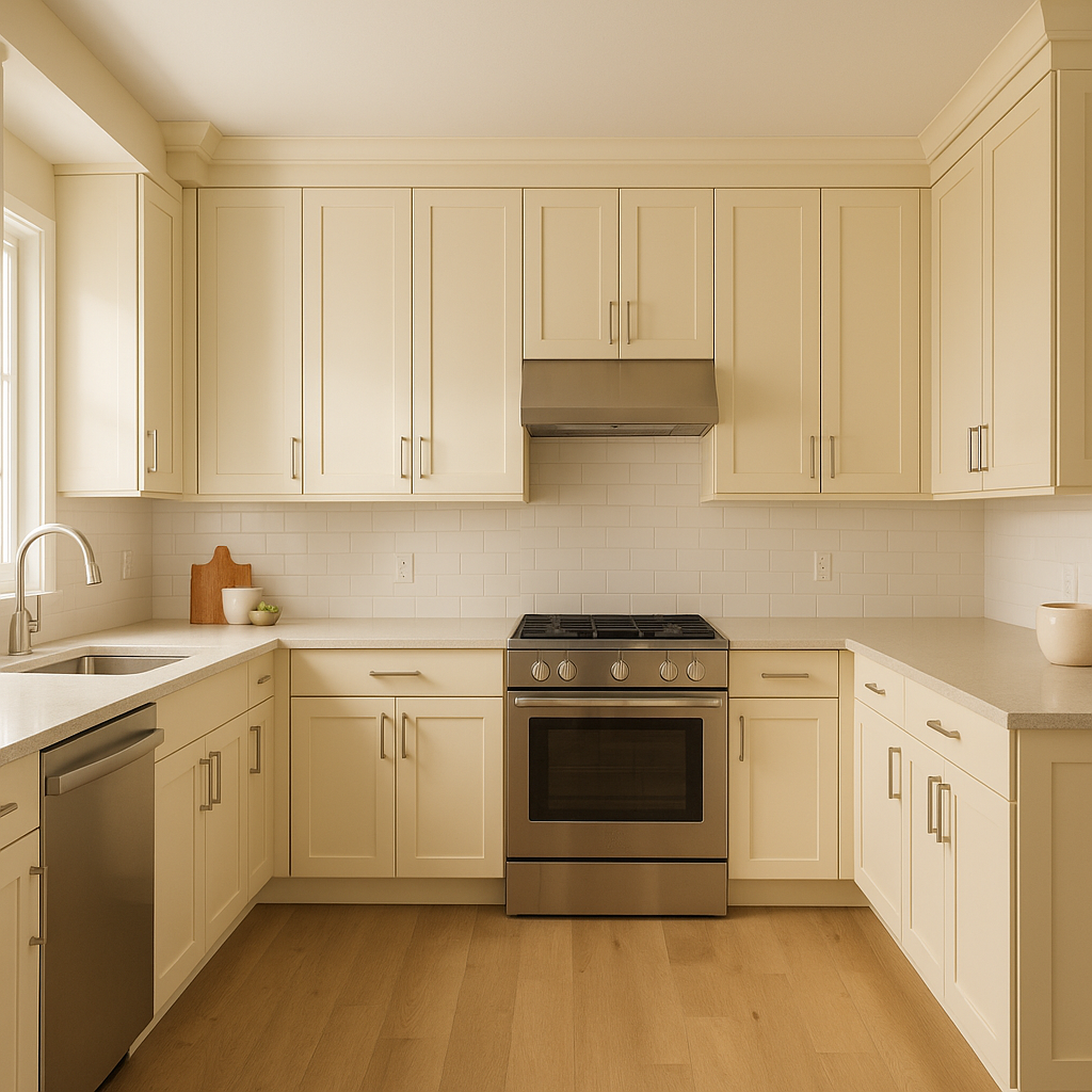
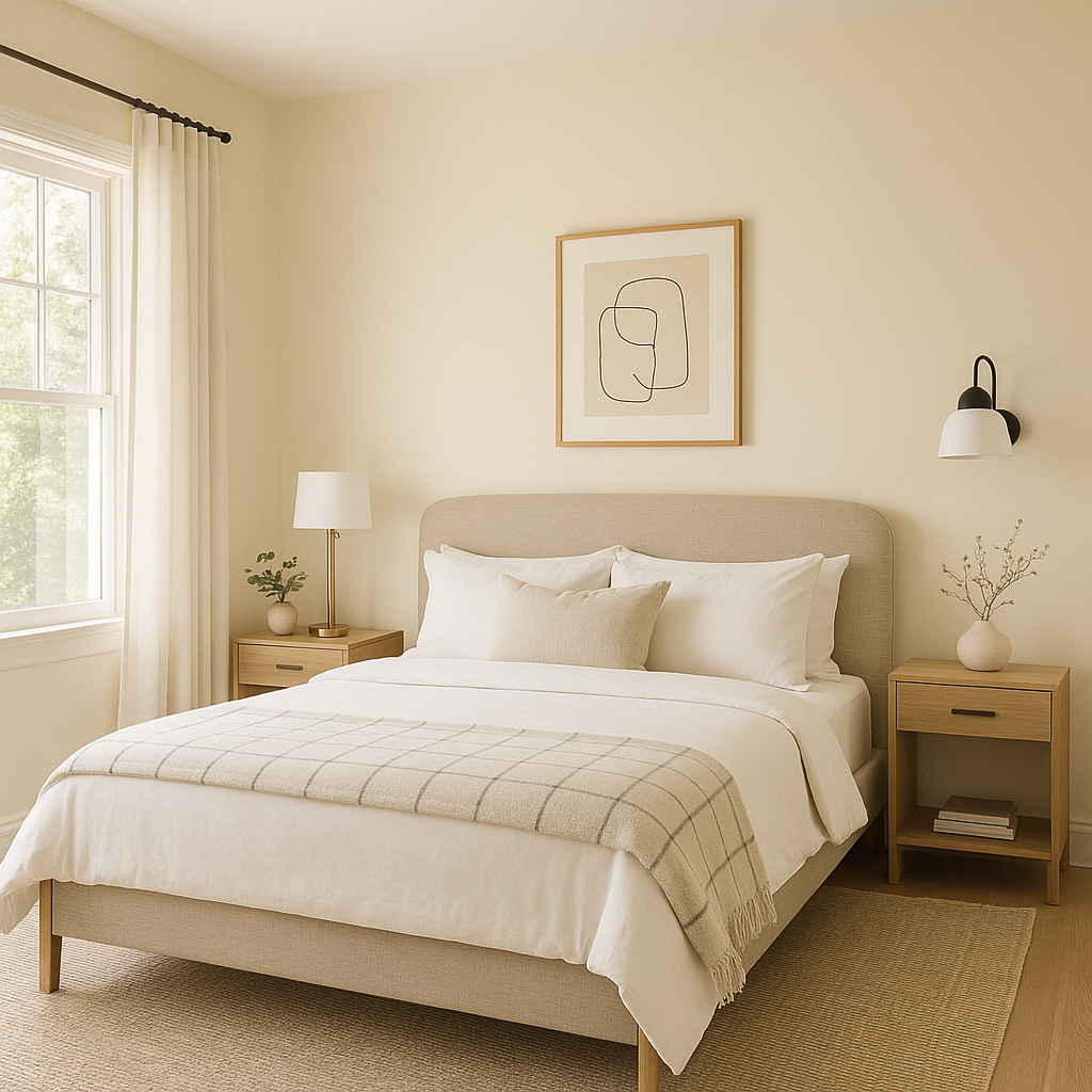
Thanks to its serene and versatile nature, Benjamin Moore Winter (345) works harmoniously across a variety of applications, bringing understated elegance to any room:
Living Rooms: Create a sophisticated and cozy gathering space by using Winter on the walls. Pair it with soft furnishings in complementary hues and metallic accents for added glamour.
Bedrooms: Winter's calming undertones make it an excellent choice for bedrooms, where it promotes relaxation and tranquility. Layer plush bedding and textured fabrics in coordinating colors for a restful retreat.
Home Offices: Foster focus and productivity with the soothing presence of Winter. Combine it with modern furniture and clean lines to achieve a professional yet inviting workspace.
Bathrooms: Its cool, clean aesthetic is perfect for bathrooms, especially when paired with crisp white tile, chrome fixtures, and natural materials like marble or wood.
Open Floor Plans: In open-concept spaces, Winter serves as a unifying backdrop, seamlessly connecting living, dining, and kitchen areas. Use it as a neutral anchor while incorporating accent colors to define individual zones.
Exterior Applications: Winter can also be used on exteriors for a modern, understated look. Pair it with white trims and darker accents for a timeless curb appeal.
The versatility of Benjamin Moore Winter (345) makes it a valuable addition to any designer’s toolkit. Its ability to adapt to various lighting conditions and pair beautifully with a wide array of colors ensures that it can suit different tastes and design preferences. Whether you're aiming to create a serene sanctuary, a polished professional space, or a welcoming family home, Winter provides a sophisticated foundation that stands the test of time.
By incorporating Benjamin Moore Winter (345) into your home design, you'll achieve a look that is both elegant and effortlessly stylish, perfect for elevating the ambiance of any space.
View Colors Only by Brand (No Imagery):
Sherwin-Williams
|
Benjamin-Moore
|
Behr
|
Valspar
Live on the Eastern Slope of Colorado and looking for a local painting professional, check out all our painting services and reach out for a free estimate.
Copyright © 2026 : Wild Fox Painting Inc. : 12435 Mead Way, Littleton, CO 80125


