Benjamin Moore Falling (351) is a tranquil and sophisticated mid-tone gray-blue that effortlessly blends a sense of calm with understated elegance. This versatile color strikes the perfect balance between cool and warm undertones, making it an ideal choice for a variety of interior design styles, from modern minimalism to cozy farmhouse aesthetics. Falling is a hue that evokes a feeling of serenity, reminiscent of a misty dawn or the soothing depths of the ocean.
Falling (351) carries subtle blue undertones that enhance its ability to create a calming atmosphere. These blue notes are softened by a gentle gray base, giving the color a muted and refined quality. This unique combination of cool blue and gray undertones allows Falling to adapt beautifully to different lighting conditions, shifting from a soft, bluish-gray in natural light to a deeper, moodier shade in artificial light.
Its slightly cool nature makes it a perfect choice for spaces where you want to cultivate a restful or meditative ambiance.
Benjamin Moore Falling pairs effortlessly with a wide range of complementary shades, allowing you to craft harmonious and visually appealing color schemes. Some excellent coordinating colors include:
This versatile shade can be used in a variety of ways to enhance the beauty and comfort of your home. Here are some inspiring ideas for incorporating Benjamin Moore Falling into your interior design:
Falling’s calm and sophisticated character makes it perfect for living rooms, especially when paired with plush furnishings and neutral accents. Use Falling on the walls to create a serene backdrop for your décor, then layer in textures like cozy throws and natural fiber rugs to add warmth.
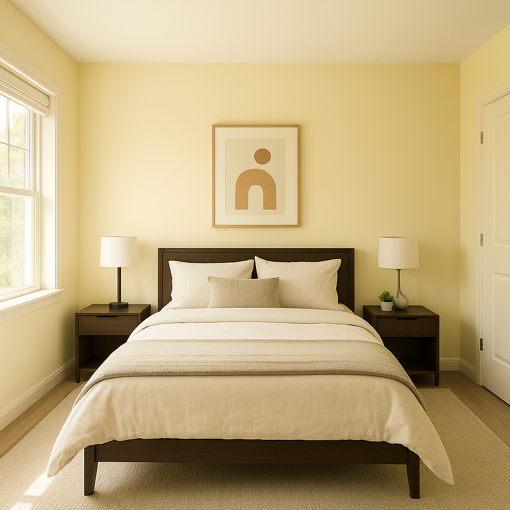
Create a soothing oasis by using Falling in bedrooms. Its tranquil undertones promote relaxation, making it an ideal option for walls, especially when paired with crisp white bedding and soft lighting. Add touches of coordinating blues or greens for an even more peaceful vibe.
Falling’s cool and fresh nature lends itself beautifully to bathrooms. Pair it with polished chrome or brushed nickel fixtures for a modern look, or use it alongside warm wood accents to create a spa-like retreat.
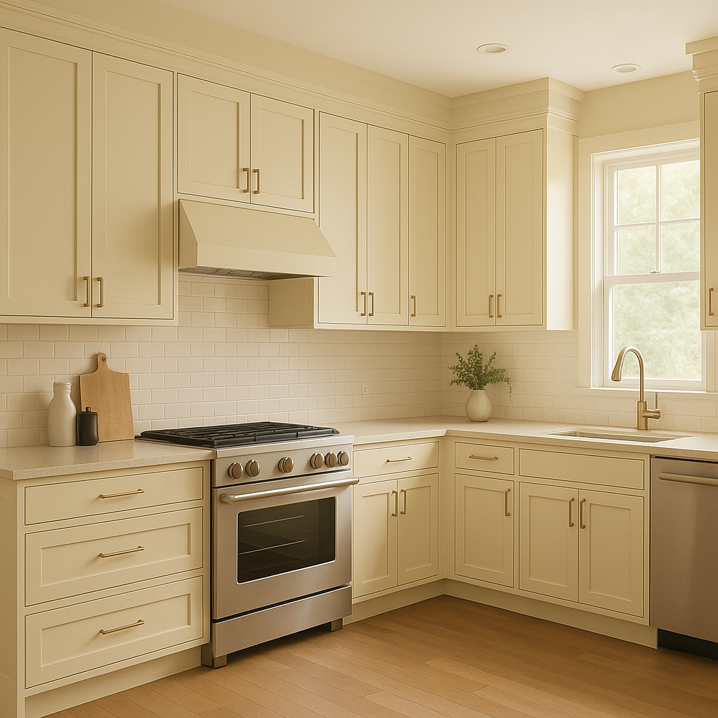
This color brings a sense of understated elegance to kitchens. Paint your cabinetry in Falling for a chic alternative to white cabinets, or use it as an accent color on walls to complement marble or quartz countertops.
For those who want to incorporate Falling but not commit to full-wall coverage, consider using it as an accent wall color. Its depth works wonderfully behind bookshelves, artwork, or as a backdrop for statement furniture.
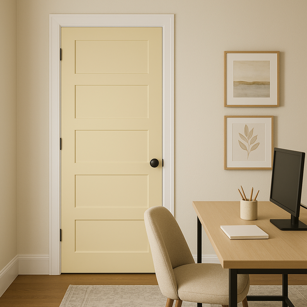
Falling’s calming gray-blue tones are ideal for fostering focus and creativity in home offices. Pair it with natural wood furniture and soft lighting for a productive yet serene workspace.
Benjamin Moore Falling (351) is a timeless choice for homeowners seeking a color that is both stylish and adaptable. Its balanced undertones make it an excellent canvas for layering textures and colors, while its soothing presence helps create spaces that feel welcoming and restful. Whether you’re designing a peaceful retreat, an elegant living space, or a fresh and modern kitchen, Falling (351) is a shade that delivers understated beauty and versatility.
By selecting Benjamin Moore Falling, you invite a sense of calm and refinement into your home that will stand the test of time.
View Colors Only by Brand (No Imagery):
Sherwin-Williams
|
Benjamin-Moore
|
Behr
|
Valspar
Live on the Eastern Slope of Colorado and looking for a local painting professional, check out all our painting services and reach out for a free estimate.
Copyright © 2026 : Wild Fox Painting Inc. : 12435 Mead Way, Littleton, CO 80125


