
Benjamin Moore Majestic 355 is an exceptional paint color that combines elegance, versatility, and sophistication. Known for its rich depth and understated charm, Majestic 355 has become a favorite among designers and homeowners alike. Whether you're looking to create a warm, inviting space or elevate a room with a touch of refinement, this hue delivers effortlessly.
Majestic 355 is a mid-tone neutral that leans into the warm beige family. Its subtle undertones of creamy taupe and soft golden brown give it a cozy yet polished appearance. The warmth in the undertones ensures that the color doesn’t feel stark or cold, making it a perfect choice for spaces that need a hint of softness. It has a balanced depth, neither too light nor too dark, which allows it to adapt beautifully to a variety of lighting conditions.
In natural light, Majestic 355 reveals its golden beige undertones, creating a welcoming and serene ambiance. Under artificial lighting, it takes on a slightly richer, more grounded tone, offering a sense of intimacy and comfort.
Benjamin Moore Majestic 355 pairs seamlessly with a variety of complementary colors, making it a versatile choice for any design style. Here are some coordinating options:
The versatility of Benjamin Moore Majestic 355 makes it a fantastic choice for a variety of spaces and design styles. Here are some ways to incorporate it into your home:
Majestic 355 is ideal for living rooms and open-concept spaces, where its warm undertones can create a welcoming and cohesive atmosphere. Pair it with soft furnishings in natural textures like linen or wool to enhance its cozy appeal.
For bedrooms, this color brings a sense of serenity and relaxation. Use it on the walls and pair it with crisp white bedding and warm wood furniture for a timeless and restful retreat.
In dining rooms, Majestic 355 adds an inviting warmth that encourages lingering conversations. Accentuate it with metallic finishes like brass or bronze in light fixtures or hardware for a touch of elegance.
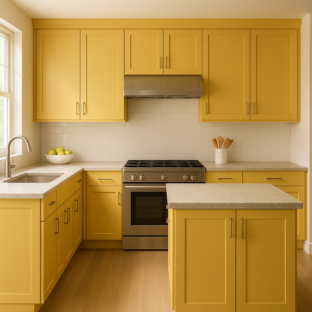
Majestic 355 is a great choice for creating a productive yet calming workspace. Its neutral tone helps maintain focus while adding a sense of sophistication.
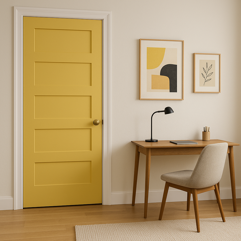
Transform often-overlooked spaces like hallways or entryways with Majestic 355. Its neutral character ensures a smooth transition between rooms while making these areas feel polished and refined.
View Colors Only by Brand (No Imagery):
Sherwin-Williams
|
Benjamin-Moore
|
Behr
|
Valspar
Live on the Eastern Slope of Colorado and looking for a local painting professional, check out all our painting services and reach out for a free estimate.
Copyright © 2026 : Wild Fox Painting Inc. : 12435 Mead Way, Littleton, CO 80125


