Benjamin Moore No-Nonsense 361 is a timeless, understated hue that embodies sophistication and versatility. This color offers a perfect balance between warmth and neutrality, making it a go-to choice for homeowners and designers seeking a refined yet approachable aesthetic. Whether used as a primary wall color or as an accent, No-Nonsense 361 effortlessly adapts to a variety of design styles, from modern minimalism to classic elegance.
No-Nonsense 361 is a medium-toned neutral with subtle beige and gray undertones. These undertones create a soft greige effect, offering the warmth needed for inviting spaces while maintaining the cool neutrality that complements contemporary interiors. The beige undertones infuse a sense of coziness, while the gray provides a grounding element, ensuring the shade remains sophisticated and adaptable.
This color performs beautifully in both natural and artificial light. In bright natural light, the beige undertones are more pronounced, giving the space a warm, sunlit glow. Under artificial or cooler lighting, the gray undertones come forward, creating a sleek and modern ambiance.
Benjamin Moore No-Nonsense 361 pairs effortlessly with a wide range of colors, making it an excellent choice for creating harmonious palettes. Here are some coordinating colors to consider:
Off-White and Creamy Neutrals
Pair No-Nonsense 361 with soft whites like Chantilly Lace OC-65 or White Dove OC-17 for a fresh and clean look. These lighter tones provide contrast while enhancing the warm undertones of the color.
Rich Earthy Tones
Complement the beige undertones with earthy hues like Sparrow AF-720 or Kingsport Gray HC-86. These deeper shades add depth and drama to a space, perfect for accent walls or paired furniture pieces.
Cool Blues and Greens
For a calming and serene palette, consider pairing No-Nonsense 361 with muted blues like Van Courtland Blue HC-145 or soft greens like October Mist 1495. These colors enhance the gray undertones and lend a tranquil vibe to the space.
Bold Accents
Add a touch of vibrancy with bold accent colors such as Kendall Charcoal HC-166 or Caliente AF-290. These striking shades create a dramatic contrast, making No-Nonsense 361 stand out as a neutral backdrop.
No-Nonsense 361 is a versatile shade that works well in many settings, bringing both warmth and sophistication to any room.
Living Rooms
Create a cozy yet stylish living area by using No-Nonsense 361 on the walls, paired with plush furniture and soft textiles. Its neutral undertones allow for a variety of décor styles, from modern to traditional.
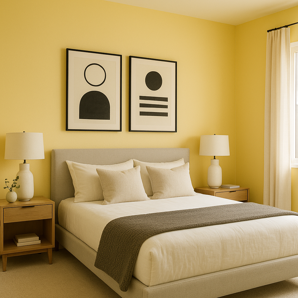
Bedrooms
This color is perfect for bedrooms, offering a soothing and restful environment. Pair it with light linens and soft accent colors for a serene retreat.
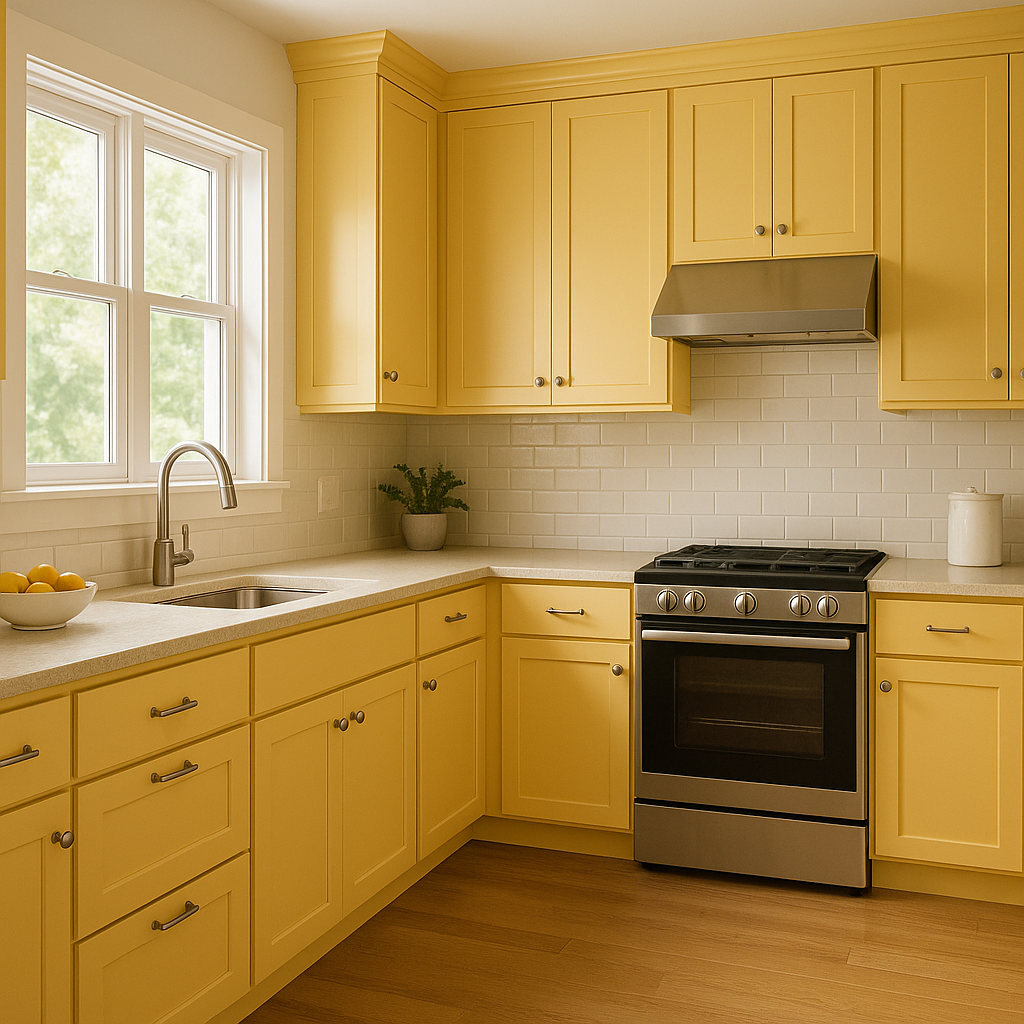
Kitchens and Dining Areas
In kitchens, No-Nonsense 361 pairs well with white cabinetry and stainless steel appliances for a clean and contemporary look. In dining areas, it provides a warm, inviting backdrop that enhances the atmosphere for gatherings.
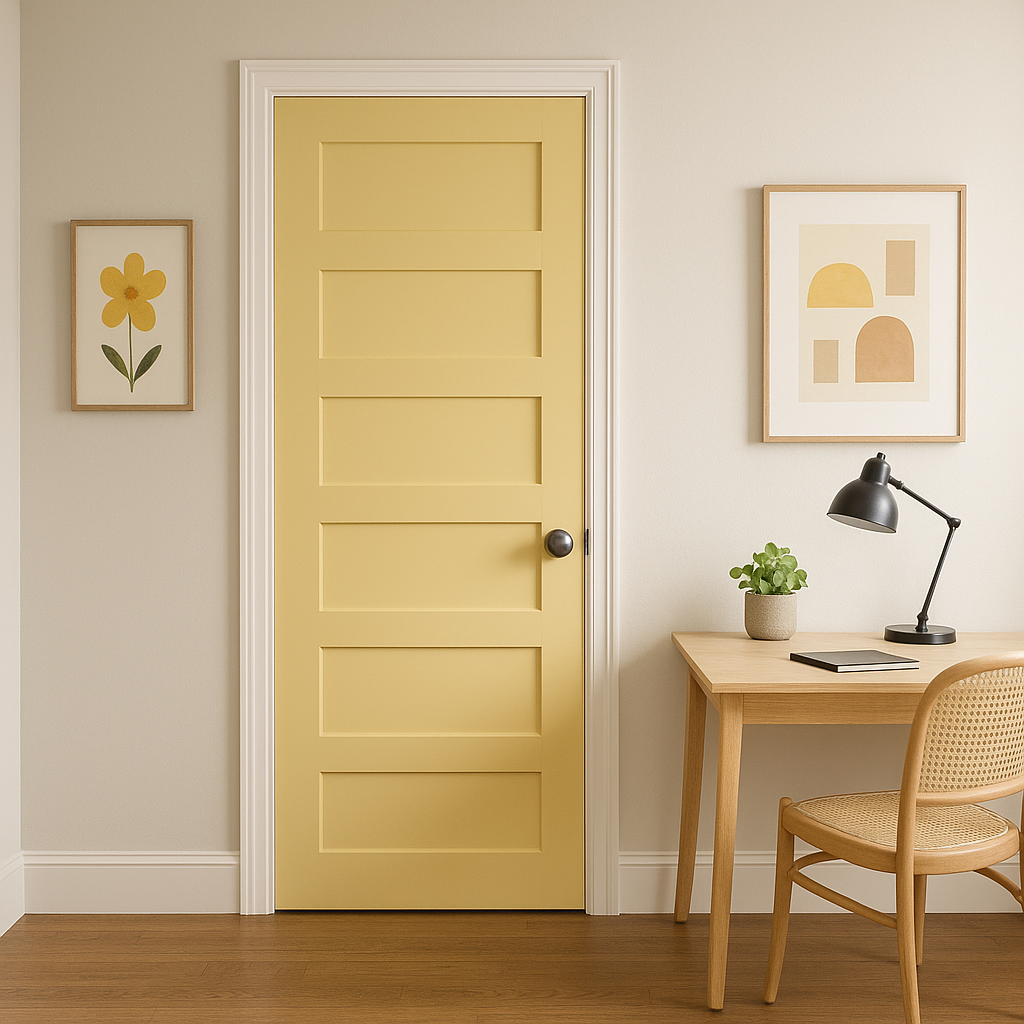
Home Offices
The balanced undertones make No-Nonsense 361 a great choice for home offices, fostering focus and creativity without being overly distracting or stark.
Hallways and Entryways
Use this shade in transition spaces like hallways or entryways to tie together different rooms in your home. Its neutrality ensures a seamless flow from one area to the next.
View Colors Only by Brand (No Imagery):
Sherwin-Williams
|
Benjamin-Moore
|
Behr
|
Valspar
Live on the Eastern Slope of Colorado and looking for a local painting professional, check out all our painting services and reach out for a free estimate.
Copyright © 2026 : Wild Fox Painting Inc. : 12435 Mead Way, Littleton, CO 80125


