Benjamin Moore Hawthorne (379) is a sophisticated and versatile paint color that effortlessly balances tradition and modernity. This soft, muted shade of green carries an understated elegance, making it a popular choice for spaces that require a sense of calm and refinement. Whether you're designing a cozy bedroom, a serene living room, or a welcoming entryway, Hawthorne provides a grounded foundation that complements a variety of design styles.
Benjamin Moore Hawthorne (379) is a gentle green with a subtle gray undertone, giving it a nuanced depth that feels natural yet refined. The gray undertones prevent the green from being overly vibrant, resulting in a color that's soothing and easy on the eyes. It has a medium-light intensity, making it suitable for both small and large spaces without overwhelming the room.
The color has an organic quality, reminiscent of soft moss or the delicate hues of spring foliage. Its understated nature allows it to pair beautifully with both warm and cool palettes, making it an adaptable choice for a wide range of interior designs.
Hawthorne (379) carries soft gray undertones that temper the green and lend the color a sophisticated edge. These undertones ensure that the green doesn't lean too bright or saturated, giving it a muted and timeless quality. Depending on the lighting conditions, the gray undertones may become more pronounced, especially in north-facing rooms or spaces with cooler artificial light.
In warmer lighting or south-facing spaces, Hawthorne may take on a slightly warmer, earthy hue, highlighting its green characteristics. This dynamic quality makes it a chameleon-like color that adapts beautifully to its environment.
Benjamin Moore Hawthorne (379) pairs seamlessly with a variety of coordinating shades, creating harmonious palettes for any room. Consider these complementary colors to enhance its beauty:
Warm Neutrals:
Cool Neutrals:
Accent Colors:
These combinations can be tailored to fit your design aesthetic, whether you lean toward a modern minimalist look, a classic traditional vibe, or a cozy farmhouse feel.
Hawthorne (379) is a versatile color that works well in a variety of spaces and applications. Its muted elegance makes it ideal for creating tranquil environments or adding a sense of understated charm.
In living rooms, Hawthorne sets a serene tone and works beautifully with natural wood finishes or soft textiles. Pair it with warm neutrals to create a cozy atmosphere or with crisp whites for a fresher, more modern look.
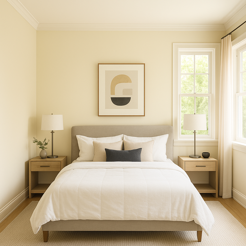
For bedrooms, Hawthorne fosters relaxation and tranquility. Use it as the main wall color to create a calming retreat, and pair it with soft bedding in whites, creams, or pale grays for a cohesive feel.
Hawthorne's soft green-gray tone is perfect for bathrooms where you want a spa-like ambiance. Coordinate it with white subway tiles, brushed nickel fixtures, and marble accents for a classic, polished appearance.
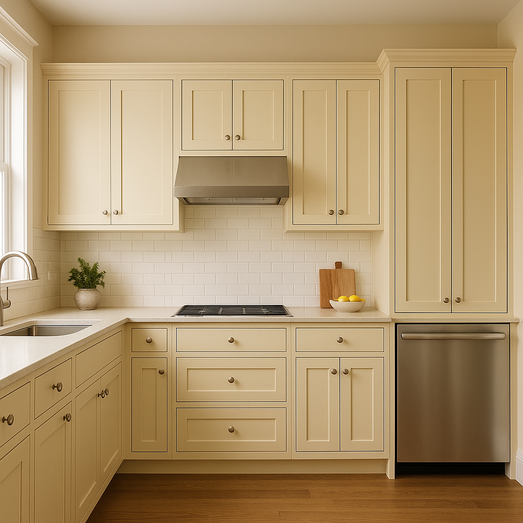
In kitchens, Hawthorne can add a touch of natural elegance. It works well as a wall color, but it also shines as a cabinet color paired with white countertops and brass or matte black hardware for added contrast.
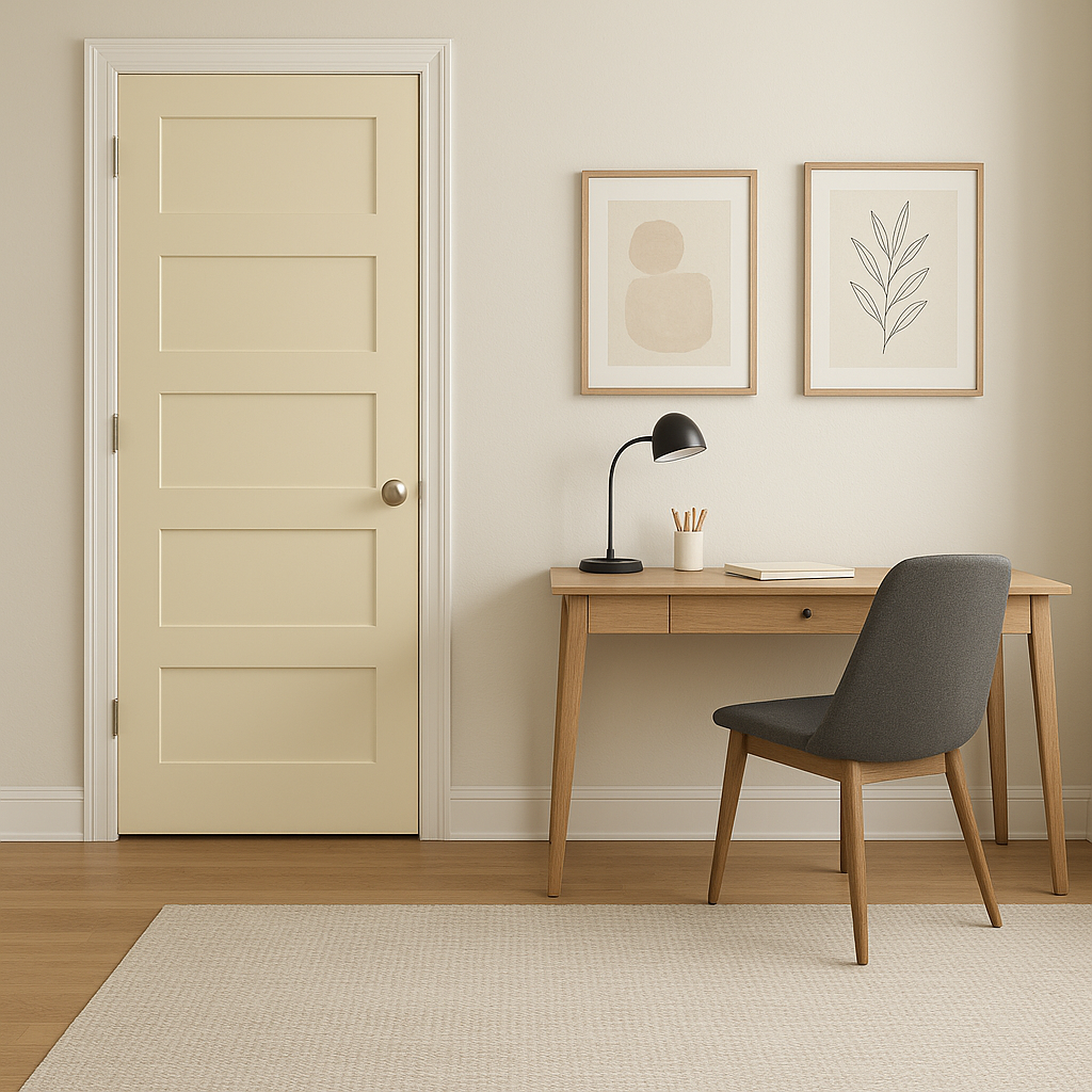
Make a welcoming first impression by using Hawthorne in your entryway. Its natural sophistication pairs effortlessly with wood furniture, woven baskets, and greenery for a charming and inviting entrance.
Hawthorne (379) is a color that responds beautifully to lighting changes. In bright, natural light, it feels airy and fresh, while in dimmer or artificial lighting, its gray undertones become more prominent, enhancing its subdued elegance. To see its full range, test the color in different lighting conditions within your space before committing.
Benjamin Moore Hawthorne (379) is a timeless choice for homeowners and designers seeking a color that blends sophistication and versatility. Its nuanced undertones, ability to coordinate with a wide range of shades, and adaptability in various spaces make it a go-to option for creating serene and elegant interiors. Whether you're refreshing a single room or designing an entire home, Hawthorne's understated charm is sure to elevate your space.
View Colors Only by Brand (No Imagery):
Sherwin-Williams
|
Benjamin-Moore
|
Behr
|
Valspar
Live on the Eastern Slope of Colorado and looking for a local painting professional, check out all our painting services and reach out for a free estimate.
Copyright © 2026 : Wild Fox Painting Inc. : 12435 Mead Way, Littleton, CO 80125


