Benjamin Moore Golden (390) is a captivating paint color that exudes warmth, sophistication, and charm. This rich golden hue is an excellent choice for creating spaces that feel cozy yet refined. Its versatility allows it to harmonize effortlessly with a variety of design styles, from traditional to modern, making it a go-to option for homeowners and designers alike.
Golden (390) carries buttery yellow and subtle brown undertones, giving it a luxurious depth that sets it apart from typical gold shades. The yellow undertones lend a sunny, uplifting quality, while the brown elements add richness and grounding, making it perfect for spaces where elegance and comfort are equally important. Depending on the lighting, this color can shift slightly from a warm golden glow to a deeper, earthy gold, ensuring your room feels dynamic and full of character throughout the day.
Benjamin Moore Golden (390) is remarkably versatile, pairing well with both neutral and bold palettes. Here are some recommended coordinating colors:
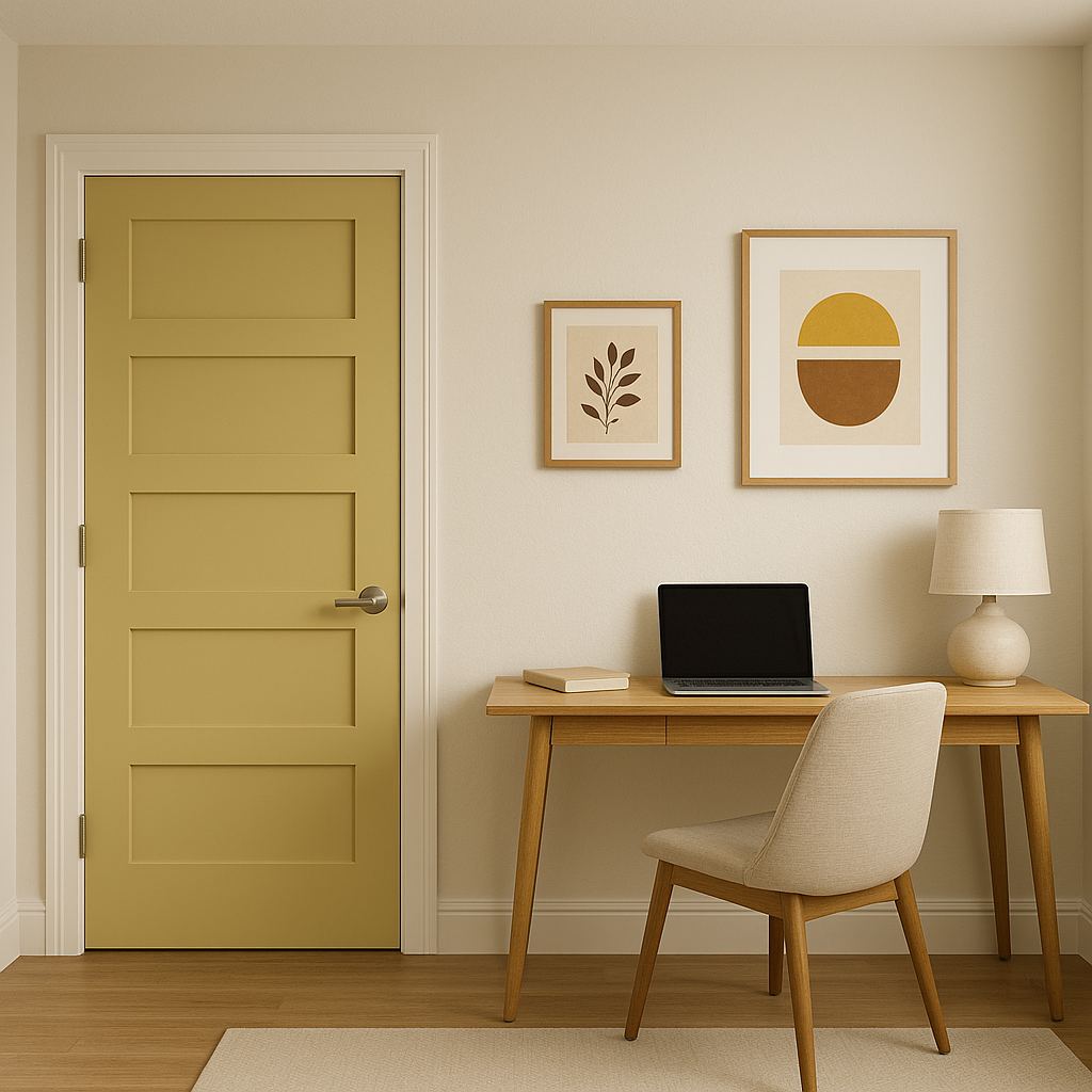
Golden (390) is a versatile choice for both residential and commercial spaces. Here’s how you can incorporate it into your interiors:
Create a warm and welcoming atmosphere by using Golden (390) as the primary wall color in your living room. Pair it with textured fabrics like linen or velvet in neutral shades to enhance its richness. Add metallic accents, such as brushed gold or bronze, for a touch of elegance.
Golden (390) works beautifully in dining rooms, where its warm undertones can make the space feel intimate and inviting. Combine it with dark wood furniture and soft lighting to elevate the ambiance.
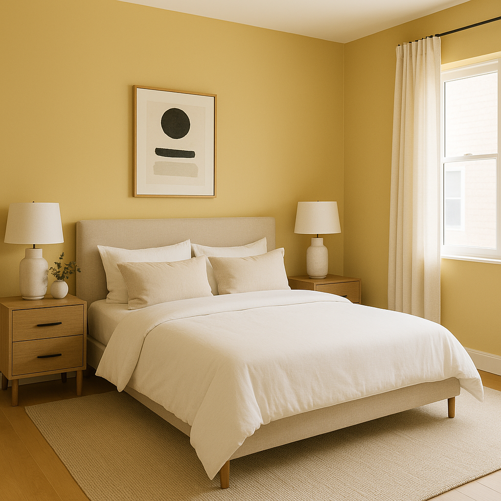
In bedrooms, Golden (390) can bring a sense of coziness and calm. Use it on an accent wall behind the bed, paired with cream or taupe bedding for a serene retreat. Incorporate natural textures like woven baskets or rattan chairs for a relaxed, earthy vibe.
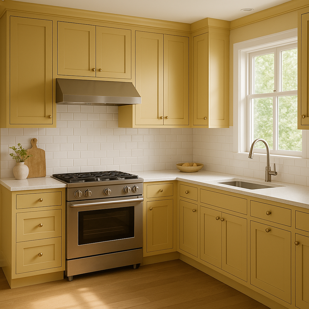
Golden (390) is an excellent choice for kitchens, especially when paired with white cabinetry or subway tiles. Its warmth makes the space feel lively and welcoming, perfect for social gatherings and family meals.
In offices, retail spaces, or restaurants, Golden (390) can create an atmosphere that feels both professional and inviting. Pair it with sleek furniture and modern lighting fixtures for a polished look.
Golden (390) interacts beautifully with different lighting conditions. In natural light, its sunny undertones shine through, giving the room a cheerful glow. Under warm artificial lighting, it takes on a deeper, richer appearance that feels cozy and intimate. Consider testing the color in your desired space to see how it performs with your specific lighting setup.
Benjamin Moore Golden (390) is a timeless hue that can transform any space into a warm and inviting haven. Whether you’re aiming for understated elegance or a bold, vibrant statement, this versatile color is sure to deliver stunning results.
View Colors Only by Brand (No Imagery):
Sherwin-Williams
|
Benjamin-Moore
|
Behr
|
Valspar
Live on the Eastern Slope of Colorado and looking for a local painting professional, check out all our painting services and reach out for a free estimate.
Copyright © 2026 : Wild Fox Painting Inc. : 12435 Mead Way, Littleton, CO 80125


