Benjamin Moore Springhill (412) is an enchanting soft green that brings a sense of rejuvenation and tranquility to any space. This versatile hue is perfect for creating a harmonious and welcoming atmosphere in your home. Whether you’re designing a serene bedroom retreat or an inviting living area, Springhill’s subtle energy is sure to breathe life into your interiors.
Springhill (412) is characterized by its delicate balance of warm and cool undertones. Its green base is complemented by a whisper of gray, giving it a muted and sophisticated quality that prevents it from feeling overly vibrant. This subtle gray undertone ensures that Springhill remains versatile, blending seamlessly with a wide range of color palettes. While the color has a slightly earthy essence, it maintains a fresh and airy quality that feels uplifting without overwhelming.
Springhill pairs beautifully with both neutral and bolder tones, making it an ideal choice for a variety of design styles. Here are some coordinating colors to inspire your palette:
These combinations allow you to tailor the mood of your space, offering options that range from serene and understated to bold and dynamic.
Springhill (412) is a color that adapts beautifully to different rooms and design intents. Here are some ideas for incorporating this hue into your home:
Springhill’s soft green tone is perfect for creating a relaxing and cozy environment in communal spaces. Pair it with neutral furniture and natural textures like linen, rattan, or wood for a modern yet timeless aesthetic. Add pops of deeper greens or muted yellows for a playful twist.
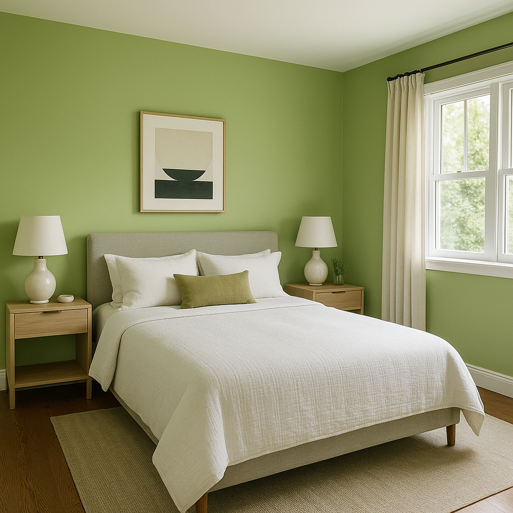
In bedrooms, Springhill shines as a soothing backdrop that promotes rest and relaxation. Use it on walls to create a calming retreat, and complement the look with soft white bedding and warm metallic accents like brushed gold or bronze.
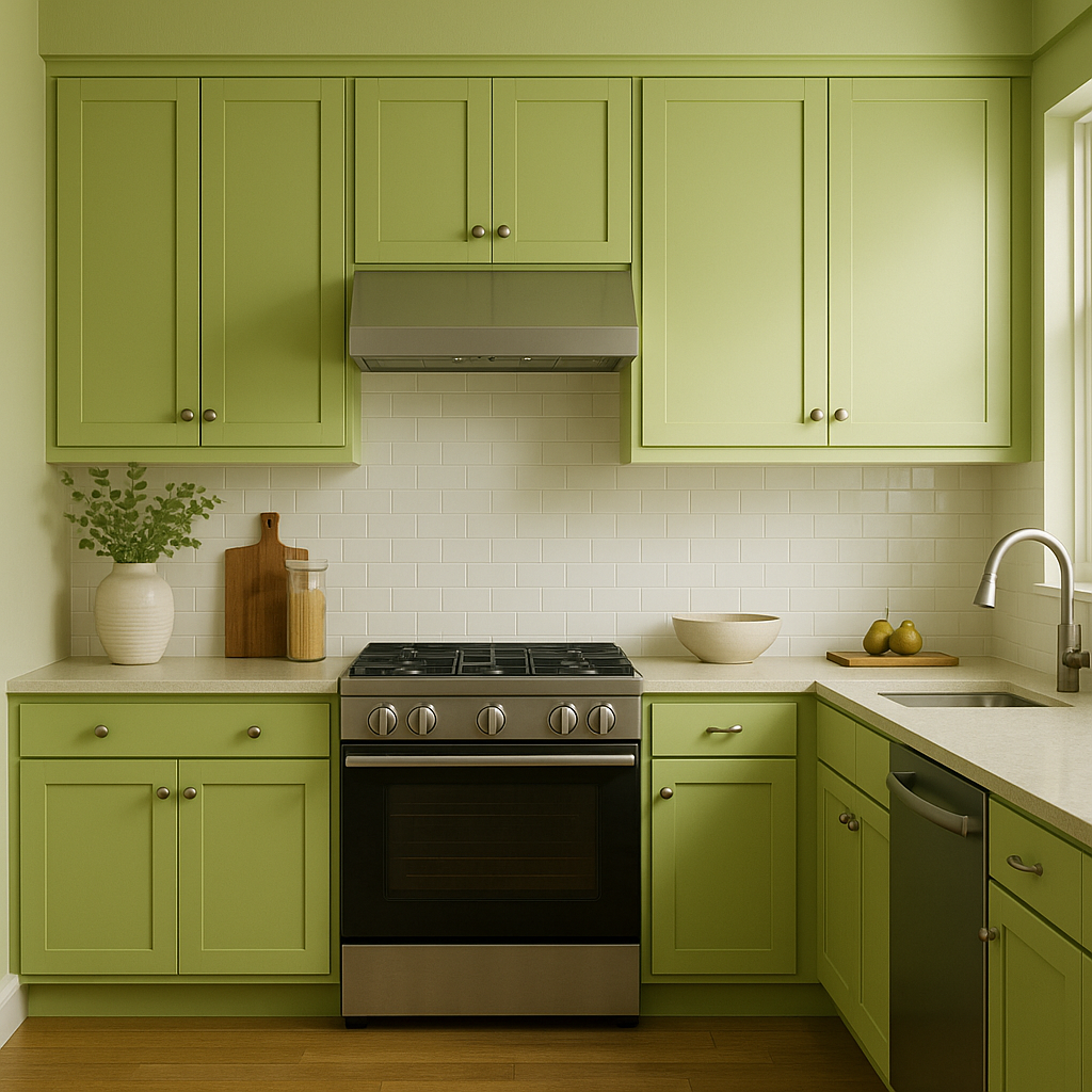
Springhill is an excellent choice for kitchen cabinets or walls, especially in spaces that receive ample natural light. Pair it with crisp white counters or backsplashes to highlight its fresh and earthy character. Add dark hardware or fixtures for an elegant contrast.
Bring a spa-like ambiance to your bathroom by using Springhill on walls or vanity cabinets. Pair it with marble or stone finishes to enhance its serene quality. Soft gray towels and matte black accents can complete the look.
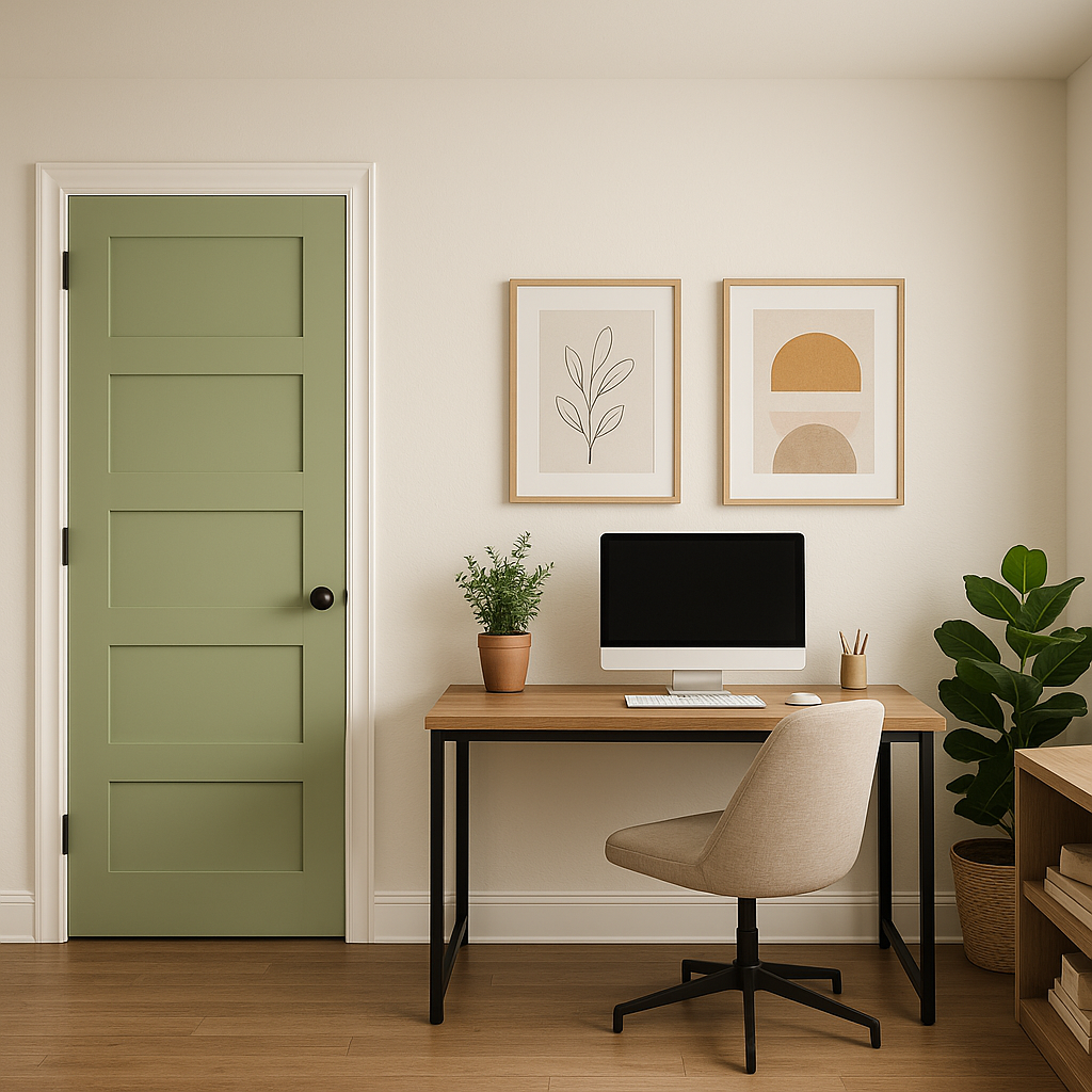
In home offices, Springhill creates a calming environment that fosters focus and creativity. Use it as a wall color, and pair it with natural wood furniture and warm neutrals for a balanced and inspiring workspace.
Springhill (412) works wonderfully in a variety of design styles, including:
Springhill is perfect for homeowners seeking a color that is both refreshing and versatile. Its muted green tone strikes a balance between vitality and softness, making it suitable for a wide range of spaces and styles. Whether you’re looking to refresh a single room or transform your entire home, Springhill (412) offers an approachable yet distinctive choice that inspires creativity.
View Colors Only by Brand (No Imagery):
Sherwin-Williams
|
Benjamin-Moore
|
Behr
|
Valspar
Live on the Eastern Slope of Colorado and looking for a local painting professional, check out all our painting services and reach out for a free estimate.
Copyright © 2026 : Wild Fox Painting Inc. : 12435 Mead Way, Littleton, CO 80125


