Benjamin Moore Blooming (413) is a delightful shade that effortlessly balances tranquility and vibrancy. This soft, refreshing blue-green evokes the serene essence of a blooming garden in spring while maintaining a modern and sophisticated edge. Its versatility makes it a favorite among homeowners and designers alike, offering a timeless appeal that can elevate any space.
Blooming (413) features subtle undertones that make it a truly unique color. The gentle infusion of green lends warmth and earthiness to this predominantly blue shade, creating a harmonious balance that feels both soothing and invigorating. Depending on the lighting in your space, Blooming can lean towards a cool, aquatic blue or showcase hints of verdant green, making it adaptable to a variety of design styles and moods.
Blooming (413) pairs beautifully with a range of complementary shades, allowing you to build a cohesive and inspired palette for your home. Below are some suggestions for coordinating colors:
The beauty of Blooming lies in its versatility—it can anchor a monochromatic scheme or serve as a refreshing accent among bold or neutral tones.
Blooming (413) is a highly adaptable paint color that can transform a variety of spaces. Here's how you can incorporate this serene hue into your home:
Living Rooms: Create a peaceful and welcoming environment by using Blooming on walls, paired with light-colored furniture and natural textures like woven rugs or wooden accents.
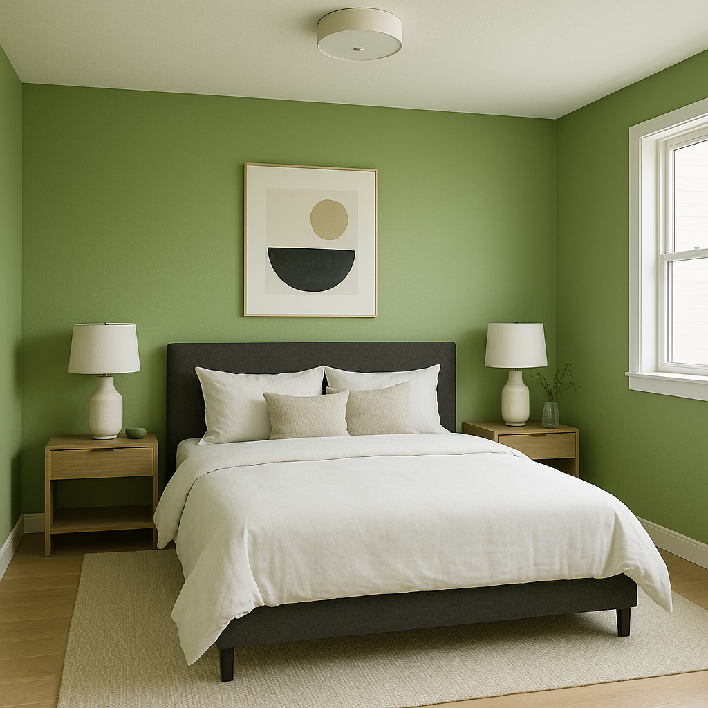
Bedrooms: This calming shade is perfect for bedrooms, promoting relaxation and restful sleep. Pair it with soft linens and muted decor for a serene retreat.
Bathrooms: Blooming’s aquatic-inspired tones make it ideal for bathrooms. Combine it with white tiles or marble for a spa-like ambiance, or add pops of greenery for a fresh and natural feel.
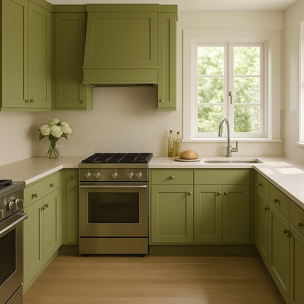
Kitchens: Use Blooming on cabinets or as an accent wall to bring a refreshing energy to your kitchen space. Pair it with brushed nickel or matte black hardware for a contemporary touch.
Nurseries: Its gentle yet uplifting tone makes Blooming a wonderful choice for nurseries, creating a soothing environment for little ones.
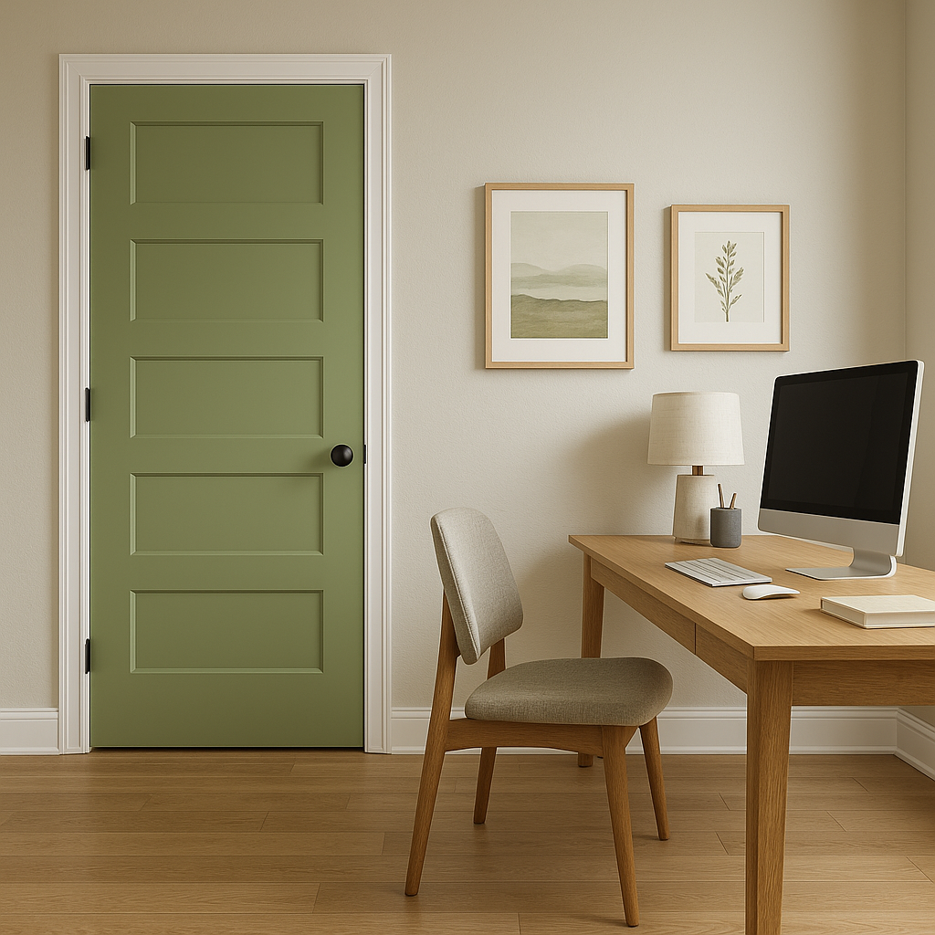
Accent Walls: If you’re not ready to commit to an entire room painted in Blooming, use it as an accent wall to bring interest and depth to a space. Combine it with neutral shades for a balanced look.
One of the defining characteristics of Blooming (413) is its ability to shift subtly depending on lighting conditions. In spaces with ample natural light, its blue-green tones will appear brighter and more vibrant, while in dimmer settings, it may exhibit a richer and moodier feel. For best results, test Blooming in your space to observe how it interacts with your lighting throughout the day.
Benjamin Moore Blooming (413) is an outstanding choice for those seeking a color that combines tranquility, versatility, and timeless appeal. Whether you’re refreshing a single room or transforming your entire home, this serene shade is sure to inspire and delight.
View Colors Only by Brand (No Imagery):
Sherwin-Williams
|
Benjamin-Moore
|
Behr
|
Valspar
Live on the Eastern Slope of Colorado and looking for a local painting professional, check out all our painting services and reach out for a free estimate.
Copyright © 2026 : Wild Fox Painting Inc. : 12435 Mead Way, Littleton, CO 80125


