Benjamin Moore Riverdale 415 is a versatile and sophisticated color that brings depth and elegance to any space. This mid-tone green hue is inspired by nature, offering a calming and grounded aesthetic that seamlessly blends modern trends with timeless appeal. Whether you're looking to create a serene retreat, a polished dining area, or an inviting living room, Riverdale 415 offers the perfect balance of richness and subtlety.
Riverdale 415 is a muted green with cool undertones that lean slightly gray-blue. These soft undertones give the color a refined, subdued quality, allowing it to work beautifully in a variety of lighting conditions. In spaces with natural light, the green tones take center stage, evoking a fresh and organic feel. In low-light settings or artificial lighting, the subtle gray-blue undertones emerge, lending a sophisticated, moody vibe to the room.
This nuanced complexity means Riverdale 415 feels neither too warm nor too cold—it strikes a harmonious balance, making it a versatile choice for both traditional and contemporary interiors.
To bring out the best in Riverdale 415, pair it with complementary shades that enhance its natural beauty. Here are some suggestions for coordinating colors:
Riverdale 415 is a highly adaptable color that works well across a variety of spaces. Here are some ways to incorporate it into your home or workspace:
Create a cozy and inviting atmosphere by using Riverdale 415 on the walls. Pair it with neutral furniture and natural textures like wood or linen for a harmonious, nature-inspired design.
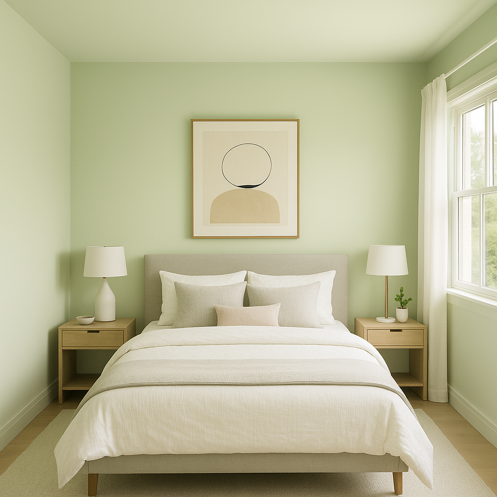
The calming nature of Riverdale makes it an excellent choice for bedrooms. Use it as a wall color to promote relaxation, and pair it with soft whites and light grays for a soothing, spa-like retreat.
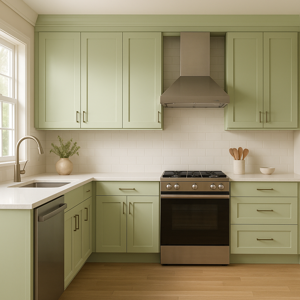
Riverdale 415 can add a touch of character to kitchen cabinetry, especially when paired with white quartz or marble countertops and brass hardware for a timeless yet modern look.
Transform your bathroom into a serene oasis by using Riverdale 415 on the walls or as an accent. Pair it with white tiles and chrome fixtures for a clean, elegant aesthetic.
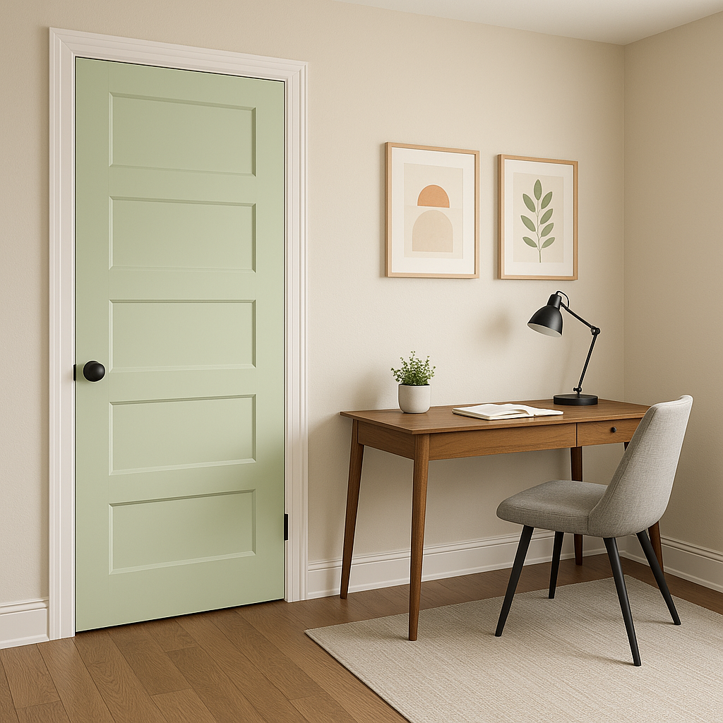
In a home office, Riverdale 415 fosters focus and tranquility. Pair it with warm woods and metallic accents for a sophisticated, productive environment.
View Colors Only by Brand (No Imagery):
Sherwin-Williams
|
Benjamin-Moore
|
Behr
|
Valspar
Live on the Eastern Slope of Colorado and looking for a local painting professional, check out all our painting services and reach out for a free estimate.
Copyright © 2026 : Wild Fox Painting Inc. : 12435 Mead Way, Littleton, CO 80125


