Benjamin Moore Napa (427) is a warm, muted shade that effortlessly bridges the gap between sophistication and comfort. This versatile color, often described as a soft taupe with subtle gray undertones, lends itself beautifully to a wide range of interior design styles. Whether you're curating a cozy retreat or elevating a contemporary space, Napa delivers a timeless allure that enhances both aesthetics and atmosphere.
Napa’s nuanced undertones set it apart from other neutral paints. Its base carries a delicate balance of taupe and gray, creating a harmonious warmth that feels inviting without being overly yellow or beige. A whisper of lavender can emerge under certain lighting conditions, adding depth and complexity to the shade. These undertones allow Napa to adapt beautifully to varying environments, making it a flexible choice for walls, cabinetry, and accent pieces.
Benjamin Moore Napa (427) pairs seamlessly with a variety of complementary colors, enabling you to craft a cohesive and layered look. Here are some suggestions for coordinating shades:
The versatility of Napa (427) makes it a popular choice for a wide array of interior applications. Here are some creative ways to incorporate this refined hue into your space:
Napa’s neutral warmth is perfect for living rooms and family areas, where comfort is key. It creates a soothing backdrop for furniture in light or dark tones and works beautifully with natural textures like wood and linen. Pair it with warm metallics like brushed gold or antique brass for an added layer of sophistication.
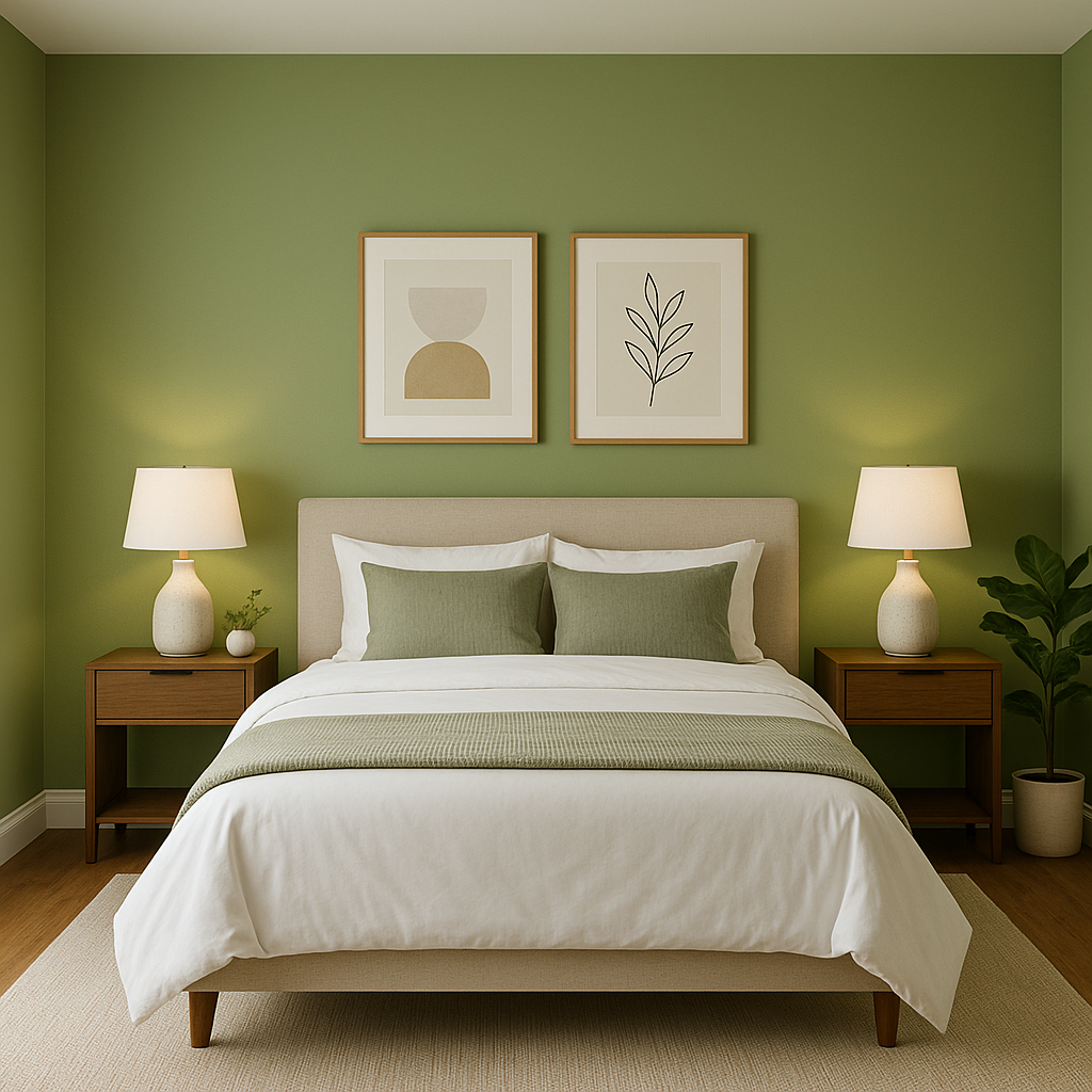
Transform your bedroom into a calming sanctuary with Napa. Its muted tones promote relaxation, making it ideal for walls. Add soft textiles in coordinating shades—like beige, blush, or sage—for a layered, inviting look.
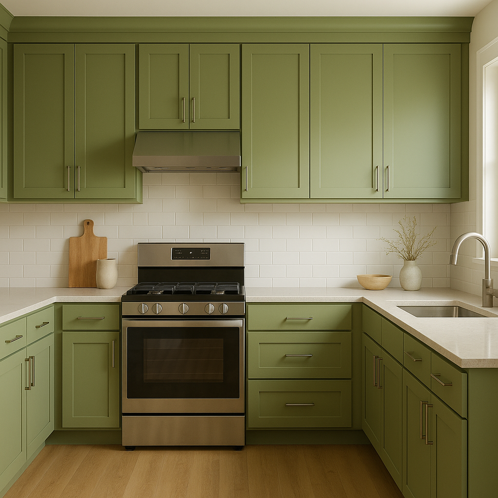
For a modern yet welcoming kitchen, consider Napa for cabinetry or island accents. Pair it with marble countertops and polished hardware to strike a balance between traditional and contemporary aesthetics. In dining areas, Napa provides a neutral backdrop that complements wooden furniture and soft lighting.
Napa excels in bathrooms where a spa-like ambiance is desired. Combine it with natural stone tiles and crisp white trim for a clean and luxurious feel. Its subtle lavender undertones can subtly enhance cooler lighting in these spaces.
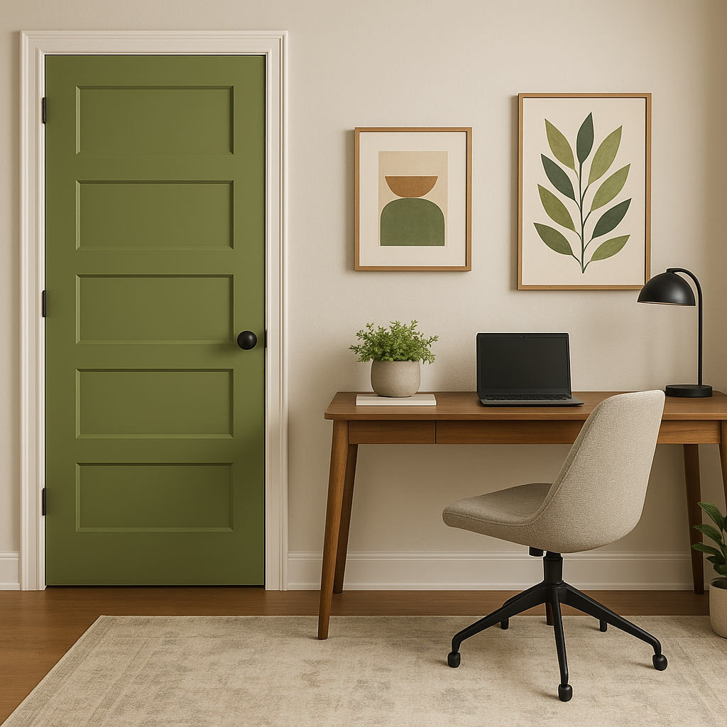
Make a lasting first impression by using Napa in entryways or hallways. Its understated elegance sets the tone for the rest of your home, while its adaptability ensures it complements adjacent rooms effortlessly.
Napa’s appearance shifts depending on the quality and direction of light in a room. In brighter spaces, the gray undertones become more pronounced, creating a cool neutrality. In dim or artificial lighting, the taupe and lavender undertones take center stage, adding warmth and depth. To ensure Napa complements your space, test it in various lighting conditions before committing.
Benjamin Moore Napa (427) is the ultimate choice for homeowners and designers seeking a versatile neutral that exudes warmth and sophistication. Its timeless appeal, paired with its ability to coordinate effortlessly with a range of colors, makes it an indispensable tool for creating elevated interiors. Whether used as a primary wall color or an accent shade, Napa is poised to bring your vision to life with understated elegance.
View Colors Only by Brand (No Imagery):
Sherwin-Williams
|
Benjamin-Moore
|
Behr
|
Valspar
Live on the Eastern Slope of Colorado and looking for a local painting professional, check out all our painting services and reach out for a free estimate.
Copyright © 2026 : Wild Fox Painting Inc. : 12435 Mead Way, Littleton, CO 80125


